Page 3 of 7
Re: Danelaw(Ver 3.2)(4/6/09)
Posted: Fri May 01, 2009 5:08 pm
by naxus
el-presidente wrote: The cities and homesteads will be seperate territories. Homesteads will be worth small bonuses and dities will have larger autodeploy but will have larger nuturals to start.
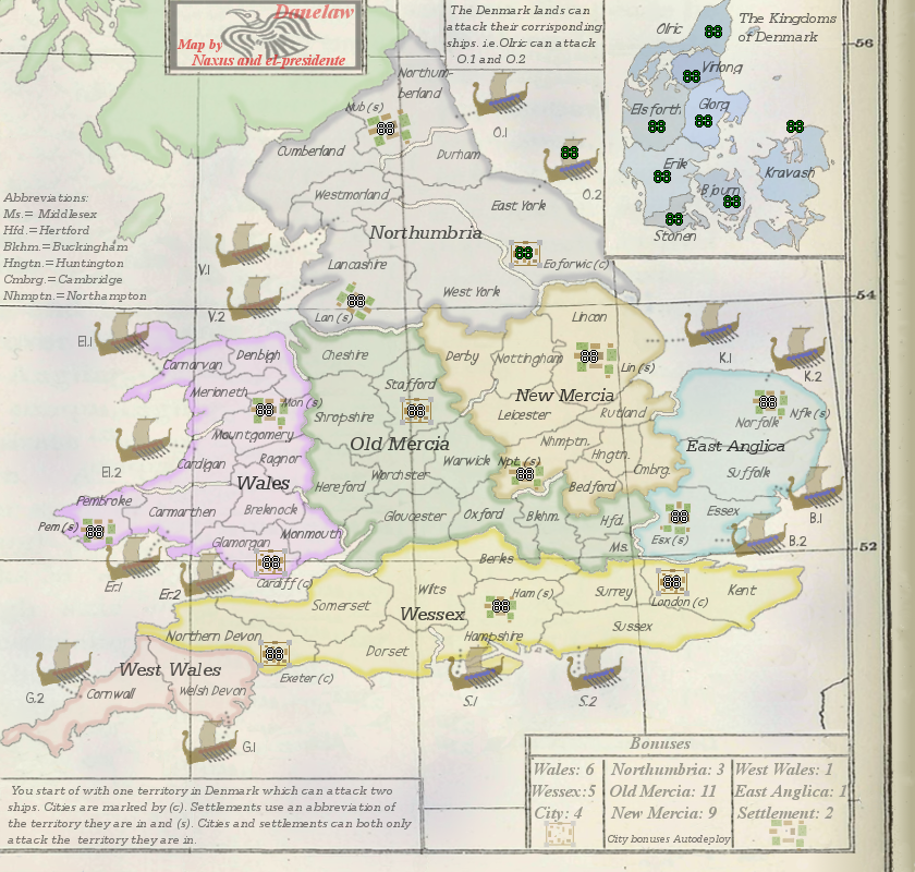
[bigimg]http://i700.photobucket.com/albums/ww1/el-presidente/Danelaw_Version35.png[/bigimg]
Also, I split denmark into 8 and all will start there. each territory will have 2 ships it attacks. I am working on balancing things out.
I split york into 2 territories but I need to name the other half.
This update was still being worked on but is being posted now so we dont get thrown in the bin.Some small problems fixed and a couple new gameplay ideas thrown in
Re: Danelaw(Ver 3.3)(5/1/09)
Posted: Fri May 01, 2009 5:20 pm
by sailorseal
I would change the color scheme, something darker maybe?
Also the impassible lines should be a different color and a different shape. Now they look a little silly.
Re: Danelaw(Ver 3.3)(5/1/09)
Posted: Sun May 03, 2009 10:55 pm
by mibi
You're really bringing nothing new to the table here. That island has been conquered every few hundred years for millenia, we really don't need a map of each historical footnote.
Re: Danelaw(Ver 3.3)(5/1/09)
Posted: Tue May 05, 2009 3:42 pm
by captainwalrus
mibi wrote:You're really bringing nothing new to the table here. That island has been conquered every few hundred years for millenia, we really don't need a map of each historical footnote.
That would make scence if there was maps of all those conquerings already, but there aren't. I like this map.
Re: Danelaw(Ver 3.3)(5/1/09)
Posted: Wed May 06, 2009 4:47 am
by TaCktiX
An interesting concept, and a nifty twist on all those Britain maps we keep on seeming to create (dang all this Brits and their love of their country). But I wouldn't be doing my job unless I was giving true feedback, so here we go:
Graphics- The old map of Britain you've superimposed on is nice, but the rest of the map screams "NEW!", including the pure black of the fonts. Fade everything out to look like it's been lying in a textbook for 50+ years, waiting for some intrepid cartographer to dig up and bring to us. A lot of my graphical suggestions follow off of the "olden" idea.
- Change the main text color to approximately the same as the superimposed map. It's a very dark gray, I'd suggest picking the tint off the thicker border along the bottom.
- Older maps, particularly color ones, had a "dot-matrix" look to them, and rarely solid colors (example
here). See if the middle of the territories can begin getting a wash-out to the base map's color.
- If that example map is any indication, adding a slight tinge of blue to note it's the sea would be sweet. Also, add some sea names on both sides of Britannia for extra feel.
- The ships are a good approximation of an actual Viking vessel, but they just seem off to me. No real suggestions on how to improve, just something to tinker with when you get a chance.
- The Abbreviations text needs a box all to itself. You've got the entire top left of the map, since nothing playable if there anyway.
- Where is the title for this map? It's not on the map proper itself, much less who made it. Pride in work my good men, pride in work.
- Consider the deletion of Scotland and the small bit of Ireland, as they have zero relevance to the gameplay of this map and you're pressed for space.
Gameplay- All the bonuses seem inflated as all get-out. Run the continents through a bonus calculator if you possibly could.
- If the red marks are impassables, there's no way for me to know given the map. Note that somewhere. And something a bit cooler than a simple red line would be nice.
- It's Westmoreland in the 9th century, I'm fairly certain. Double-check me though.
- There is zero explanation of the role of Denmark in this version, much less the ships. I cannot intuit attack routes from what's presented because of this. I suppose this is a side-effect of the half-update, but the way they were presented in older versions...get a box.
- What bonuses do the cities and farms give? No clue here. If caused by half-update, consider a box when you add it.
- The bonus box is fairly haphazard. Adding some order, whether it be a three-column setup or something similar would be grand. Take advantage of Layer copy to extend the already-there box for your needs.
- It's spelled Danish Settlers.
I do believe that covers all I have for now, which is a tome in its own regard. Consider this map

.
Re: Danelaw(Ver 3.3)(5/1/09)
Posted: Sat May 09, 2009 2:20 am
by alexandrois
mibi wrote:You're really bringing nothing new to the table here. That island has been conquered every few hundred years for millenia, we really don't need a map of each historical footnote.
i think you will find england was last counquered in 1066, is that just me or is that more than a few hundered years?
Re: Danelaw(Ver 3.3)(5/1/09)
Posted: Sat May 09, 2009 10:54 am
by naxus
sailorseal wrote:I would change the color scheme, something darker maybe?
Also the impassible lines should be a different color and a different shape. Now they look a little silly.
The impassables will be changed/improved as we go along.Right now thier just basics so as to let you know there thier.Once gameplay is a little more set in stone then they'll be changed.
TaCktiX wrote:An interesting concept, and a nifty twist on all those Britain maps we keep on seeming to create (dang all this Brits and their love of their country). But I wouldn't be doing my job unless I was giving true feedback, so here we go:
Graphics- The old map of Britain you've superimposed on is nice, but the rest of the map screams "NEW!", including the pure black of the fonts. Fade everything out to look like it's been lying in a textbook for 50+ years, waiting for some intrepid cartographer to dig up and bring to us. A lot of my graphical suggestions follow off of the "olden" idea.
- Change the main text color to approximately the same as the superimposed map. It's a very dark gray, I'd suggest picking the tint off the thicker border along the bottom.
- Older maps, particularly color ones, had a "dot-matrix" look to them, and rarely solid colors (example
here). See if the middle of the territories can begin getting a wash-out to the base map's color.
We will play around with aging the map and see what we can come up with.- If that example map is any indication, adding a slight tinge of blue to note it's the sea would be sweet. Also, add some sea names on both sides of Britannia for extra feel.
Will do- The ships are a good approximation of an actual Viking vessel, but they just seem off to me. No real suggestions on how to improve, just something to tinker with when you get a chance.
- The Abbreviations text needs a box all to itself. You've got the entire top left of the map, since nothing playable if there anyway.
- Where is the title for this map? It's not on the map proper itself, much less who made it. Pride in work my good men, pride in work.
- Consider the deletion of Scotland and the small bit of Ireland, as they have zero relevance to the gameplay of this map and you're pressed for space.
Ireland/scotland started out as possibly playable but then just ended up as fillers.we'll delete a small bit to start and put up Abbrev box/titleGameplay- All the bonuses seem inflated as all get-out. Run the continents through a bonus calculator if you possibly could.
I believe my partner did but ill double check when i get a minute- If the red marks are impassables, there's no way for me to know given the map. Note that somewhere. And something a bit cooler than a simple red line would be nice.
Noted and there just basic for now- It's Westmoreland in the 9th century, I'm fairly certain. Double-check me though.
- There is zero explanation of the role of Denmark in this version, much less the ships. I cannot intuit attack routes from what's presented because of this. I suppose this is a side-effect of the half-update, but the way they were presented in older versions...get a box.
Denmark will be the start place and each player will be able to attack 2 ships as thier way onto england but i see what you mean.Will get a box.- What bonuses do the cities and farms give? No clue here. If caused by half-update, consider a box when you add it.
- The bonus box is fairly haphazard. Adding some order, whether it be a three-column setup or something similar would be grand. Take advantage of Layer copy to extend the already-there box for your needs.
- It's spelled Danish Settlers.
I do believe that covers all I have for now, which is a tome in its own regard. Consider this map
.
half update caused some of the problems but the next one will solve a few of them.
Danelaw version 4
Posted: Fri May 15, 2009 9:27 pm
by el-presidente
[bigimg]http://i700.photobucket.com/albums/ww1/el-presidente/Danelaw_Version42.png[/bigimg]
Here is the lates version. There are some bad things bout it, like the attack from the ships look bad. I sort of just faded everything and tried to use the graphic styles I ave seen in old maps. The oceans are a little bue and there are more settlements and cities placed. THe impassibles are not too great still but I think everything looks better. I changed other stuff but I forget what. I have a better font I want to use but I will do that later.
Re: Danelaw(Ver 3.4)(5/15/09)
Posted: Sat May 16, 2009 5:14 am
by alexandrois
Great update
does that flag really suit the vikings?
Re: Danelaw(Ver 3.4)(5/15/09)
Posted: Sat May 16, 2009 10:17 am
by el-presidente
alexandrois wrote:Great update
does that flag really suit the vikings?
The flag doesn't really fit but I couldn't find anything better. I'll look harder.
Re: Danelaw(Ver 3.4)(5/15/09)
Posted: Sat May 16, 2009 10:36 am
by oaktown
Hi Naxus, nice looking map so far. There's a lot to like - the idea of an invasion of England map is an interesting one, and the basic look of the map is off to a good start. The longitude and latitude lines are distracting, but overall I like the atlas elements.
Big question about the gameplay: how does anybody attack Denmark?

If you can't, then this map just comes down to controlling Denmark and then you can't lose. Ships should be able to hit back.
The historian in me is cringing at your use of territory names. A 9th century map wouldn't use the regional names we use today, since most of these names are post-Norman conquest uses. A good example is York: as an Anglian settlement it was Eoforwic, when the Danes controlled the city they called it Jorvik, and the Normans shortened it to York 300 years later. Since this map is supposed to represent England on the eve of the Danish invasions, you should go back to 7th and 8th century Anglian names.
Re: Danelaw(Ver 3.4)(5/15/09)
Posted: Sun May 17, 2009 5:55 am
by alexandrois
el-presidente wrote:alexandrois wrote:Great update
does that flag really suit the vikings?
The flag doesn't really fit but I couldn't find anything better. I'll look harder.
Look for maybe a religious symbol because they didn't have national flags
Re: Danelaw(Ver 3.4)(5/15/09)
Posted: Mon May 18, 2009 9:42 pm
by naxus
alexandrois wrote:el-presidente wrote:alexandrois wrote:Great update
does that flag really suit the vikings?
The flag doesn't really fit but I couldn't find anything better. I'll look harder.
Look for maybe a religious symbol because they didn't have national flags
We will.maybe some of the nordic alphabet or a symbol of a god or two.
oaktown wrote:Big question about the gameplay: how does anybody attack Denmark?
If you can't, then this map just comes down to controlling Denmark and then you can't lose. Ships should be able to hit back.
The historian in me is cringing at your use of territory names. A 9th century map wouldn't use the regional names we use today, since most of these names are post-Norman conquest uses. A good example is York: as an Anglian settlement it was Eoforwic, when the Danes controlled the city they called it Jorvik, and the Normans shortened it to York 300 years later. Since this map is supposed to represent England on the eve of the Danish invasions, you should go back to 7th and 8th century Anglian names.
If i'm right(which i'm pretty sure i am) then the danish lands cant attack each other but thier ships. And those arnt one way attack so that the ships can attack each other,england, and denmark.
Re: Danelaw(Ver 3.4)(5/15/09)
Posted: Sun May 24, 2009 2:25 pm
by el-presidente
[bigimg]http://i700.photobucket.com/albums/ww1/el-presidente/Danelaw_Version43.png[/bigimg]
Updated.
Changed wording, flag of Denmark now Viking flag. Not much else changed.
Does anyone have any suggestions for the impassibles, cause I am sort of stuck on that.
Re: Danelaw(Ver 3.4)(5/15/09)
Posted: Sun May 24, 2009 6:07 pm
by captainwalrus
Why not just use blue for the impassibles that are rivers?
Re: Danelaw(Ver 3.4)(5/15/09)
Posted: Thu May 28, 2009 2:45 pm
by el-presidente
captainwalrus wrote:Why not just use blue for the impassibles that are rivers?
It would look odd, since the oceans are not blue, when the rivers met the ocean it would be wierd.
What else specificly is needing to be fixed? Some names, the impassibles, and what else?
Re: Danelaw(Ver 4.2)(5/24/09)
Posted: Sat May 30, 2009 4:53 pm
by Durrge
the font doesnt seem to fit, other then that i think the maps coming along great
Re: Danelaw(Ver 4.2)(5/24/09)
Posted: Thu Jun 04, 2009 10:15 pm
by apolloguy
i think the map is awsome
Re: Danelaw(Ver 4.2)(5/24/09)
Posted: Fri Jun 05, 2009 3:03 pm
by el-presidente
Durrge wrote:the font doesnt seem to fit, other then that i think the maps coming along great
Yeah, I'm fixing that.
apolloguy wrote:i think the map is awsome
Thanks for the support.
Oak, I have been looking all over, but I am really having trouble finding what the Anglo names of a lot of the regions are. If you have any source you know that might help us would really be appreciated.
Re: Danelaw(Ver 4.2)(5/24/09)
Posted: Fri Jun 05, 2009 3:59 pm
by Danyael
I think this map needs grit and grunge due to the vikings fighting style
as well the atlas line look nice but maybe play around with there look so it doesn't throw your eyes all buggy
Re: Danelaw(Ver 4.2)(5/24/09)
Posted: Fri Jun 05, 2009 4:42 pm
by el-presidente
Danyael wrote:I think this map needs grit and grunge due to the vikings fighting style
as well the atlas line look nice but maybe play around with there look so it doesn't throw your eyes all buggy
What do you mean all buggy?
Anyways, new version. Changed the impassibles and font, don't love either of them, though.
Re: Danelaw(Ver 4.2)(5/24/09)
Posted: Fri Jun 05, 2009 5:20 pm
by Danyael
it seems to look the same as most borders and it makes my eyes jump all over maybe a lower opacity over all on just land would solve it
as well its invisible over certain region colours in the wales and south
Re: Danelaw(Ver 4.5)(6/5/09)
Posted: Sat Jun 06, 2009 9:51 am
by captainwalrus
Fiddle around with the locations of the names within a territory. Berks is right on a line of lattitude and some overlap baorders in odd ways. The impassibles that comein from the sea look ok (like cargigan-merioneth), but the ones that are just surrounded by land look odd (like derby liecashire).
Re: Danelaw(Ver 4.5)(6/5/09)
Posted: Sat Jun 06, 2009 9:19 pm
by sailorseal
This map is improving nicely...
Can you blue up the water a little? The rivers look odd.
Re: Danelaw(Ver 4.5)(6/5/09)
Posted: Sun Jun 07, 2009 3:09 am
by santon836
I really like the map seen how it looks: I do have some gameplay concerns though.
Will Denmark territories attack each other? If so, players could be eliminated first turn, even without taking one, as they have only one terit.
Do the boats attack back to the terit they go with? It doesn't say.
You have to think more about the boat placement. For the moment the G-boats have a MAJOR advantage. The player that starts with those boats will have a +1 continent way too soon and can easily take a +4 city soon after, with no-one close to stop him. The best bonuses the S-boats can dream of, on the other hand, are a settlement and a city. They will never grab a continent and their terits won't be easy to defend as they will have too much borders. They will have to fight themselves to a better place, like West Wales, while living as 'nomads' and having to abandon their city and settlement. The V-boats are even worse: they only have one settlement close and are very very close to the O-boats. These O-boats have a city to take and so many more armies. Byebye V-boats.
I want to emphasize I really like the map idea and especially the look. Great work. Please continue!
Wishing you luck.