Page 3 of 17
V4 Update
Posted: Tue Jul 10, 2007 1:26 pm
by cairnswk
V4 Update
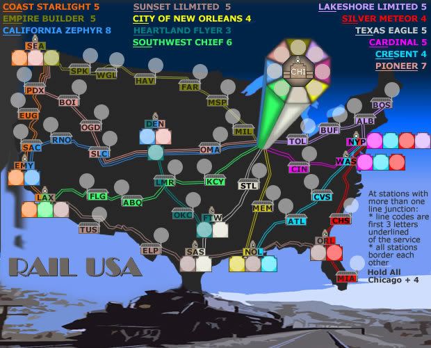
This is a small colour swap between the Crescent and Silver Meteor lines.
Just makes the lines more distinguishable in Washington and New York.
Posted: Tue Jul 10, 2007 1:38 pm
by jako
its looking really good, i was to be honest not very interested at the beggining as the gameplay was somewhat confusing

, but im starting to get the hang of it now. not a train buff myself though

so im guessing the best possible strategy for this map would be the same as any map which is to grab a small easily defendable bonus that is not connected to CHI station, but i find that if everyone was too focused on doing that, then a more risky player could go for trying to get that bonus that is connected to CHi so that he can more easily push into the other larger bonus territories. looks like luck wil have a big hand in this map.
Posted: Tue Jul 10, 2007 3:43 pm
by cairnswk
jako wrote:its looking really good, i was to be honest not very interested at the beggining as the gameplay was somewhat confusing
, but im starting to get the hang of it now. not a train buff myself though
so im guessing the best possible strategy for this map would be the same as any map which is to grab a small easily defendable bonus that is not connected to CHI station, but i find that if everyone was too focused on doing that, then a more risky player could go for trying to get that bonus that is connected to CHi so that he can more easily push into the other larger bonus territories. looks like luck wil have a big hand in this map.
Jako...thanks for your comments....i find that lady luck has a big part in any game where die are involved. The Lakeshore Limitmied line, City of New Orleans and Empire Builder line will probably be the easiest to keep since they only have origin/destination terminals.
Posted: Thu Jul 12, 2007 10:55 am
by cairnswk
Any further comments?
Posted: Thu Jul 12, 2007 12:07 pm
by Coleman
cairnswk wrote:Any further comments?
Look fun enough to me, I don't really care if it's realistic as far as how the railroad looks and is named now that I've thought about it.
Posted: Thu Jul 12, 2007 1:21 pm
by unriggable
Fix the territory PDX By moving the one underneath down a bit.
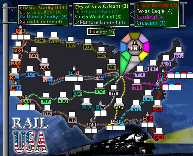
V6 Update.
Posted: Thu Jul 12, 2007 2:03 pm
by cairnswk
V6 Update.
WidowMakers and I got our heads together and com up with this version below as to better feature of the map.
I'm sure WM will post something here in the next few days, but this is where this map was heading.
The stations and terminals were re-worked to better allow the army shadows to sit on a non coloured background, and not take up so much space.
WM has added some wonderful rail lines, and the overhead gantry.
Every station will be able to attack every other station regardless of whether you hold a terminal tert of a shared tert.
Posted: Thu Jul 12, 2007 2:05 pm
by cairnswk
unriggable wrote:Fix the territory PDX By moving the one underneath down a bit.
V6 should solve that issue....unriggable.

Posted: Thu Jul 12, 2007 2:09 pm
by cairnswk
Coleman wrote:cairnswk wrote:Any further comments?
Look fun enough to me, I don't really care if it's realistic as far as how the railroad looks and is named now that I've thought about it.
Yes...thanks Coleman....it is realistic based on current day Amtrak services, a now defunct Pioneer service and a future possible connection between Oklahoma City and Denver.
I did check the UP site out to look for that road and found a couple including one from Denver to Cheyenne to Ogden to Hinkle and Spokane, but in the end the old Pioneer road served a better purpose.
Posted: Thu Jul 12, 2007 8:57 pm
by WidowMakers
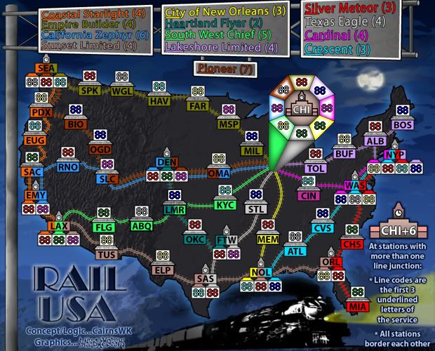
Here is the next draft Version 7
I will be eliminating the white clouds int he background.
Also the pioneer line will be changed to a purple color. That way Sunset Limited and pioneer will not be to close to the same color.


Posted: Fri Jul 13, 2007 4:55 am
by DiM
i liked the old train better it really looked like usa is in the smoke.
but i like the new legend.

also 2 concerns.
1. are the white squares large enough for the armies?
2. in chicago the gradient and colours kinda hurt the eye.
PS: now the watches are so small you can't see the time

Posted: Fri Jul 13, 2007 4:57 am
by yeti_c
DiM wrote:i liked the old train better it really looked like usa is in the smoke.
Agree - that was the best bit about the original concept gfx from Cairns.
C.
Posted: Fri Jul 13, 2007 5:05 am
by edbeard
DiM wrote:1. are the white squares large enough for the armies? (
I was looking at this earlier. I got an 88 to barely fit. I think a slightly larger square would be better, but I only looked at one square at a time, so it might look fine with the current ones
Posted: Fri Jul 13, 2007 5:14 am
by WidowMakers
edbeard wrote:DiM wrote:1. are the white squares large enough for the armies? (
I was looking at this earlier. I got an 88 to barely fit. I think a slightly larger square would be better, but I only looked at one square at a time, so it might look fine with the current ones
88 fits. That was the first thing we did when starting to make the new stations. version 8 will have the 88 in each box. That way we can all discuss it. Plus 88 is centered but how often does anyone reach 88. It is really just used for development.
DiM wrote:i liked the old train better it really looked like usa is in the smoke.
but i like the new legend.
also 2 concerns.
1. are the white squares large enough for the armies?
2. in chicago the gradient and colours kinda hurt the eye.
PS: now the watches are so small you can't see the time Sad
The old train forced the map up, which was forced down due to the new legend. There is not enough room to have the train under Texas (to have the US act like smoke) and still have the gantry legend. This will need to be something CairnsWK responds too as well.
I don't know what to tell you about the chicago gradient. They were solid color but we thought the army numbers might be visually lost so CairnsWK felt teh gradient needed to be added. I agree with him.
Posted: Fri Jul 13, 2007 5:18 am
by DiM
WidowMakers wrote:edbeard wrote:DiM wrote:1. are the white squares large enough for the armies? (
I was looking at this earlier. I got an 88 to barely fit. I think a slightly larger square would be better, but I only looked at one square at a time, so it might look fine with the current ones
88 fits. That was the first thing we did when starting to make the new stations. version 8 will have the 88 in each box. That way we can all discuss it. Plus 88 is centered but how often does anyone reach 88. It is really just used for development.
if it fits it's ok
WidowMakers wrote:DiM wrote:i liked the old train better it really looked like usa is in the smoke.
but i like the new legend.
also 2 concerns.
1. are the white squares large enough for the armies?
2. in chicago the gradient and colours kinda hurt the eye.
PS: now the watches are so small you can't see the time Sad
The old train forced the map up, which was forced down due to the new legend. There is not enough room to have the train under Texas (to have the US act like smoke) and still have the gantry legend. This will need to be something CairnsWK responds too as well.
I don't know what to tell you about the chicago gradient. They were solid color but we thought the army numbers might be visually lost so CairnsWK felt teh gradient needed to be added. I agree with him.
then at least dampen the colours a bit. they are too bright
and what about the watches?
Posted: Fri Jul 13, 2007 5:26 am
by WidowMakers
DiM wrote:then at least dampen the colours a bit. they are too bright
and what about the watches?
The colors are the colors of the rail lines. They can't be changed. They need to be the same
As far as the watches go. I will adjust the hand that you can see to the 4 hour difference between timezones.
WM
Posted: Fri Jul 13, 2007 5:27 am
by DiM
WidowMakers wrote:DiM wrote:then at least dampen the colours a bit. they are too bright
and what about the watches?
The colors are the colors of the rail lines. They can't be changed. They need to be the same
As far as the watches go. I will adjust the hand that you can see to the 4 hour difference between timezones.
WM
the colours seem too bright. maybe because of the white near them. maybe they'll look better with the armies inside.
Posted: Fri Jul 13, 2007 6:56 am
by cairnswk
OK All...I'm hearing all these concerns.
Thanks to all for the kudos about the original graphic, but sometimes on the swings and roundabouts some items change for the betterment of the overall design.
I think WidowMakers has taken this map to a whole new level that I possibly wouldn't have gone to, and I can tell you all there is more to come from suggestions I have PMed WM this evening about.
I am extremely happy with the night scene that WM has created for this map. Yes it is very dark, but it is also very alluring.
Now to answer some concerns:
Firstly, WM has already stated he will alter the tower clocks and try to make them stand out more, then we will be able to put the different times for each station in them.
The colours...these are no different than the ones I had in the original map. They may possibly stand out more because of the white army shadow close to them, but they need to remain clear and bright against the gray and black backgrounds. So there are no changes planned for them.
The numbers will fit inside these placement boxes.
If needs be I would be happy for WM to the lengthen the map by 20 or 30 pixels at the bottom to give the train more "unobtrusive" prominence in the design.
The Chicago gradient was changed by myself to that shown in the map above, and I will stick by my decision to have the colours graduating into white as a background to the Chicago army shadows consistent with other station designs.
And I know WM is removing the white clouds from the background.
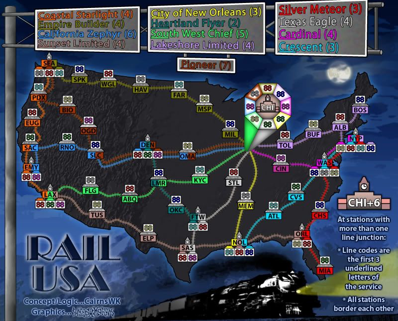
V8 Update
Posted: Fri Jul 13, 2007 5:57 pm
by cairnswk
V8 Updates.
* White clouds removed and replace by moon
* Chicago colours softened
* Pioneer line changed to brown - but this is due for replacement by better colour
* legend backing colours changed to grey but his didn't work either.
So we have some fixing to do!
Small V8
Large V8
Posted: Fri Jul 13, 2007 6:43 pm
by gimil
The legends make no sence.

Can they be simlified please
Re: V8 Update
Posted: Fri Jul 13, 2007 6:52 pm
by lostatlimbo
looks good... hope to see this one up and running soon
(no pun intended)
Posted: Fri Jul 13, 2007 6:55 pm
by cairnswk
gimil wrote:The legends make no sence.
Can they be simlified please
Gimil
Please explain why u think it makes no sense.
Posted: Fri Jul 13, 2007 6:56 pm
by gimil
becasue . . .
i dont understand it

Posted: Fri Jul 13, 2007 7:13 pm
by cairnswk
gimil wrote:becasue . . .
i dont understand it
Fair enough gimil
The legend names represent the Railroad lines on the map.
For instance:
Heartland Flyer (2) is stations:
DEN - Denver (terminal)
LMR - Lamar (Shared Station)
OKC - Oklahoma City
FTW - Fort Worth (Terminal)
If you hold all those stations on that Railroad line you get 2 bonus points.
The same applies to all other lines.
And all stations can attack each other because they are all joined by lines.
Does that explain it for you?
Posted: Fri Jul 13, 2007 7:33 pm
by gimil
Oh i understood how the bonus worked i thought the legends was trying to explin something diffirent

lol well thats fine