Lookin' good. There are only a few region name placements that could use adjustment I think, for instance: Univ City (the abbrev), Juniata, and maybe a couple more.
--Andy
Philadelphia [Quenched]
Moderator: Cartographers
Forum rules
Please read the Community Guidelines before posting.
Please read the Community Guidelines before posting.
-
AndyDufresne

- Posts: 24935
- Joined: Fri Mar 03, 2006 8:22 pm
- Location: A Banana Palm in Zihuatanejo
- Contact:
-
sannemanrobinson
- Posts: 255
- Joined: Mon Dec 20, 2010 6:35 am
- Gender: Male
Re: Philadelphia - [29 July 2012] pg 32 -spray paintier
The graffiti comes to life now.
Two minor points:
- Inset of Center City has streight lines at the right side that make it look unifinished and overlaps with the pipe/raingutter.
- Legend has the old colours.
Two minor points:
- Inset of Center City has streight lines at the right side that make it look unifinished and overlaps with the pipe/raingutter.
- Legend has the old colours.

Re: Philadelphia - [29 July 2012] pg 32 -spray paintier
Looks good. Some of the arrow connections could be clearer like Holmesburg to Tacony for example.
I like the idea of underdog bonus
I like the idea of underdog bonus
Re: Philadelphia - [29 July 2012] pg 32 -spray paintier
Ah yes, this is looking more like graffiti now!! As for the city center inset, yes the paint needs to on the pipes as well. I agree that the attack arrows between regions need to stand out more, maybe add an outer glow?

Re: Philadelphia - [29 July 2012] pg 32 -spray paintier
Well I think the graffiti look has really improved. However, i think there is no flow to this map. Probably because of all the outlining instructions and images and arrows. The map is unique, however I'm not a fan.

-
RedBaron0

- Posts: 2657
- Joined: Sun Aug 19, 2007 12:59 pm
- Gender: Male
- Location: Pennsylvania
- Contact:
Re: Philadelphia - [31 August 2012] pg 32 -cleanup, what els
- Click image to enlarge.
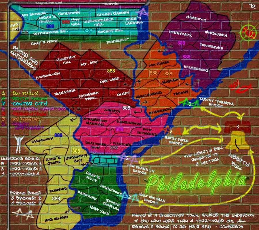
With this cleaned up Large version... I'm hoping its enough to get the small taken care of and get done here, I work slowly I know, but lets see if this can't get this done!


Re: Philadelphia - [31 August 2012] pg 32 -cleanup, what els
The city inset - I think the text needs to be black instead of the white. With the white text and the bright blue, it is just waaaaayyyyy to glaring.
-
AndyDufresne
- Posts: 24935
- Joined: Fri Mar 03, 2006 8:22 pm
- Location: A Banana Palm in Zihuatanejo
- Contact:
Re: Philadelphia - [31 August 2012] pg 32 -cleanup, what els
I think keeping all white text would be kind of nice for balance on the map. Couldn't he just darken it from:isaiah40 wrote:The city inset - I think the text needs to be black instead of the white. With the white text and the bright blue, it is just waaaaayyyyy to glaring.

To something like:

Or

--Andy
-
sumone10154
- Posts: 4
- Joined: Tue Jul 08, 2008 4:09 pm
- Location: Boston
Re: Philadelphia - [31 August 2012] pg 32 -cleanup, what els
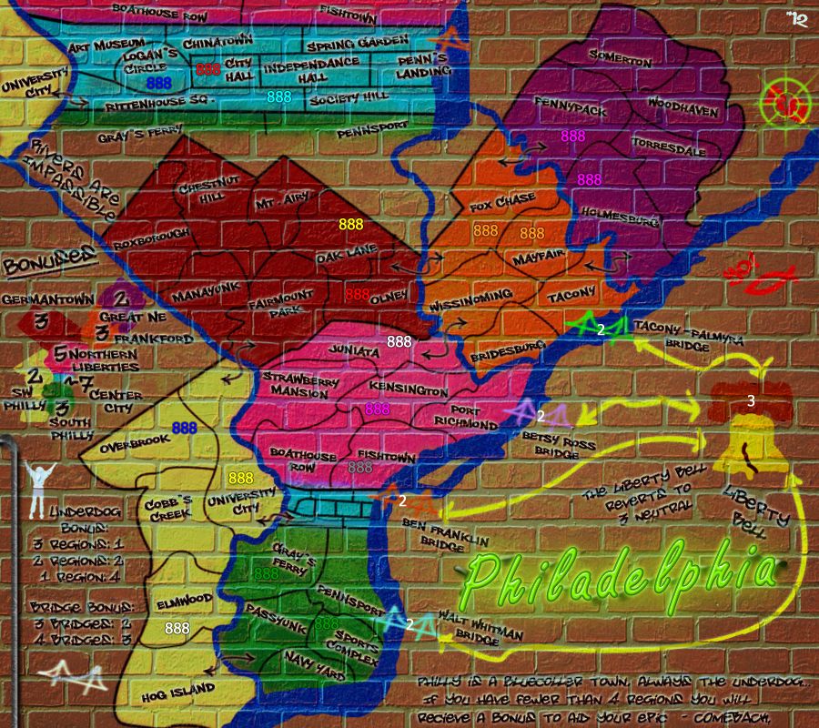
I don't understand the Liberty Bell; why is it connected to the bridges? Shouldn't it be New Jersey? Also, the brick background makes the map hard to see in general.
-
RedBaron0
- Posts: 2657
- Joined: Sun Aug 19, 2007 12:59 pm
- Gender: Male
- Location: Pennsylvania
- Contact:
Re: Philadelphia - [31 August 2012] pg 32 -cleanup, what els
I had it on there for a while early on, sections of south Jersey, but decided to keep it about Philly. The Liberty Bell is just a vehicle, as well as a symbol of the city. It's similar to the Indian territories on 13 colonies, or even the Sea of Japan on my other map of Japan. (except this has a killer neutral)
The text I'm working on visibility on the brick background
The text I'm working on visibility on the brick background

Re: Philadelphia - [31 August 2012] pg 32 -cleanup, what els
RBO, i admire your tenacity in working on this...it has taken such a long time for you to arrive at something you like.  and imho, it is starting to look good.
Just s coouple of small things from me...
1. are you going to colour over the pipes in those two regions above the city and on univ city
2. it is quite difficult to read the boathouse ???? and fish??? regions over the pipe
3. you have a black crack in the liberty bell <- very stark...perhaps a darker yellow or brown might be better
4. agree with Andy on the background colour of the city...last colour is my pick.
5. on some writings under the brick mortar, some white is blended in with the mortar colour instead of sitting on top of it....makes it look weird for me because the title and other colours in bridges etc goes straight over the top of the mortar....is your text layering sitting behind the mortar layer?
6. cannot quite read the last region in purple in the legend
7. your signature....is that it top right corner or is that a compass?

* Pearl Harbour * Waterloo * Forbidden City * Jamaica * Pot Mosbi
-
nolefan5311
- Posts: 1768
- Joined: Mon Nov 22, 2010 11:51 am
- Gender: Male
- Location: Florida
Re: Philadelphia - [31 August 2012] pg 32 -cleanup, what els
Also, this...

Well, it kind of looks like something lol
Well, it kind of looks like something lol
-
RedBaron0
- Posts: 2657
- Joined: Sun Aug 19, 2007 12:59 pm
- Gender: Male
- Location: Pennsylvania
- Contact:
Re: Philadelphia - [31 August 2012] pg 32 -cleanup, what els
I wasn't planning on it, but I can try it and see how it looks.cairnswk wrote:RBO, i admire your tenacity in working on this...it has taken such a long time for you to arrive at something you like.
Just s coouple of small things from me...
1. are you going to colour over the pipes in those two regions above the city and on univ city
Boathouse Row and Fishtown, it was a suggestion further back to get the names more onto the pipe, I can work on those.cairnswk wrote:2. it is quite difficult to read the boathouse ???? and fish??? regions over the pipe
Probably go with a dark brown.cairnswk wrote:3. you have a black crack in the liberty bell <- very stark...perhaps a darker yellow or brown might be better
Already fiddled with and hopefully taken care of.cairnswk wrote:4. agree with Andy on the background colour of the city...last colour is my pick.
Ditto this.cairnswk wrote:5. on some writings under the brick mortar, some white is blended in with the mortar colour instead of sitting on top of it....makes it look weird for me because the title and other colours in bridges etc goes straight over the top of the mortar....is your text layering sitting behind the mortar layer?
Double ditto this.cairnswk wrote:6. cannot quite read the last region in purple in the legend
No, its the cross-hairs from the old-old classic avatar I used to have. (It's also the "0" from RedBaron0 )cairnswk wrote:7. your signature....is that it top right corner or is that a compass?
um... opps? kinda makes more "graffiti" now doesn't it?nolefan5311 wrote:Also, this...
Well, it kind of looks like something lol
-
ManBungalow
- Posts: 3431
- Joined: Sun Jan 13, 2008 7:02 am
- Location: On a giant rock orbiting a star somewhere
Re: Philadelphia - [31 August 2012] pg 32 -cleanup, what els
Have to nitpick here, but "less than 4 territories" should be "fewer than 4 territories".
In fact, 'territories' might be better as 'regions' just to be consistent with the game log.
In fact, 'territories' might be better as 'regions' just to be consistent with the game log.


Re: Philadelphia - [31 August 2012] pg 32 -cleanup, what els
To add on to this, "Bluecoller" should be "Blue Collar." It's two words, not one, and collar is spelled wrong.ManBungalow wrote:Have to nitpick here, but "less than 4 territories" should be "fewer than 4 territories".
-
RedBaron0
- Posts: 2657
- Joined: Sun Aug 19, 2007 12:59 pm
- Gender: Male
- Location: Pennsylvania
- Contact:
Re: Philadelphia - [31 August 2012] pg 33-outline or no outl
This should cover all the issues mentioned so far. My own issues with this are the 2 inset region names on the pipes, I don't think they've integrated into the map correctly and I'll likely have to do something there, and my main question about the outline of the map itself. Help me decide kids, I personally lean towards NO outline, but I wanna be sure.
Outline:
NO Outline:
Outline:
- Click image to enlarge.
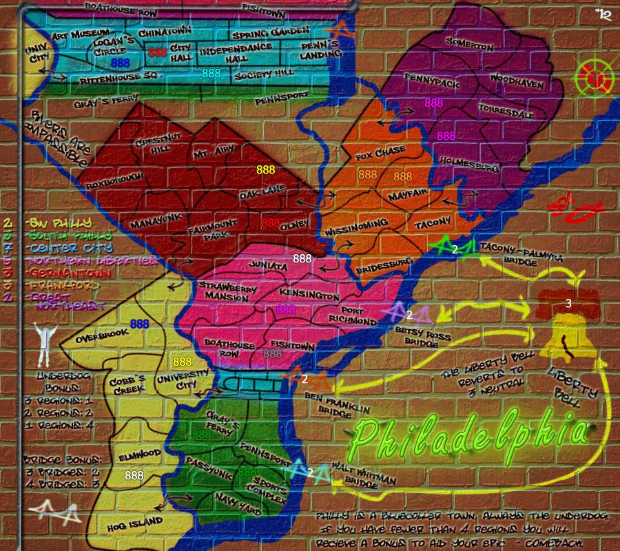
- Click image to enlarge.
-
ManBungalow
- Posts: 3431
- Joined: Sun Jan 13, 2008 7:02 am
- Location: On a giant rock orbiting a star somewhere
Re: Philadelphia - [31 August 2012] pg 33-outline or no outl
I also prefer no outline, but you can get away with either IMO.
Is that the pipe segment at the top connected to various other layers now? Otherwise, you could try the simple solution of removing that horizontal segment. Or you could do a horizontal flip of the pipe layer, so it goes out of the left margin instead of through the region names. If there's a real issue and the names there are deemed absolutely necessary (it's good to have them there for completeness), consider that people can simply write on pipes in chalk/marker pens etc. - it doesn't have to be the spray paint stuff.
Is that the pipe segment at the top connected to various other layers now? Otherwise, you could try the simple solution of removing that horizontal segment. Or you could do a horizontal flip of the pipe layer, so it goes out of the left margin instead of through the region names. If there's a real issue and the names there are deemed absolutely necessary (it's good to have them there for completeness), consider that people can simply write on pipes in chalk/marker pens etc. - it doesn't have to be the spray paint stuff.
Re: Philadelphia - [31 August 2012] pg 33-outline or no outl
I prefer the outline myself...just gives that finished apppearance, and it's a continuation of the black border appearance...with no outline it looks unfinished.
Also, you'ge still got something phallic going on in the blue inset section in the map...deliberate?
all other text except the legend bonus text is clear - can you put a black offset under layer behind those names and numbers just to make them stand out more legibly.
Also, you'ge still got something phallic going on in the blue inset section in the map...deliberate?
all other text except the legend bonus text is clear - can you put a black offset under layer behind those names and numbers just to make them stand out more legibly.
* Pearl Harbour * Waterloo * Forbidden City * Jamaica * Pot Mosbi
Re: Philadelphia - [31 August 2012] pg 33-outline or no outl
This is my thought exactly!! Or you could have it go straight up as well.ManBungalow wrote:... do a horizontal flip of the pipe layer, so it goes out of the left margin instead of through the region names.
I prefer the outlines, but if you go that route, I recommend to get rid of the "overspray" on the outside of the outlines. I've never seen any graffiti that looked like it had a lot of overspray.
-
RedBaron0
- Posts: 2657
- Joined: Sun Aug 19, 2007 12:59 pm
- Gender: Male
- Location: Pennsylvania
- Contact:
Re: Philadelphia - [4 October 2012] pg 33-Minimap?
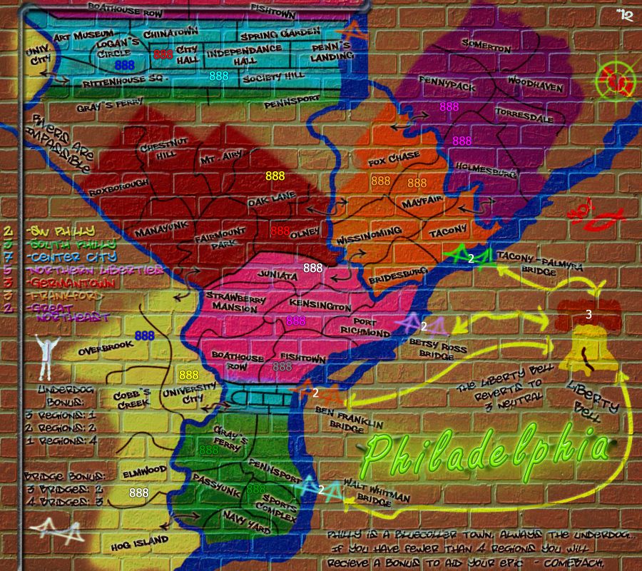
- Click image to enlarge.
I'm hoping I've cleared up everyone's issues, in doing so I'm toying with a minimap instead of the list. So far I'm liking it, the colored list was just interacting too much with the bricks and and causing me trouble, I can fiddle more with the theme to get the list to work, a poster or neon perhaps. But lets see what the mini map turns up.
-
AndyDufresne
- Posts: 24935
- Joined: Fri Mar 03, 2006 8:22 pm
- Location: A Banana Palm in Zihuatanejo
- Contact:
Re: Philadelphia - [3 November 2012] pg 33-Minimap?
Liking the look of it. The only thing that sort of comes to mind now is that the legend text isn't as easy to read as say the gameboard text for the regions, probably because it is in a more fluid and writing style.
But good work.
--Andy
But good work.
--Andy
Re: Philadelphia - [3 November 2012] pg 33-Minimap?
*poke, poke* How's this coming kiddo!!
-
RedBaron0
- Posts: 2657
- Joined: Sun Aug 19, 2007 12:59 pm
- Gender: Male
- Location: Pennsylvania
- Contact:
Re: Philadelphia - [3 November 2012] pg 33-Minimap?
Slowly.isaiah40 wrote:*poke, poke* How's this coming kiddo!!
-
generalhead
- Posts: 806
- Joined: Mon Apr 26, 2010 10:09 pm
Re: Philadelphia - [3 November 2012] pg 33-Minimap?
I love the underdog factor, that is so unique. Beautiful map!
