Page 17 of 29
Posted: Tue Mar 18, 2008 9:12 pm
by wcaclimbing
wcaclimbing wrote:Theres a small green area behind the lo'ln name. Looks to be part of the Age of Might textures. is that supposed to be there?
I edited right before you posted. did you see that part?
Posted: Tue Mar 18, 2008 9:12 pm
by DiM
wcaclimbing wrote:Theres a small green area behind the lo'ln name. Looks to be part of the Age of Might textures. is that supposed to be there?
will solve. i have no idea what it is. there shouldn't be any texture from the other maps as all those layers are gone. will investigate when i get home and solve it.
Posted: Wed Mar 19, 2008 4:59 am
by Itrade
I'm loving the look of this map. It screams of awesome.
Posted: Wed Mar 19, 2008 9:43 am
by DiM
Itrade wrote:I'm loving the look of this map. It screams of awesome.
glad you like it mate. hopefully after the update bellow i'll get some stamps and we can move to final forge.
Posted: Wed Mar 19, 2008 9:47 am
by DiM
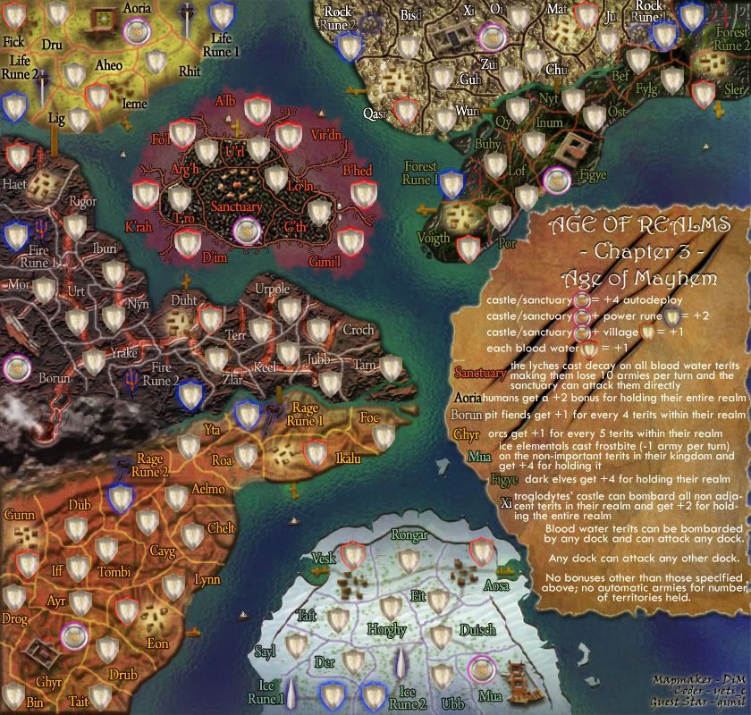
v10
* small version
* made the docks more visible
* made army circles more visible
* changed the bonus for humans from +4 to +2
* added the no automatic armies thing in the legend
* solved the weird greenish thing in the sanctuary island
* made the river between troglodytes and night elves thicker and more visible.
large
small
Posted: Wed Mar 19, 2008 6:38 pm
by wcaclimbing
in troglodytes on the small version, with the greyscale on the text, it is making it hard to read some of the names. they get lost in the texture behind them. Zui Mostly, but Xi a bit, also. you should brighten the text or darken the background just a bit so they stand out more.
Other than that, I think its about as good as it will ever be. no complaints from me (other than the one mentioned above).
Posted: Wed Mar 19, 2008 6:48 pm
by DiM
wcaclimbing wrote:in troglodytes on the small version, with the greyscale on the text, it is making it hard to read some of the names. they get lost in the texture behind them. Zui Mostly, but Xi a bit, also. you should brighten the text or darken the background just a bit so they stand out more.
Other than that, I think its about as good as it will ever be. no complaints from me (other than the one mentioned above).
if you compare large version with small version you'll see the troglodytes names have a different gradient. on large it is horizontal on small it is vertical. i changed it cause the vertical gradient made the names hard to read on small. i find them very visible but i will also try and do something and make them even more visible.
btw on a general note i don't think it is a problem if the small and large are slightly different. i mean the most obvious change is that the legend has another shape because the text would have been to cramped in the large version shape.
Wow...
Posted: Sun Mar 23, 2008 11:49 am
by badlouie
This is my first venture into the map forum, and all i can say is Wow.
The map looks awesome...I wish i had the skills to set something like this up, but i don't! I'm glad you're putting in the effort & i can't wait to try out the map!
Re: Wow...
Posted: Sun Mar 23, 2008 3:34 pm
by DiM
badlouie wrote:This is my first venture into the map forum, and all i can say is Wow.
The map looks awesome...I wish i had the skills to set something like this up, but i don't! I'm glad you're putting in the effort & i can't wait to try out the map!
welcome to the foundry, i hope you stick around.
and i'm glad you like the map.
PS: on monday i'll post another update and hopefuly we can move on.
Posted: Mon Mar 24, 2008 10:41 am
by DiM
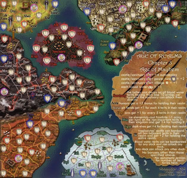
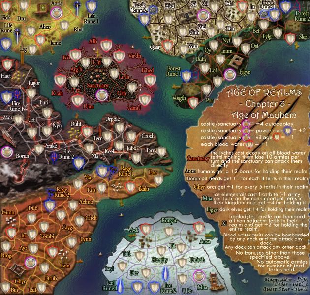
v11
done:
solved the small version text readability in the troglodites terits
made various other elements more visible in the small version.
to do:
get stamps
start xml
large
small
Posted: Mon Mar 24, 2008 11:06 am
by gimil
1 minor idea, since lava solidifys (sp?) in water could some on the land be reshaped to show this? maybe even a connection to the santuary instead of the port

Posted: Mon Mar 24, 2008 11:30 am
by DiM
gimil wrote:1 minor idea, since lava solidifys (sp?) in water could some on the land be reshaped to show this? maybe even a connection to the santuary instead of the port
the port also connects to other ports so i can't add that connection.
as for the solidifying lava i guess i can add that but i'm not sure how spectacular it would be after all it would mean just adding a few lumps of solidified lava. like so:

Posted: Mon Mar 24, 2008 12:04 pm
by gimil
Meh just an idea, I remeber when the volcano in either greenland or iceland (cant remeber which) it created a lava path that almost closed off one of the countries biggest ports from the main ocean.
Posted: Mon Mar 24, 2008 12:08 pm
by DiM
gimil wrote:Meh just an idea, I remeber when the volcano in either greenland or iceland (cant remeber which) it created a lava path that almost closed off one of the countries biggest ports from the main ocean.
iceland.
and yes it is possible for lava to create bridges but that wouldn't fit the gameplay.
Posted: Tue Mar 25, 2008 11:08 pm
by oaktown
DiM wrote:to do:
get stamps
start xml
alright already, start your damn xml.
Another piece of art, DiM.

Posted: Wed Mar 26, 2008 2:13 am
by DiM
oaktown wrote:DiM wrote:to do:
get stamps
start xml
alright already, start your damn xml.
Another piece of art, DiM.
thanks mate. xml is already started.

Re: Age of Realms - Age of Mayhem - V11 S+L - pg1+41 [I][Gp]
Posted: Thu Mar 27, 2008 9:05 pm
by fireedud
Great map Dim.
It may be just me, but I feel that the glow in the water surrounding the continents are too strong, perhaps toning them down will help if anybody feels this way.
Also, since the post count per page changed, you have the wrong page number in the title, not sure if their changing back though.
Re: Age of Realms - Age of Mayhem - V11 S+L - pg1+41 [I][Gp]
Posted: Thu Mar 27, 2008 9:14 pm
by pepperonibread
Someone suggested a while ago to add a glow to the lava. A slight reddish glow might be cool, if you haven't already tried it.
Posted: Sat Mar 29, 2008 12:18 am
by Unit_2
Nice work of art again DiM, though is that red stuff under the territorys routes or just lava routes? and can you attack though them? if you can/can't it doesnt say in the instructions.
Re: Age of Realms - Age of Mayhem - V11 S+L - pg1+41 [I][Gp]
Posted: Mon Mar 31, 2008 6:24 am
by DiM
fireedud wrote:Great map Dim.
It may be just me, but I feel that the glow in the water surrounding the continents are too strong, perhaps toning them down will help if anybody feels this way.
Also, since the post count per page changed, you have the wrong page number in the title, not sure if their changing back though.
changed the page number as for the water "glow", that's actually just representing shallow water near the shores. it's normal for the water to get darker as you move away from the shore.
Re: Age of Realms - Age of Mayhem - V11 S+L - pg1+41 [I][Gp]
Posted: Mon Mar 31, 2008 6:26 am
by DiM
pepperonibread wrote:Someone suggested a while ago to add a glow to the lava. A slight reddish glow might be cool, if you haven't already tried it.
i'd rather not. after all the lava isn't very glowing and it would clutter even more the area.
Re: Age of Realms - Age of Mayhem - V11 S+L - pg1+28 [I][Gp]
Posted: Mon Mar 31, 2008 8:11 am
by gimil
Seems were just nitpicking here:

Re: Age of Realms - Age of Mayhem - V11 S+L - pg1+28 [I][Gp]
Posted: Mon Mar 31, 2008 9:52 am
by DiM
gimil wrote:Seems were just nitpicking here:
thanks gimil.

Re: Age of Realms - Age of Mayhem - V11 S+L - pg1+28 [I][Gp]
Posted: Mon Mar 31, 2008 9:53 am
by gimil
I thought what te hell. you deserve it

Re: Age of Realms - Age of Mayhem - V11 S+L - pg1+28 [I][Gp]
Posted: Mon Mar 31, 2008 2:47 pm
by DiM
gimil wrote:I thought what te hell. you deserve it
lol, and i can't edit the first post because of the big images
