Page 16 of 22
Posted: Sun Nov 25, 2007 7:03 pm
by Backglass
Why did you re-do Mt. Rainer? Everyone knows it's square.
(It's a joke!!!)

I think it looks even better. Awesome job!
Posted: Sun Nov 25, 2007 7:05 pm
by RjBeals
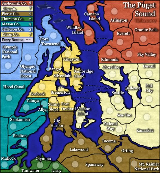
ORIGINAL
REVISE
Much Much better Tisha! I even like the drop shadow on the lands. Don't you like this revise better? You would never had gotten here without all of our bitching

- One day you'll thank us
But seriously great revise.
Posted: Sun Nov 25, 2007 10:31 pm
by oaktown
wow, much much better tisha. This is coming along nicely.
three minor things from before still bother me:
• I like the glow on the water radiating from, the land, but i'm not sure why there's also glow around the ferry routes.
• love the land shadow, as I said about Mibi's draft, the shadow from the land should be just a bit tighter with the land to give the impression of shadow from land features, not shadow from land floating above the water. There are a few spots - like the Seattle territory - where it looks like the land mass is hanging over the water.
• I promise this is the last time I'll mention my distaste for the flying whales... looks like the opening sequence of the Hitchhikers' Guide movie (So Long and Thanks for All the Fish!)

And because you'll never shut me up completely, one new thing:
• does anyone think it is necessary to have the line in the legend about unpassables? Water plays the same roll in every map.
Posted: Sun Nov 25, 2007 11:17 pm
by Tisha
oaktown wrote:wow, much much better tisha. This is coming along nicely.
three minor things from before still bother me:
• I like the glow on the water radiating from, the land, but i'm not sure why there's also glow around the ferry routes.
• love the land shadow, as I said about Mibi's draft, the shadow from the land should be just a bit tighter with the land to give the impression of shadow from land features, not shadow from land floating above the water. There are a few spots - like the Seattle territory - where it looks like the land mass is hanging over the water.
• I promise this is the last time I'll mention my distaste for the flying whales... looks like the opening sequence of the Hitchhikers' Guide movie (So Long and Thanks for All the Fish!)
And because you'll never shut me up completely, one new thing:
• does anyone think it is necessary to have the line in the legend about unpassables? Water plays the same roll in every map.
there is a glow under the ferry route because someone complained that they couldn't see the routes very well...and i would rather not change the routes to white
and my whales are not flying..can't u see the blue over them?
Posted: Sun Nov 25, 2007 11:56 pm
by oaktown
Tisha wrote:there is a glow under the ferry route because someone complained that they couldn't see the routes very well...and i would rather not change the routes to white
Right, that would be a problem. I just think that the water texture is good, and it's a shame it has to be interrupted. Have you considered leaving the texture as is, but putting a lighter stroke around the dashes?
Tisha wrote:and my whales are not flying..can't u see the blue over them?
Right, whales can't fly! Silly me.

But it's a top down view of the region (from space, right backglass?) with a side view of two whales. Makes it look to me like they are dead and just floating in the ocean. Anyway, I broke my promise and mentioned the whales again, so I'll shut up and leave it to your discretion as map maker.
Nice work on the latest improvements.
Posted: Mon Nov 26, 2007 12:20 am
by wicked
Maybe they're breaching whales.
Posted: Mon Nov 26, 2007 1:13 am
by reverend_kyle
Tisha wrote:redrew all the borders...even the mt. rainier area. after i redid the borders i went all around and made sure color wasn't hanging out on the wrong side of the border anywhere
redid the drop shadow on all names
straightened the ferry routes in the legend
tried to center words and numbers better in the legend
desaturated the water a bit
i added a bit of a drop shadow to the land..but i don't like the way that it adds shadow to my rivers also
Excellent every shadow seems very consistant. In the future it might be helpful to do all the text on one layer and just adjust the pixels in between line breaks to be as far or as close as you desire. It makes it so photoshop will center them for you and you can assure everything is universal between them, but this DOES look much much better. The drop shadow on the land looks very good also, and I like how it goes into your rivers. It makes me feel like the rivers are dark and gloomy. Those are the types of rivers I wouldn't want to cross anyways.
I agree with oaktown about the ferry routes though. The water texture is beautiful if you put a light stroke on the dashes it would work excellently.
Posted: Mon Nov 26, 2007 7:26 am
by rebelman
looking fantastic Tisha and I like the whales but i do agree with Oaktown on the ferry routes and lose impassible from the legend it goes without saying
Posted: Mon Nov 26, 2007 7:34 am
by yeti_c
I concur... looking a lot crisper...
One small point - it might just be my imagination though... but does the small map look a bit lighter? Or is it meant to? Or am I just crazy!!!!
C.
Posted: Mon Nov 26, 2007 10:56 am
by gimil
I also agree that is is much much better and crisper, i also agree though that the drop shadow isnt agreeing with the river even though i would like the drop shadow to stay.
Posted: Mon Nov 26, 2007 10:58 am
by hulmey
Posted: Mon Nov 26, 2007 11:03 am
by hulmey
im sorry gonna be blunt, but if this map is quenched then iy will probably be the worst looking map on CC. But hey dont worry WM can then revamp it for u
Posted: Mon Nov 26, 2007 11:07 am
by cena-rules
Lovely T
Dont listen to hulmey. Hes lost the plot
Posted: Mon Nov 26, 2007 11:35 am
by hulmey
wouldnt be the first time cena..but i call it how i see it!!
Posted: Mon Nov 26, 2007 12:11 pm
by Risky_Stud
hulmey, sry you were not here during the bashing faze. please don't do that here. if your comments are not going to help or be constuctive then don't leave them.
Posted: Mon Nov 26, 2007 1:06 pm
by oaktown
hulmey wrote:im sorry gonna be blunt, but if this map is quenched then iy will probably be the worst looking map on CC.
Worse than Crossword? Hong Kong? Until I looked just now I forgot those maps even existed.
No map will be beautiful to everybody - the Berlin map probably still has more haters than this one, and Wid's ConquerMan and Canada revamp both beat this one in terms of provoking hate and anger. What's important is that it is improving, and while I think it could use some more eyes and some more little improvements it is certainly on its way.
Posted: Mon Nov 26, 2007 1:35 pm
by insomniacdude
Much better!
I like how the water is more muted. The last color you used was too bright. I think the it's set up now, though, while better, might be too muted. I think a mixture of the two would be better, though definitely leaning to the levels you have now. Right now it doesn't really look like water to me.
$0.02
Posted: Mon Nov 26, 2007 5:22 pm
by bedub1
Tisha,
I LOVE this update you just did, I'm glad you finally posted it after I got a sneak peak what seems like forever ago. The Legend looks great, the water doesn't hurt my eyes, (which I never realized it did until the update), the borders and nice and smooth, the shadow on the land is good...etc. Sunny slope also fits nearly nicely in it's territory too now.....only a TINY bit of the circle goes over the line. I call that good.
Here is what else I think should be done....
bedub1 wrote:I've read from Page 15. Here is my opinion.
Things I think should change
*I think the "Bremerton" label should be moved to the right, especially on the small map.
*I think the "Impassable" in the legend can be removed...if people can't figure out that you can't get across the river, they are stupid and should be laughed at.
EDIT: changed can to can't and bolded it
looks great
Posted: Mon Nov 26, 2007 7:34 pm
by James Vazquez
looks great Tisha
Final stretch.........
Posted: Mon Nov 26, 2007 10:11 pm
by reverend_kyle
oaktown wrote:hulmey wrote:im sorry gonna be blunt, but if this map is quenched then iy will probably be the worst looking map on CC.
Worse than Crossword? Hong Kong? Until I looked just now I forgot those maps even existed.
No map will be beautiful to everybody - the Berlin map probably still has more haters than this one, and Wid's ConquerMan and Canada revamp both beat this one in terms of provoking hate and anger. What's important is that it is improving, and while I think it could use some more eyes and some more little improvements it is certainly on its way.
I agree that there's no way as is it would be the worst, but I may be crazy, but I think hong kong is one of the prettiest.
Posted: Tue Nov 27, 2007 11:45 am
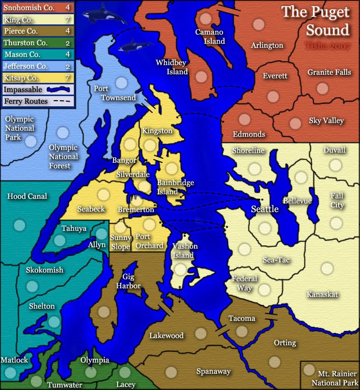
by Tisha
here's my worst map on conquerclub again..
i made the water a little more blue..less purple..
added a little blue to the rivers as well.
took the glow off the ferry routes...added a little shine to them instead. yes or no?
tried to bring the shadow closer to the land
took the river stuff out of the legend
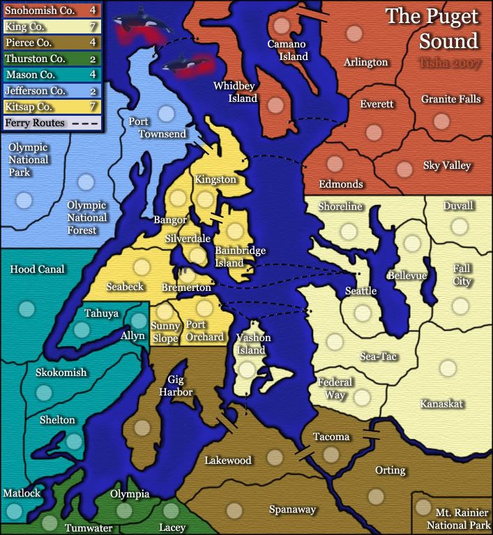
the whales are just for oaktown..
i found a whale from above..but u can't even tell it is a killer whale
Posted: Tue Nov 27, 2007 12:18 pm
by Dancing Mustard
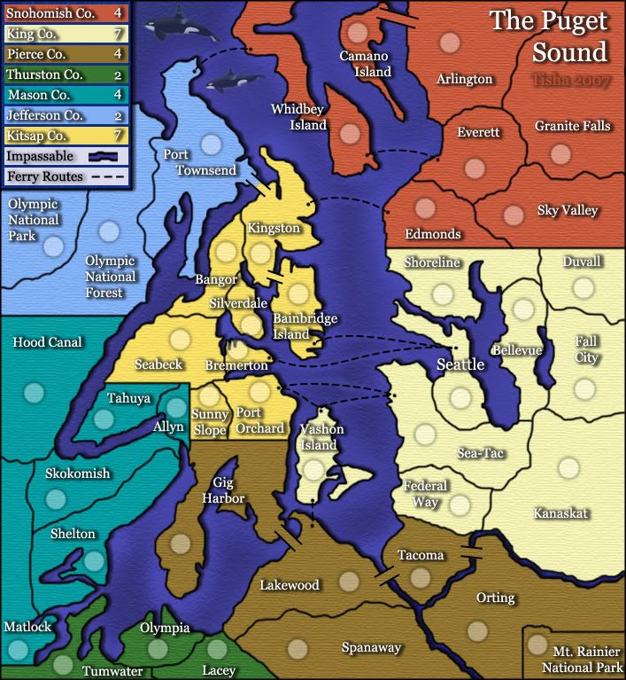
Who harpooned those wales?
Posted: Tue Nov 27, 2007 12:35 pm
by rebelman
Dancing Mustard wrote:Who harpooned those wales?
Posted: Tue Nov 27, 2007 4:24 pm
by Tisha
the makah tribe
Posted: Tue Nov 27, 2007 5:32 pm
by reverend_kyle
umm.. I liked the purple.