Page 15 of 50
Posted: Fri Mar 30, 2007 8:35 am
by DiM
mibi wrote:I'd love to play this map. Once the game play is figured out, I could really care less about fonts and lines and other visual factors as it's the game play and the players that make a game fun, for me.
This map for me is ready to go.
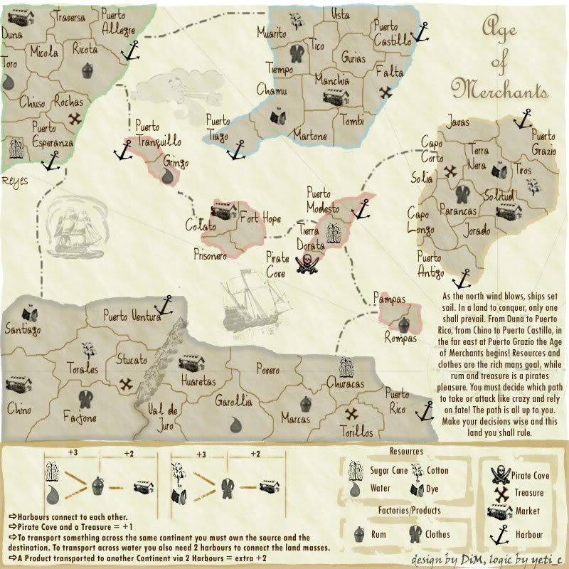
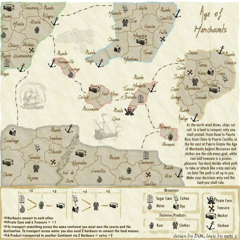
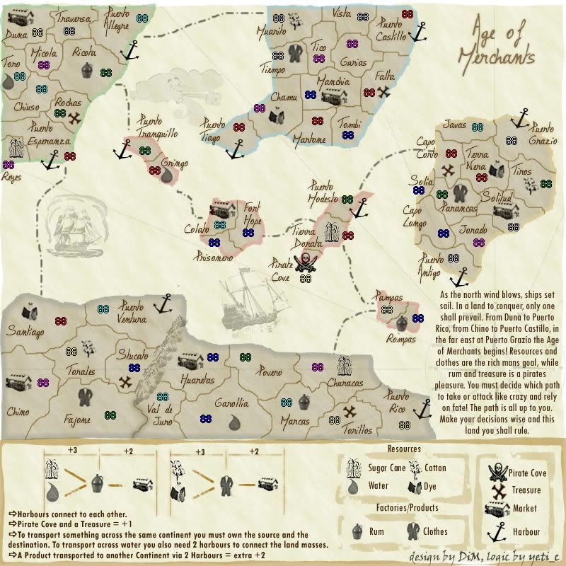
well the gameplay is 100% finished. the only problem is that people don't seem to understand it

at first i had only written explanations, then i made a graphic legend. i'm still waiting for suggestions on how to make the legend more clear.
Posted: Fri Mar 30, 2007 9:59 am
by boberz
i realise we have had this discussion sooooo much but if i was new coming to the site or if i was an experienced veteran i would not want to read that much writing only those that follow the foundry will be interested it spils it for me. SOrry had to say it.
Posted: Fri Mar 30, 2007 10:11 am
by johloh
-I just read the explanations and I do not understand it. I think either the gameplay/idea needs to be simplified, or the explanation. (remember, people who play this map on the site wont be reading this entire thread to figure it out)
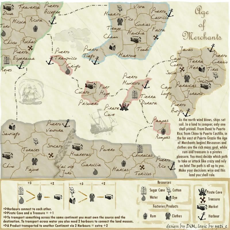
-I think youre going for an old parchment like feel, and I do not think the overall map really has that look.
-i dont like the story in the corner, its unnecessary. might be interesting to read once, but people will be playing this game over and over and over again. id use that area for the compass you have or other graphics...
-I feel the title should be "Age of" on one line "Merchants" 2nd line. it looks a bit to vertical...
all in all I just feel it needs to be simplified...but I DOOO like the initial concept, its interesting and different.
Posted: Fri Mar 30, 2007 10:18 am
by DiM
ok, you guys don't get the explanations. no problem, tell me what part you don't get and i'll try to improve it.
i could give up on one trade chain and remain with only 2 resources and one product. would this simplify things?
Posted: Fri Mar 30, 2007 10:21 am
by boberz
i get it fully and think it well explained just cant be bothered to read it all or the story
Posted: Fri Mar 30, 2007 10:23 am
by DiM
boberz wrote:i get it fully and think it well explained just cant be bothered to read it all or the story
well if you get the game concept and the legend is clear for you, then what's the problem?

you don't have to read the story, it's just for fun, read it once and then forget it. the story is there to help newcomers get used to the new concept of being a merchant. i think it really helps.
Posted: Fri Mar 30, 2007 10:32 am
by mibi
I have no problem with maps that arn't designed for the dumbest possible CC user, but im sure others will.
Posted: Fri Mar 30, 2007 10:39 am
by Enigma
Skittles! wrote:DiM, I like this map, and how it is different from other maps.
But I don't like the font for the areas. It just seems.. Too big for it. I know you've had a hard time with the fonts, but still, I think the font is too large for the territories.
I hope you continue with this map DiM, as it has good potential.
yup, makes it too cluttered. im pretty sure i tried to say this earlier but got ignored, so i gave up. try making the font size smaller, as skittles suggested, but if that doesnt work you may have to find a different one again. im sorry youre getting frusterated with the slow progress, but it does seem that that is how mapmaking works. you have to try a lot of different ideas to find the one that fits perfectly.
Posted: Fri Mar 30, 2007 10:41 am
by johloh
im sorry. i do not consider myself to be the dumbest possible CC user. however, the directions simply are not clear.
and I cannot tell you how to make it clearer if it doesnt make sense...im pretty sure the ones who this make sense to have been reading this thread the entire time.
do you get a 3 bonus for holding a cane, water, and rum plant? or a 3 bonus for holding every cane/water/rumplant? then if you also hold a market you get another +2?
what does transporting to another continent mean? you say have two harbors, is that all you need? do you also need a market in the new continent?
please continue to call me stupid and not improve...
Posted: Fri Mar 30, 2007 10:46 am
by Enigma
johloh wrote:im sorry. i do not consider myself to be the dumbest possible CC user. however, the directions simply are not clear.
and I cannot tell you how to make it clearer if it doesnt make sense...im pretty sure the ones who this make sense to have been reading this thread the entire time.
do you get a 3 bonus for holding a cane, water, and rum plant? or a 3 bonus for holding every cane/water/rumplant? then if you also hold a market you get another +2?
what does transporting to another continent mean? you say have two harbors, is that all you need? do you also need a market in the new continent?
please continue to call me stupid and not improve...
lol dont call him stupid- the only way i understand how the gameplay works is because ive read the whole thread, and even so there is some confusion. i also dont really know how to clarify the legend, but it needs to be done. the goal is to be able to look at the map and understand how to play it, even if your brand new and havent read through the mapmaking process.
Posted: Tue Apr 03, 2007 9:10 am
by DiM
i've been very busy lately hence the lack of updates.
here are some fonts. which do you preffer?
please specify if you want it to have shadow or if you want it larger smaller bolded, etc.
also i'm still waiting for any suggestions especially on making the gameplay and legend easyer to understand.

Posted: Tue Apr 03, 2007 9:28 am
by johloh
i like the 2nd one the best...but im not a huge fan of any of them...
Posted: Tue Apr 03, 2007 9:30 am
by Enigma
i think theyre still all too big. im sorry
Posted: Tue Apr 03, 2007 10:15 am
by DiM
too big as in the font size should be smaller? or should the font be less bulky?
also, if any of you guys sees anything more suitable on
http://www.dafont.com/ please post here a link to that font.
PS: i would really preffer using a handwritting type font because it gives a nice feeling

Posted: Tue Apr 03, 2007 10:19 am
by Enigma
DiM wrote:too big as in the font size should be smaller? or should the font be less bulky?
also, if any of you guys sees anything more suitable on
http://www.dafont.com/ please post here a link to that font.
PS: i would really preffer using a handwritting type font because it gives a nice feeling
font size. and i agree, written look, but its gotta be subtle.
Posted: Tue Apr 03, 2007 10:44 am
by DiM
Enigma wrote:DiM wrote:too big as in the font size should be smaller? or should the font be less bulky?
also, if any of you guys sees anything more suitable on
http://www.dafont.com/ please post here a link to that font.
PS: i would really preffer using a handwritting type font because it gives a nice feeling
font size. and i agree, written look, but its gotta be subtle.
here are a few font sizes with different effects:
colour black, size 27, transparency 77, brown shadow:
colour black, size 30, transparency 100, yellow brown shadow:

colour dark brown, size 25, transparency 90, brown shadow with half transparency:
colour black, size 28, transparency 70, brown shadow, edgy:
Posted: Tue Apr 03, 2007 12:43 pm
by mibi
i like the top and bottoms ones... but im not sure how you are going to get army circles in some of those territories
Posted: Tue Apr 03, 2007 1:12 pm
by DiM
mibi wrote:i like the top and bottoms ones... but im not sure how you are going to get army circles in some of those territories
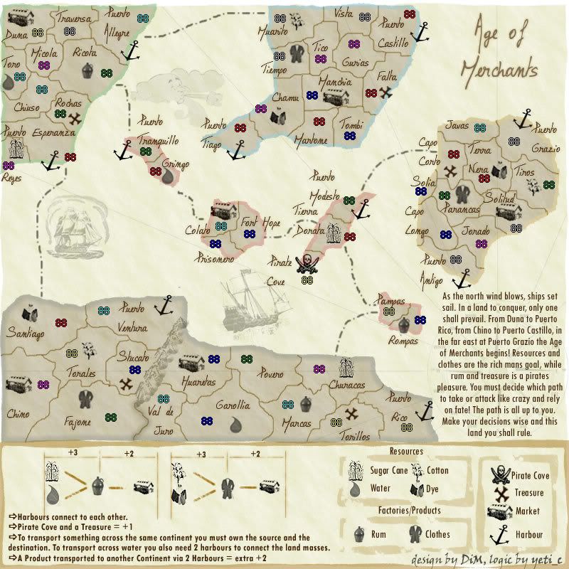
ne need for circles. the armies are very visible.
here:
Posted: Tue Apr 03, 2007 1:14 pm
by mibi
ah ok, looks good then.
Posted: Tue Apr 03, 2007 2:44 pm
by Enigma
im still not a fan of the font...
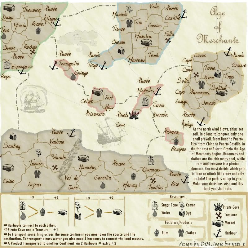
the problem might be on the territory names that are on 2 rows, theres a lot of space btwn the top word and the bottom word.
for instance puerto tranqilo- theres a ton of space btwn words, almost like its double spaced instead of single. is it possible to fix that?
Posted: Tue Apr 03, 2007 6:38 pm
by DiM
Enigma wrote:im still not a fan of the font...
the problem might be on the territory names that are on 2 rows, theres a lot of space btwn the top word and the bottom word.
for instance puerto tranqilo- theres a ton of space btwn words, almost like its double spaced instead of single. is it possible to fix that?
i guess it can be changed. i'm at work now and i don'thave the image but i'll fix it when i get home.
there should be a spacing option

Posted: Tue Apr 03, 2007 11:58 pm
by mibi
DiM wrote:Enigma wrote:im still not a fan of the font...
the problem might be on the territory names that are on 2 rows, theres a lot of space btwn the top word and the bottom word.
for instance puerto tranqilo- theres a ton of space btwn words, almost like its double spaced instead of single. is it possible to fix that?
i guess it can be changed. i'm at work now and i don'thave the image but i'll fix it when i get home.
there should be a spacing option
if you using photoshop you have to toggle the character pallet, its the option with the two letters on top of each other.
Posted: Wed Apr 04, 2007 12:02 am
by DiM
mibi wrote:DiM wrote:Enigma wrote:im still not a fan of the font...
the problem might be on the territory names that are on 2 rows, theres a lot of space btwn the top word and the bottom word.
for instance puerto tranqilo- theres a ton of space btwn words, almost like its double spaced instead of single. is it possible to fix that?
i guess it can be changed. i'm at work now and i don'thave the image but i'll fix it when i get home.
there should be a spacing option
if you using photoshop you have to toggle the character pallet, its the option with the two letters on top of each other.
nope not photoshop. i use fireworks 8.
i just got home and i'm about to go to bed but i'll fix this issue now.
edit//
Posted: Wed Apr 04, 2007 4:33 pm
by DiM
so is the font ok now?
Posted: Sat Apr 07, 2007 7:03 am
by KEYOGI
Should i continue?
yes
68% [ 37 ]
no
31% [ 17 ]
Total Votes : 54