Page 14 of 18
Re: Classic cities: London [16.12.11] p22
Posted: Sat Dec 17, 2011 2:08 am
by koontz1973
Victor Sullivan wrote:What if you toned down the red a bit? I feel like my eye naturally gravitates toward it specifically.
-Sully
natty_dread wrote:Already addressed, read back.
Victor Sullivan wrote:Derp! I missed an entire page...lol

-Sully
But if Sully missed the page and still finds it a problem, maybe a different solution is needed. How about a lighter shade, bordering onto pink or even a yellow or orange.
Re: Classic cities: London [16.12.11] p22
Posted: Sat Dec 17, 2011 2:11 am
by Victor Sullivan
Re: Classic cities: London [16.12.11] p22
Posted: Sat Dec 17, 2011 2:44 am
by natty dread
Yeah the colours are pretty much optimal right now.
And remember guys, with the need for colourblind friendliness, there's bound to be colours in the map palette that stand out more than others.
Speaking of which,
[bigimg]http://img828.imageshack.us/img828/5309/cbtest.png[/bigimg]
Upper=Protanopia, Lower=Deuteronopia
Re: Classic cities: London [16.12.11] p22
Posted: Sat Dec 17, 2011 3:02 am
by Victor Sullivan
Hm, East and Southwest look a little difficult to distinguish in the second image (mainly speaking about the bonus legend).
-Sully
Re: Classic cities: London [16.12.11] p22
Posted: Sat Dec 17, 2011 3:12 am
by natty dread
Possibly, but if you can't figure out by the names which is "East" and which is "Southwest", then you have bigger problems than colourblindness...
Re: Classic cities: London [16.12.11] p22
Posted: Sat Dec 17, 2011 3:54 am
by Victor Sullivan
natty_dread wrote:Possibly, but if you can't figure out by the names which is "East" and which is "Southwest", then you have bigger problems than colourblindness...

True.
-Sully
Re: Classic cities: London [16.12.11] p22
Posted: Sat Dec 17, 2011 3:54 am
by koontz1973
But we have to think of the players that way. Also, the red in the first CB test looks ugly. I believe that a colour to make it look nicer can be found though.
Re: Classic cities: London [16.12.11] p22
Posted: Sat Dec 17, 2011 4:50 am
by natty dread
koontz1973 wrote: we have to think of the players that way
No, we don't. We don't have to assume players are retarded and don't know what words mean.
koontz1973 wrote:Also, the red in the first CB test looks ugly.
The CB tests are used to ensure the readability & clarity of the map. Not to base the aesthetics of the map on the way a minuscule percentage of the population perceives it.
Re: Classic cities: London [16.12.11] p22
Posted: Sat Dec 17, 2011 6:20 am
by koontz1973
natty_dread wrote:No, we don't. We don't have to assume players are retarded and don't know what words mean.
But as an international site with players who do not have English as a language, how will someone then distinguish between the two. I never said players are retarded, but some cannot read English and some more cannot read at all.
Re: Classic cities: London [16.12.11] p22
Posted: Sat Dec 17, 2011 6:38 am
by natty dread
koontz1973 wrote:natty_dread wrote:No, we don't. We don't have to assume players are retarded and don't know what words mean.
But as an international site with players who do not have English as a language, how will someone then distinguish between the two. I never said players are retarded, but some cannot read English and some more cannot read at all.
Oh come on... you're not serious, are you?
Re: Classic cities: London [16.12.11] p22
Posted: Sun Dec 18, 2011 12:32 pm
by natty dread
So, is there anything else? Something that doesn't concern only illiterate protanopics?
Re: Classic cities: London [16.12.11] p22
Posted: Mon Dec 19, 2011 3:54 am
by gimil
Look at the continents in question. Despite the colourblind test showing some lack of contrast between EAST and SOUTHWEST...I don't think there is a colourblind issue per say. The colourblind tests mearly show you what colours may be an issue...not how an image looks to a colourblind person. Those two continents will still for the most part appear as distinct colours (Orange and Green). For people who are color blind the issue (I think) only really arises when colours are right next to each other or on top of one another. That is when the eye struggles to differentiate. But both these continents are largely separate colour and not really integrated with each other. So although I am not colourblind myself...I think the colourblind test is a tool for general guidance rather than something to be followed religiously.
Apart from that there are no further issues. I don't want to say the colourblind issue is resolved just yet (since I am not exactly a final voice on the issue). So I will stamp it if this issue feels resolved later today.
Re: Classic cities: London [16.12.11] p22
Posted: Mon Dec 19, 2011 5:24 pm
by natty dread
gimil wrote:I think the colourblind test is a tool for general guidance rather than something to be followed religiously.
I agree. If an actual colourblind person comes along and says he has problems with the map I'm open to changing it, pending that I think the colours are good to go.
gimil wrote:Apart from that there are no further issues. I don't want to say the colourblind issue is resolved just yet (since I am not exactly a final voice on the issue). So I will stamp it if this issue feels resolved later today.
Great, thanks.
Re: Classic cities: London [16.12.11] p22
Posted: Tue Dec 20, 2011 6:21 pm
by gimil

I think we can safely say silence is bliss. Here is your stamp natty. Remember this isn't a final seal of approval. If any further graphical issues should arise...you will have to address them.
Welcome to the forge.
[
moved]
Re: Classic cities: London [16.12.11] p22
Posted: Tue Dec 20, 2011 6:23 pm
by natty dread
Thanks for the stamping!
Re: Classic cities: London [16.12.11] p22
Posted: Wed Dec 21, 2011 3:39 am
by natty dread
Re: Classic cities: London [16.12.11] p22
Posted: Wed Dec 21, 2011 4:23 pm
by AndyDufresne
Looking pretty good, Natty_Dread. If the gameplay turns out to be kickass for 1vs1, I'll probably add this to my rotation list since it is a nice size.
--Andy
Re: Classic cities: London [16.12.11] p22
Posted: Thu Dec 22, 2011 10:49 pm
by Victor Sullivan
AndyDufresne wrote:Looking pretty good, Natty_Dread. If the gameplay turns out to be kickass for 1vs1, I'll probably add this to my rotation list since it is a nice size.
--Andy


I don't think I've seen Andy swear like that before!

-Sully
Re: Classic cities: London [16.12.11] p22
Posted: Thu Dec 22, 2011 10:55 pm
by DiM
Re: Classic cities: London [16.12.11] p22
Posted: Tue Jan 10, 2012 2:26 pm
by Vixit
I'm liking this map, can't wait for it to come into beta

Re: Classic cities: London [16.12.11] p22
Posted: Thu Jan 12, 2012 12:00 pm
by Pedronicus
I know I'm late to the party with this map, but can i make a suggestion as someone who lives in London.
It's just an idea with regards to the non passable borders.
instead of a grey line, how about a line of closely stacked traffic cones?
London is so full of roadworks, traffic cones are everywhere. it would be an original idea on a map.
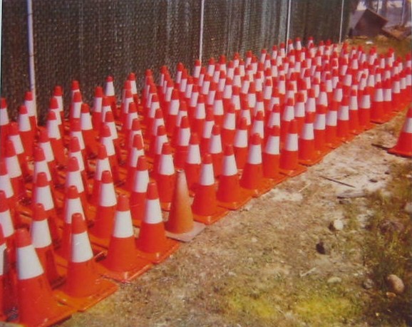
Re: Classic cities: London [16.12.11] p22
Posted: Thu Jan 12, 2012 12:26 pm
by natty dread
Well... I really like that idea. The only caveat is, I'm not sure if I'll be able to do it in a way that fits in with the style of the map...
Anyway, I'll give it a try and see if I can make it work.
Re: Classic cities: London [16.12.11] p22
Posted: Thu Jan 12, 2012 2:59 pm
by AndyDufresne
I'll be interested to see if the cone idea works!
--Andy
Re: Classic cities: London [16.12.11] p22
Posted: Fri Jan 13, 2012 12:17 am
by natty dread
It doesn't... I tried various things, but the cones either end up looking messy and unrecognizable or they just look out of place on the map...
I also tried little traffic signs, but I can't get those to look good either in the style of the map... I think it's best to stay with the minimalistic style for this map.
Re: Classic cities: London [16.12.11] p22
Posted: Fri Jan 13, 2012 12:55 am
by natty dread
I'll try some more things, but if they don't work I'll keep the map as is...