France [Quenched]
Moderator: Cartographers
Forum rules
Please read the Community Guidelines before posting.
Please read the Community Guidelines before posting.
-
Ruben Cassar

- Posts: 2160
- Joined: Thu Nov 16, 2006 6:04 am
- Gender: Male
- Location: Civitas Invicta, Melita, Evropa


-
reverend_kyle

- Posts: 9250
- Joined: Tue Mar 21, 2006 4:08 pm
- Location: 1000 post club
- Contact:

-
cena-rules

- Posts: 9740
- Joined: Sat Apr 28, 2007 2:27 am
- Gender: Male
- Location: Chat
-
thegeneralpublic
- Posts: 126
- Joined: Fri Mar 09, 2007 9:49 pm
- Location: In front of my computer screen.
- Contact:
-
wcaclimbing

- Posts: 5598
- Joined: Fri May 12, 2006 10:09 pm
- Location: In your quantum box....Maybe.
- Contact:

-
thegeneralpublic
- Posts: 126
- Joined: Fri Mar 09, 2007 9:49 pm
- Location: In front of my computer screen.
- Contact:


-
gimil

- Posts: 8599
- Joined: Sat Mar 03, 2007 12:42 pm
- Gender: Male
- Location: United Kingdom (Scotland)
Unit_2 wrote:reverend_kyle wrote:besides the text on the legend I don't know what text your talking about.
i mean the territoy textures, try to make them smooth
why? there nothnig wrong with the way it is at the moment.
What do you know about map making, bitch?
Top Score:2403
natty_dread wrote:I was wrong
Top Score:2403
-
Lucius Catilina

- Posts: 23
- Joined: Mon Nov 06, 2006 2:11 pm
- Location: France
- Contact:
-
reverend_kyle
- Posts: 9250
- Joined: Tue Mar 21, 2006 4:08 pm
- Location: 1000 post club
- Contact:
Lucius Catilina wrote:Please, no ! Stop it !
It's unbearable. I'm sorry, I don't want to offense the mappers here, but please, no ! No ! No ! No ! No !
Too many things to modify to make this map look like a real map of France.
I'm really sorry to disagree, but I couldn't bear it any longer.
I don't understand, this was taken from a map of the original provinces of france... Most other people from france to visit this thread haven't said much about it not looking like a real map of france. I could fix specific things if you are that worried about it..
gimil wrote:Unit_2 wrote:reverend_kyle wrote:besides the text on the legend I don't know what text your talking about.
i mean the territoy textures, try to make them smooth
why? there nothnig wrong with the way it is at the moment.
Yeah, I really like the textures I have chosen and unless alot of people object they will stay. Smooth would be more lack of texture anyways
thegeneralpublic wrote:wcaclimbing wrote:reverend_kyle wrote: Also, what do you guys think of the white borders, should they be black and would that make this better.
Yes.
Make the borders black.
It would look a lot better.
I think I would need to see it first. I like the borders as they are now anyway.
I'm going to make it black and i'll give the option and we'll see which is liked better.
DANCING MUSTARD FOR POOP IN '08!

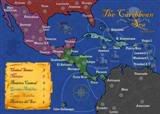 MIDDLE AMERICA MAP
-
reverend_kyle
- Posts: 9250
- Joined: Tue Mar 21, 2006 4:08 pm
- Location: 1000 post club
- Contact:
-
reverend_kyle
- Posts: 9250
- Joined: Tue Mar 21, 2006 4:08 pm
- Location: 1000 post club
- Contact:
-
reverend_kyle
- Posts: 9250
- Joined: Tue Mar 21, 2006 4:08 pm
- Location: 1000 post club
- Contact:

-
reverend_kyle
- Posts: 9250
- Joined: Tue Mar 21, 2006 4:08 pm
- Location: 1000 post club
- Contact:
-
Bad Speler

- Posts: 1027
- Joined: Fri Jun 02, 2006 8:16 pm
- Gender: Male
- Location: Ottawa
- Contact:
-
reverend_kyle
- Posts: 9250
- Joined: Tue Mar 21, 2006 4:08 pm
- Location: 1000 post club
- Contact:
-
Bad Speler
- Posts: 1027
- Joined: Fri Jun 02, 2006 8:16 pm
- Gender: Male
- Location: Ottawa
- Contact:

-
reverend_kyle
- Posts: 9250
- Joined: Tue Mar 21, 2006 4:08 pm
- Location: 1000 post club
- Contact:
-
reverend_kyle
- Posts: 9250
- Joined: Tue Mar 21, 2006 4:08 pm
- Location: 1000 post club
- Contact:
-
reverend_kyle
- Posts: 9250
- Joined: Tue Mar 21, 2006 4:08 pm
- Location: 1000 post club
- Contact: