Rorke's Drift. [QUENCHED]
Moderator: Cartographers
Forum rules
Please read the Community Guidelines before posting.
Please read the Community Guidelines before posting.
-
natty dread

- Posts: 12877
- Joined: Fri Feb 08, 2008 8:58 pm
- Location: just plain fucked
Re: Battle at Rorke's Drift.[110811]V.38Pg1[HELPpg22]
Change the border colour back and add back the white glow. They worked wonders for your map.

-
koontz1973
- Posts: 6960
- Joined: Thu Jan 01, 2009 10:57 am
Re: Battle at Rorke's Drift.[110811]V.38Pg1[HELPpg22]
You mean like this.
Just got to make them nice again. 
- Click image to enlarge.


Re: Battle at Rorke's Drift.[110811]V.38Pg1[HELPpg22]
I like those borders better. Looking like you are coming along nicely. Much more clean and easy to read this way.
Highest Rank: 26 Highest Score: 3480

-
Victor Sullivan

- Posts: 6010
- Joined: Mon Feb 08, 2010 8:17 pm
- Gender: Male
- Location: Columbus, OH
- Contact:
Re: Battle at Rorke's Drift.[110811]V.38Pg1[HELPpg22]
Yes, though you need to fix the pixelation of the border along the river.Bruceswar wrote:I like those borders better. Looking like you are coming along nicely. Much more clean and easy to read this way.
-Sully
Beckytheblondie: "Don't give us the dispatch, give us a mustache ride."
Scaling back on my CC involvement...
Scaling back on my CC involvement...
-
koontz1973
- Posts: 6960
- Joined: Thu Jan 01, 2009 10:57 am
Re: Battle at Rorke's Drift.[110811]V.38Pg1[HELPpg22]
- Click image to enlarge.

What's next?
-
DiM

- Posts: 10415
- Joined: Wed Feb 14, 2007 6:20 pm
- Gender: Male
- Location: making maps for scooby snacks
Re: Battle at Rorke's Drift.[110811]V.38Pg1[HELPpg22]
1. the black outside border from the river warriors terits (ayize bongani.....njabulo) looks very jagged compared to your other borders.
2. the warrior on the bridge doesn't have a shadow
3. i'm not too fond of the legend and title background. i think they're supposed to be a stone? it looks so clean.
4. if you want to change the bushes or the trees here the tutorial i mentioned. just make sure you chose a brush that looks like a tree/bush then toy with the settings i talked about.
tut
DiM wrote:never underestimate the power of personalized brushes. create a shape of how you think a tree looks from above. let's say a star shape. now take that brush and set the background and foreground to 2 foliage colours (dark green and yellowy green) then do the following:
shape dynamics>
> size jitter 100%
> minimum diameter 0%
> angle jitter 0%
> roundness jitter 68%
> min roundness 25%
scatter> adjust as you please dependng on what you need
colour dynamics>
>fore/back 100%
> saturation 50%
the rest at 0%
and check smoothing.
then go ahead and paint what you need adjusting the brush size according to the height of the viewpoint.
after you paint put on some drop shadow and even bevel if it suits your need. but keep the bevel at a minimum.
here's a quick example. i didn't bother making a custom shape so i used a flower one. it looks rather bad on large trees but it works for small ones as the details are hard to spot.
“In the beginning God said, the four-dimensional divergence of an antisymmetric, second rank tensor equals zero, and there was light, and it was good. And on the seventh day he rested.”- Michio Kaku
-
koontz1973
- Posts: 6960
- Joined: Thu Jan 01, 2009 10:57 am
Re: Battle at Rorke's Drift.[110811]V.38Pg1[HELPpg22]
Thanks DiM, know you are a very busy boy right now but wow.DiM wrote:1. the black outside border from the river warriors terits (ayize bongani.....njabulo) looks very jagged compared to your other borders.
2. the warrior on the bridge doesn't have a shadow
3. i'm not too fond of the legend and title background. i think they're supposed to be a stone? it looks so clean.
4. if you want to change the bushes or the trees here the tutorial i mentioned. just make sure you chose a brush that looks like a tree/bush then toy with the settings i talked about.tut
DiM wrote:never underestimate the power of personalized brushes. create a shape of how you think a tree looks from above. let's say a star shape. now take that brush and set the background and foreground to 2 foliage colours (dark green and yellowy green) then do the following:
shape dynamics>
> size jitter 100%
> minimum diameter 0%
> angle jitter 0%
> roundness jitter 68%
> min roundness 25%
scatter> adjust as you please dependng on what you need
colour dynamics>
>fore/back 100%
> saturation 50%
the rest at 0%
and check smoothing.
then go ahead and paint what you need adjusting the brush size according to the height of the viewpoint.
after you paint put on some drop shadow and even bevel if it suits your need. but keep the bevel at a minimum.
here's a quick example. i didn't bother making a custom shape so i used a flower one. it looks rather bad on large trees but it works for small ones as the details are hard to spot.
Some of it has already been fixed, territ lines and shadow.
Legend and title background can be changed but an idea would be nice. It is taken from a photo of a white washed wall (my house). This is in keeping with the theme but can look at alternatives.
Will give that tutorial a try and post some results later today.


Re: Battle at Rorke's Drift.[110811]V.38Pg1[HELPpg22]
It's been quite a while since I've had a chance to drop by here. Looks like you've made a HUGE amount of progress. It's definitely a different generation of map from the version I remember!
Kudos!
Kudos!
“Life is a shipwreck, but we must not forget to sing in the lifeboats.”
― Voltaire
― Voltaire
-
koontz1973
- Posts: 6960
- Joined: Thu Jan 01, 2009 10:57 am
Re: Battle at Rorke's Drift.[110811]V.38Pg1[HELPpg22]
Thanks Dukasaur.
Here is the latest image.
Ideas for consideration.
With the trees, do I go for a top down view or leave as they are. If I leave them as they are, do you want me to change trees.
The territ lines will stay as is.
Do I keep the white washed wall look (dirtied it up for DiM) for the legend or change it. If change it, then leave idea.
Got just under 3 weeks before work starts, so lets try to get this to the next level before then guys.
Here is the latest image.
- Click image to enlarge.

With the trees, do I go for a top down view or leave as they are. If I leave them as they are, do you want me to change trees.
The territ lines will stay as is.
Do I keep the white washed wall look (dirtied it up for DiM) for the legend or change it. If change it, then leave idea.
Got just under 3 weeks before work starts, so lets try to get this to the next level before then guys.
Re: Battle at Rorke's Drift.[110811]V.38Pg1[HELPpg23]
Okay this is looking good!.
Three things.
1.
Looks like the border goes through the grass but loses something.
2. Remove the drop shadow from the rocks as they look like they are floating slightly above the ground.
3. The color fill in the arrows is pixelated.
I'll take another look later! Keep up the good work!
Three things.
1.
Looks like the border goes through the grass but loses something.
2. Remove the drop shadow from the rocks as they look like they are floating slightly above the ground.
3. The color fill in the arrows is pixelated.
I'll take another look later! Keep up the good work!
-
Victor Sullivan
- Posts: 6010
- Joined: Mon Feb 08, 2010 8:17 pm
- Gender: Male
- Location: Columbus, OH
- Contact:
Re: Battle at Rorke's Drift.[110811]V.38Pg1[HELPpg23]
Better, but the dry river border is still a bit pixelated to me. Also, are the bushes flanking the 'wet' river necessary? I feel like you could drop them, especially considering you already have it in the legend as impassable.
-Sully
-Sully
Last edited by Victor Sullivan on Fri Aug 12, 2011 2:53 pm, edited 1 time in total.
Beckytheblondie: "Don't give us the dispatch, give us a mustache ride."
Scaling back on my CC involvement...
Scaling back on my CC involvement...
-
DiM
- Posts: 10415
- Joined: Wed Feb 14, 2007 6:20 pm
- Gender: Male
- Location: making maps for scooby snacks
Re: Battle at Rorke's Drift.[110811]V.38Pg1[HELPpg23]
i just realised the map is not signed (unless you count having a terit named after you as a signature).
i think you should definitely sign it. perhaps in the bottom right corner.
i think you should definitely sign it. perhaps in the bottom right corner.
“In the beginning God said, the four-dimensional divergence of an antisymmetric, second rank tensor equals zero, and there was light, and it was good. And on the seventh day he rested.”- Michio Kaku
-
natty dread
- Posts: 12877
- Joined: Fri Feb 08, 2008 8:58 pm
- Location: just plain fucked
Re: Battle at Rorke's Drift.[110811]V.38Pg1[HELPpg23]
The borders drawn with the path tool seem a bit too simple... When compared to the dry river borders, for example.
I think you could try your hand in freehand drawing. If you work real carefully, it should turn out ok...
Alternatively, add some more vertexes in those paths, make them a bit more complex than simple straight or curved lines.
I think you could try your hand in freehand drawing. If you work real carefully, it should turn out ok...
Alternatively, add some more vertexes in those paths, make them a bit more complex than simple straight or curved lines.
-
DiM
- Posts: 10415
- Joined: Wed Feb 14, 2007 6:20 pm
- Gender: Male
- Location: making maps for scooby snacks
Re: Battle at Rorke's Drift.[110811]V.38Pg1[HELPpg23]
how about making the legend in the form of a parchment decorated with some victorian artwork that contains battle orders.
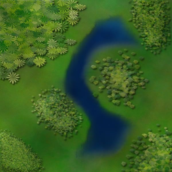
something like the image bellow. also i changed the bushes between dingane and zethembe using the tutorial i posted earlier. obviously without the psd file there's only so much i can do. i'm pretty sure you could make it better.
something like the image bellow. also i changed the bushes between dingane and zethembe using the tutorial i posted earlier. obviously without the psd file there's only so much i can do. i'm pretty sure you could make it better.
- Click image to enlarge.
“In the beginning God said, the four-dimensional divergence of an antisymmetric, second rank tensor equals zero, and there was light, and it was good. And on the seventh day he rested.”- Michio Kaku
-
koontz1973
- Posts: 6960
- Joined: Thu Jan 01, 2009 10:57 am
Re: Battle at Rorke's Drift.[110811]V.38Pg1[HELPpg23]
That line in the bush was part of the bush and not the territ line. Broke it up so it no longer looks like that.isaiah40 wrote:Okay this is looking good!.
Three things.
1.
Looks like the border goes through the grass but loses something.
2. Remove the drop shadow from the rocks as they look like they are floating slightly above the ground.
3. The color fill in the arrows is pixelated.
I'll take another look later! Keep up the good work!
Removed drop shadows.
Sorted arrows.
Where is it pixelated. Can you give me a name as I truly cannot see it. I know there are areas where the line juts about in a short space but that is because I stroked the selection. I can do the territ line by hand next time.Victor Sullivan wrote:Better, but the dry river border is still a bit pixelated to me. Also, are the bushes flanking the 'wet' river necessary? I feel like you could drop them, especially considering you already have it in the legend as impassable.
-Sully
The bushes by the river stay, because they would be confusion over the territ boundaries. Players would say why can I not attack that region. I know the water but they also cover the ends of the bridge.
Signed it, just ran out of Zulu names with 3 left to do.DiM wrote:i just realised the map is not signed (unless you count having a terit named after you as a signature).
i think you should definitely sign it. perhaps in the bottom right corner.
Only got a mouse so I will not hand draw the territ lines. I do not have that confidence yet. Maybe map 2 or 3 if I get that far. As I said above, I will re do the dry river border to match the rest. Will add a few more vectors in.natty_dread wrote:The borders drawn with the path tool seem a bit too simple... When compared to the dry river borders, for example.
I think you could try your hand in freehand drawing. If you work real carefully, it should turn out ok...
Alternatively, add some more vertexes in those paths, make them a bit more complex than simple straight or curved lines.
The parchment treatment is done way to much. It is also out of context for the time period. The symbols would also feel out of place. But thanks for looking at it. The orders would of been printed on clean linen paper like money is today.DiM wrote:how about making the legend in the form of a parchment decorated with some victorian artwork that contains battle orders.
something like the image bellow. also i changed the bushes between dingane and zethembe using the tutorial i posted earlier. obviously without the psd file there's only so much i can do. i'm pretty sure you could make it better.
- Click image to enlarge.
Lastly, you bastard,
Will take another look at the tutorial tomorrow and give it another go. Are you using GIMP or PS?
Tonights version. Not as much has changed as I would of liked but here it is.
- Click image to enlarge.

-
DiM
- Posts: 10415
- Joined: Wed Feb 14, 2007 6:20 pm
- Gender: Male
- Location: making maps for scooby snacks
Re: Battle at Rorke's Drift.[110811]V.38Pg1[HELPpg23]
then do a printed linen paper legend if it fits the time period. i'd rather see a legend printed on paper than typed on stone.koontz1973 wrote:The orders would of been printed on clean linen paper like money is today.
PS CS5.koontz1973 wrote:Are you using GIMP or PS?
“In the beginning God said, the four-dimensional divergence of an antisymmetric, second rank tensor equals zero, and there was light, and it was good. And on the seventh day he rested.”- Michio Kaku
-
koontz1973
- Posts: 6960
- Joined: Thu Jan 01, 2009 10:57 am
-
natty dread
- Posts: 12877
- Joined: Fri Feb 08, 2008 8:58 pm
- Location: just plain fucked
Re: Battle at Rorke's Drift.[110811]V.38Pg1[HELPpg23]
DiM wrote:never underestimate the power of personalized brushes. create a shape of how you think a tree looks from above. let's say a star shape. now take that brush and set the background and foreground to 2 foliage colours (dark green and yellowy green) then do the following:
shape dynamics>
> size jitter 100%
> minimum diameter 0%
> angle jitter 0%
> roundness jitter 68%
> min roundness 25%
scatter> adjust as you please dependng on what you need
colour dynamics>
>fore/back 100%
> saturation 50%
the rest at 0%
and check smoothing.
then go ahead and paint what you need adjusting the brush size according to the height of the viewpoint.
Translated to GIMP:
Firstly, to create custom brushes in GIMP, you can go two routes... if you need just a temporary brush, you can just select an area, copy it to clipboard, and it will appear in your brush window and stay there as long until you copy something else to clipboard. If you need something more permanent, you can create a new image, draw something, and save it as a brush (it needs to be saved in one of your brush folders, though).
For now, we'll go with the easier route. Create a transparent layer, and draw your tree shape there - colour doesn't matter. Select it with the rectangle selection tool, copy it, and then go to brush selection and select the very first brush, named clipboard. Your tree shape should be there.
Now, take the paint brush tool and set these settings...
Under brush dynamics: on the random-row, check "size" and "colour". Leave all other boxes unchecked.
Rest of the options: check "Apply jitter" with amount 1,20 (or so, between 1 - 1,50 is best I think), and "incremental", others unchecked.
Set the foreground and background colours as dark and light green. In case you want more than these 2 colours, you can check the "use colour from gradient" option and create a gradient with various shades of green.
-
koontz1973
- Posts: 6960
- Joined: Thu Jan 01, 2009 10:57 am
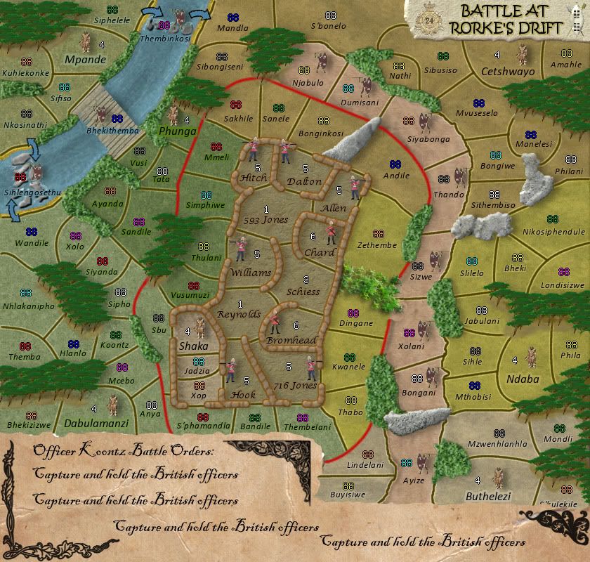
Re: Battle at Rorke's Drift. [110811] V.39 Pg1/23
Version 39.
What's changed.
Trees
Bushes
Legend
Territ lines
Little men (placement) Now icons
Rocks
Title legend picture
Font of legend
Arrows (removed pixelation)
- Click image to enlarge.

Trees
Bushes
Legend
Territ lines
Little men (placement) Now icons
Rocks
Title legend picture
Font of legend
Arrows (removed pixelation)

Re: Battle at Rorke's Drift. [13 08 11] V.39 Pg1/23
Looking very good, nice koontz.
The lightgreen bushes look a bit fake though.
What are Zulus? The legend doesn't make that clear. Same goes for iButho.
The sentence "The 11 British Soldiers named all won the Victoria Cross" is a bit weird. Were there only 11 soldiers inside the outpost or did only 11 get the Victoria Cross?
Don't think you can win the Victoria Cross either.
If there were just 11 soldiers I'd propose something among the lines of: "All 11 soldiers defending the outpost were awarded the Victoria Cross, Britain's highest military honour."
If only 11 got the Victoria Cross, something like: "11 British Soldiers, here inside the outpost, were awarded the Victoria Cross, Britain's highest military honour.
~CD
-
koontz1973
- Posts: 6960
- Joined: Thu Jan 01, 2009 10:57 am
Re: Battle at Rorke's Drift. [13 08 11] V.39 Pg1/23
Can darken the bushes up a tad.mr. CD wrote:Looking very good, nice koontz.
The lightgreen bushes look a bit fake though.
What are Zulus? The legend doesn't make that clear. Same goes for iButho.
The sentence "The 11 British Soldiers named all won the Victoria Cross" is a bit weird. Were there only 11 soldiers inside the outpost or did only 11 get the Victoria Cross?
Don't think you can win the Victoria Cross either.
If there were just 11 soldiers I'd propose something among the lines of: "All 11 soldiers defending the outpost were awarded the Victoria Cross, Britain's highest military honour."
If only 11 got the Victoria Cross, something like: "11 British Soldiers, here inside the outpost, were awarded the Victoria Cross, Britain's highest military honour.
~CD
Zulus = territs. iButhos = regions (different colours).What are Zulus? The legend doesn't make that clear. Same goes for iButho.
Was told to take out the iButho part of the legend. Do I need to put it back in?
You do not win the VC, it is awarded to you. Will change the wording.
Will post updates later but here is the small version for now. Having a lot of trouble with the legend in this one. Anyone have any solutions?
Large
- Click image to enlarge.
- Click image to enlarge.

-
DiM
- Posts: 10415
- Joined: Wed Feb 14, 2007 6:20 pm
- Gender: Male
- Location: making maps for scooby snacks
Re: Battle at Rorke's Drift. [13 08 11] V.39 Pg1/24
1. you lost the shadows for the soldiers and they now look very flat compared to the rest of the elements.
2. could you tweak the bevel on the bushes to make it less strong? (especially on the yellowish-green ones)
3. on the title you had the shield and the coat of arms. now you have 2 shields. bring back the coat of arms
4. i really like the new legend aspect. however i'm a bit bothered by the many fonts used there. some consistency would be great.
“In the beginning God said, the four-dimensional divergence of an antisymmetric, second rank tensor equals zero, and there was light, and it was good. And on the seventh day he rested.”- Michio Kaku
-
natty dread
- Posts: 12877
- Joined: Fri Feb 08, 2008 8:58 pm
- Location: just plain fucked
Re: Battle at Rorke's Drift. [13 08 11] V.39 Pg1/24
The title font does not work...
Also, the new forest looks like a space alien's vomit. Not fond of the new bushes either.
Also, the new forest looks like a space alien's vomit. Not fond of the new bushes either.
-
koontz1973
- Posts: 6960
- Joined: Thu Jan 01, 2009 10:57 am
Re: Battle at Rorke's Drift. [13 08 11] V.39 Pg1/24
Removed shadows just for the men. Will place back in.DiM wrote:1. you lost the shadows for the soldiers and they now look very flat compared to the rest of the elements.
2. could you tweak the bevel on the bushes to make it less strong? (especially on the yellowish-green ones)
3. on the title you had the shield and the coat of arms. now you have 2 shields. bring back the coat of arms
4. i really like the new legend aspect. however i'm a bit bothered by the many fonts used there. some consistency would be great.
There was no bevel on the bushes.
The coat was for the 24 foot regiment. Now that I have the armies coat of arms in the legend, I will keep it like this unless a few others say to change it back. Others have asked for the two shield. Damned if I do, damned if I do not.
The legend only has two fonts, just different ways of them. Will lose the differences. The small one only has one because of the size.
I like the title font. Got any suggestions on what it should be?natty_dread wrote:The title font does not work...
Also, the new forest looks like a space alien's vomit. Not fond of the new bushes either.
Did you not know, they cut that out at the end of the film. The bit when ET comes down and pukes all over the dead Zulus.
The bushes I like and they will stay. The trees I will have another go at.
Next 2 for you all to peruse.
Got the small ones legend problems delt with.
Changed some wording in the legend to exclude confusion.
Added iButhos back to legend.
- Click image to enlarge.

- Click image to enlarge.

Trees.
Legend font.
Man shadows.
Thanks for this and keep it coming.
-
Sniper08

- SoC Training Adviser
- Posts: 1703
- Joined: Tue Dec 09, 2008 12:58 pm
- Gender: Male
- Location: Dublin,Ireland
Re: Battle at Rorke's Drift. [13 08 11] V.40 Pg1/24
what was wrong with the old trees? i didnt think they need changing. the trees look more like the bushes, revert back to the old trees they were much better.
