Page 13 of 28
Posted: Tue Feb 12, 2008 8:07 am
by cazmart
rgbubba wrote:cazmart wrote:Map looks good - can't wait to play.............
but since I am from texas also and live in Midland - the geographical stuff bugs me - i have not went through the rest of the posts so i do not know if this has been brought up -
Midland would be better as Andrews
Odessa better as San Angelo(especially if that is going to be Hill Country)
Big spring is also definitely not hill country but west texas -
Since I live in this area (raised in Big Spring - Lived in Midland for 10years - 40years total in this area) I guess that is why those bother me the most -
I know you are limited by borders and such but I also feel that it needs to be closer to truth (Midland is between Odessa and Big Spring) than the way it is even if that means i lose my beloved Midland!
Here are the name changes on the map. Do you agree?
600x600 name change
800x800 name change

Looks much better - more geographically correct - good job - and quick too!!!
Posted: Tue Feb 12, 2008 12:41 pm
by Unit_2
you need to get the idea passed, graphics, game play and final forge stamp

Posted: Tue Feb 12, 2008 1:01 pm
by gimil
Unit_2 wrote:you need to get the idea passed, graphics, game play and final forge stamp
no he can get,


the color blin issues still havent been addressed to my knowledge which is both a graphical and gameplay matter.
Posted: Tue Feb 12, 2008 1:02 pm
by gimil
I also dont like the color on the sea, its too pure and too blue compared to the rest of the map.
Posted: Tue Feb 12, 2008 1:40 pm
by bryguy
wow dude, looks alot better than the first time i saw it
anyways i agree with gimil about the color of the sea, how about a little duller blue??
Posted: Tue Feb 12, 2008 10:19 pm
by oaktown
colorblind issues took a nice step forward with the darker east texas... if Houston and Bryan were a bit more distinct we'd be there, but I could live with the current colors.
I'm still concerned about the size of some bonuses... let me play with it...
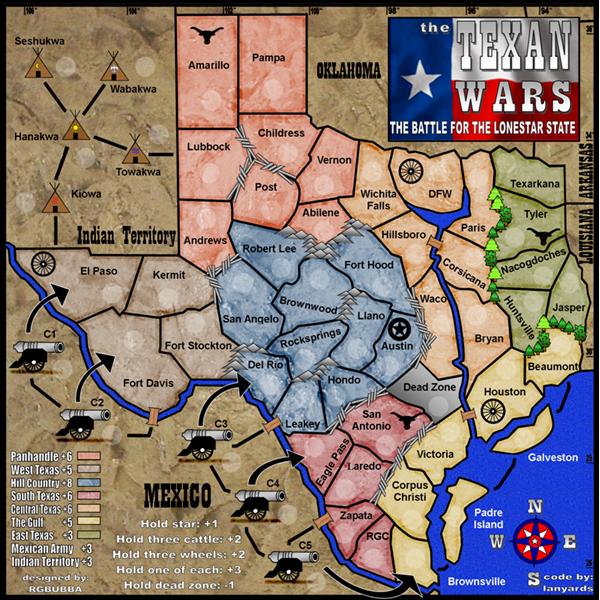
edit: OK, I've crunched the numbers in Excel, using my new and as-yet untested formula, and here's what i get:
Panhandle: +5
West: +3
Hill: +6 (in addition to the auto +1)
South: +4
Central: +5
Gulf: +5
East:+3
Mexico: +3
Indian: +3
of course, you can use a different formula to calculate your bonuses. What's important is that you do use some kind of formula, because right now they don't seem consistent. For instance, you have west texas and the gulf receiving the same bonus, yet they are very different in size. Both have four territories to defend and four neighboring regions, yet west only has to capture four total territories, and they have an easier next region to take in Indian terits.
I think you also need some clarification on the symbol bonuses - if you hold one of each symbol do you get +3 in addition to the +1 for the star? And if you hold a star, a cattle, and two wagons do you get two +3s, because technically you will have two distinct sets. You'll have to think this out in the XML as well.
Posted: Fri Feb 15, 2008 8:28 pm
by rgbubba
oaktown wrote:colorblind issues took a nice step forward with the darker east texas... if Houston and Bryan were a bit more distinct we'd be there, but I could live with the current colors.
I will work on it.
Posted: Fri Feb 15, 2008 8:29 pm
by rgbubba
oaktown wrote:I'm still concerned about the size of some bonuses... let me play with it...
edit: OK, I've crunched the numbers in Excel, using my new and as-yet untested formula, and here's what i get:
Panhandle: +5
West: +3
Hill: +6 (in addition to the auto +1)
South: +4
Central: +5
Gulf: +5
East:+3
Mexico: +3
Indian: +3
of course, you can use a different formula to calculate your bonuses. What's important is that you do use some kind of formula, because right now they don't seem consistent. For instance, you have west texas and the gulf receiving the same bonus, yet they are very different in size. Both have four territories to defend and four neighboring regions, yet west only has to capture four total territories, and they have an easier next region to take in Indian terits.
Ok let me look into it. I think your right.
Posted: Fri Feb 15, 2008 8:36 pm
by rgbubba
Does the sea look better than the last one?
600x600 lighter sea

800x800 lighter sea

Posted: Fri Feb 15, 2008 8:40 pm
by Unit_2
now that looks good

Posted: Fri Feb 15, 2008 8:45 pm
by rgbubba
Unit_2 wrote:now that looks good
You really like it?
Posted: Fri Feb 15, 2008 9:12 pm
by Unit_2
yeah, as soon as it comes out i wanna play it
Posted: Fri Feb 15, 2008 9:13 pm
by rgbubba
Unit_2 wrote:yeah, as soon as it comes out i wanna play it
Sweet!!! Come join the Fun!!!
Posted: Fri Feb 15, 2008 9:14 pm
by Unit_2
But i do see something, down where lanyards name is there is black inbetween the letters.
Posted: Fri Feb 15, 2008 9:15 pm
by pepperonibread
I'd rather have the sea color somewhere in between... preferably towards the darker blue, though others may disagree. Also, the light color kind of gives the black borders with the sea a pixelated look.
Posted: Fri Feb 15, 2008 9:51 pm
by rgbubba
Unit_2 wrote:But i do see something, down where lanyards name is there is black inbetween the letters.
Thanks!! I will take care of it.
Posted: Fri Feb 15, 2008 9:52 pm
by rgbubba
pepperonibread wrote:I'd rather have the sea color somewhere in between... preferably towards the darker blue, though others may disagree. Also, the light color kind of gives the black borders with the sea a pixelated look.
ok I will work on it. Thanks.
Posted: Sat Feb 16, 2008 3:00 am
by oaktown
at some point, rg, you're going to just have to go with what you like... I'm not wild about the latest sea color and texture, but that's just my opinion, and clearly others have a different opinion. As it is it's a really nice looking map, so don't let yourself get caught up trying to please everybody around the little details.
But please do consider my concern around how you're going to set up the bonuses for the stars/cattle/wheels.
Posted: Sun Feb 17, 2008 8:00 am
by rgbubba
oaktown wrote:at some point, rg, you're going to just have to go with what you like... I'm not wild about the latest sea color and texture, but that's just my opinion, and clearly others have a different opinion. As it is it's a really nice looking map, so don't let yourself get caught up trying to please everybody around the little details.
Thanks Oaktown! You are right I will be done with it this week.
Posted: Sun Feb 17, 2008 8:35 am
by Lone.prophet
two things
1 make clear that the cannon arrows are 1 way attack
2 the sea looks really bad now try the blue of the territory with a slight variation
Posted: Sun Feb 17, 2008 8:57 am
by rgbubba
Please select out of the three the one you like best! This will be the one showing on game play. Thank you.
lighter

mid

darker

Posted: Sun Feb 17, 2008 3:35 pm
by rgbubba
oaktown wrote:But please do consider my concern around how you're going to set up the bonuses for the stars/cattle/wheels.
THANKS I WILL. I DID SOME CHANGES ON THE BONUES CHECK IT OUT.
Posted: Sun Feb 17, 2008 3:44 pm
by Wisse
the lighter one
Posted: Sun Feb 17, 2008 4:04 pm
by rgbubba
Wisse wrote:the lighter one
THANKS YOU WISSE!
Posted: Sun Feb 17, 2008 4:47 pm
by AndyDufresne
The middle one.

--Andy