Page 11 of 16
Re: Central America [D] V11 Input Drastically Needed! [D,GP]
Posted: Sat Jan 09, 2010 8:40 pm
by lgoasklucyl
cairnswk wrote:Industrial Helix wrote:Falkomagno wrote:Let's quench this map....!
Seconded!
Thirded....fourthted...100thted
Is this now still going through some voting process for options as above?
Well... there's a couple different options I wanted people to consider to help me choose a direction to move in. I, personally, am liking the grungy ocean the best. I'm looking for feedback regarding other people liking it the best, if it's okay with the land textures or not, if it's okay with the land colors or not, among other things.
Notably:
-The key. Besides the fonts (which are kind of hard to read due to the glow, this will be fixed next update), should a background be placed to help separate it from the map? While it would be nice, I'm not 100% sure it's necessary.
-The territories in the ocean (with regards to visibility): are they obvious enough?
Re: Central America [D] V11 Input Drastically Needed! [D,GP]
Posted: Sat Jan 09, 2010 9:01 pm
by natty dread
lgoasklucyl wrote:Notably:
-The key. Besides the fonts (which are kind of hard to read due to the glow, this will be fixed next update), should a background be placed to help separate it from the map? While it would be nice, I'm not 100% sure it's necessary.
I don't think a background is necessary for the minimap. But you could try it with a frame... Not sure if it would work, but it's worth a shot.
-The territories in the ocean (with regards to visibility): are they obvious enough?
They are for me, but I still wonder how the colourblind will perceive them...
Re: Central America [D] V11 Input Drastically Needed! [D,GP]
Posted: Sat Jan 09, 2010 10:08 pm
by thenobodies80
Hi lgoasklucyl, very nice maps.
I think that the V11 grunge is the best one.
Agree with Industrial Helix about sea connections, they look like islands, maybe the connections could be not so clear.

You should move managua and puntarenas so the names don't cover the borders.

natty_dread wrote:lgoasklucyl wrote:The territories in the ocean (with regards to visibility): are they obvious enough?
They are for me, but I still wonder how the colourblind will perceive them...
Using vischeck i don't see any colorblind issue.
On the minimap you should move the +3 on guatemala to the right, just not to touch the black border.
Have a nice day
Nobodies
Re: Central America [D] V11 Input Drastically Needed! [D,GP]
Posted: Sat Jan 09, 2010 10:30 pm
by the.killing.44
Let's get this finished, shall we?
I only have a few concerns, though a bit large.
1. I really think you should outline the land with the same borders. The playable land doesn't look so bad, per se, but the gray area is very awkward. The land-sea transition is jagged and pixelly, and it'll fix it, not to mention I always think that outlined land masses look better. Play with the bevel, too, especially if/after you outline the land, play with the bevel settings; a subtle, soft bevel can do a lot more than a sharp one sometimes.
2. You should revisit the layer styles of your text, mainly on the legend text. The stroke isn't really working. I don't know if it is the opacity or just the colors, but the light-blue-at-low-opacity stroke just doesn't show up in the ocean. Use outer glow or a drop shadow with 0 distance; it'll be so much nicer. The stroke's fine on the tert names.
3. The whole ocean and ocean-to-sea transition is very bleh. It seems like there's the ocean, then someone plopped some colored land on it (which, I know, is what you did in Ps

). If you look at Indochina and RJ's maps, there is the kind of tracking lines going off the coast …
here. Experiment with that and some outer glows from all the land…
4. Small things (in rough order of importance):
- the land textures could use some work, try overlaying grunge OVER the textures, instead of substituting them
- the colors of the Sea Route names aren't very distinguishable in relating them to the wheels, though I think the stroke changing will fix that
- the connections to the small island terts look like they're islands in themselves—take that bevel off
- the stroke on the title is pretty pixelly
- the gradient on the credits is unnecessary IMO
- the compass is kind of in the middle of nowhere and plan. Try labeling North, making it more opaque, and making it look nicer through glow, colored bits, whatever you can find
Gettttt itttttttt quenchedddddddddd
Re: Central America [D] V11 Input Drastically Needed! [D,GP]
Posted: Sat Jan 09, 2010 11:46 pm
by cairnswk
lgoasklucyl wrote:...
Well... there's a couple different options I wanted people to consider to help me choose a direction to move in. I, personally, am liking the grungy ocean the best. I'm looking for feedback regarding other people liking it the best, if it's okay with the land textures or not, if it's okay with the land colors or not, among other things.
Notably:
-The key. Besides the fonts (which are kind of hard to read due to the glow, this will be fixed next update), should a background be placed to help separate it from the map? While it would be nice, I'm not 100% sure it's necessary.
-The territories in the ocean (with regards to visibility): are they obvious enough?
I think most of this map was ready a long time ago. Sometimes there can be disaster in wanting to make something too perfect if you get my drift.
1. I prefer the grungy ocean in option 1. it give contrast to the map and is a good texture, and it works well with the land.
2. There appears to be some sort of accent or black mark over the word canal in the legend text and looks as though it shouldn't be there.
3. The font for me is extremely legible and i have no issues with reading it or making it out or it's glow.
4. I don't think it needs any background to help seperate it.
5. The area I think that could be improved is the non-playable land area...it looks kinda rough at the top left and right bottom of the map.
6. the ocean territories are clearly visible and i have no issue with them, although i understand that the rounded attack routes very mentioned as looking like island themselves because they are shadow.
Let's make some clear cut final decisions and get this one quenched. It's almost ready for it.
Re: Central America [D] V11 Input Drastically Needed! [D,GP]
Posted: Mon Jan 11, 2010 5:26 pm
by RedBaron0
Fortnightly review of Central America:
- The "+3" in the legend for Guatemala is blending into the border of the mini-map slide it to the right a little bit.
- The compass on the map is very light, perhaps increasing the opacity will lower the feeling of empty space there.
- Move Puntarenas(between Bocos del Toro) and Managua(between the lakes) names away from the border to prevent confusion if those territories connect.
- Sea links look like islands for the territories of the Cayas and Islas de la Bahia
- Your legend doesn't list lakes as being impassables
Looking good, couple little things!

Re: Central America [D] V11 Input Drastically Needed! [D,GP]
Posted: Mon Jan 11, 2010 7:38 pm
by lgoasklucyl
Awesome input, everyone! Three more days of full-time seasonal retail work/other obligations and then I will be all freed up to work on it
Re: Central America [D] V11 Input Drastically Needed! [D,GP]
Posted: Tue Jan 12, 2010 2:11 pm
by AndyDufresne
Look forward to seeing this map worked on!
--Andy
Re: Central America [D] V11 Input Drastically Needed! [D,GP]
Posted: Thu Jan 14, 2010 12:58 am
by oaktown
I'm still on board to do the army coordinates when the graphics are 99% worked out. I feel like this is the last thing tying me to CC... then I'll be free!!

Re: Central America [D] V11 Input Drastically Needed! [D,GP]
Posted: Thu Jan 14, 2010 12:30 pm
by AndyDufresne
oaktown wrote:I'm still on board to do the army coordinates when the graphics are 99% worked out. I feel like this is the last thing tying me to CC... then I'll be free!!
You cannot ever be free.
--Andy
Re: Central America [D] V11 Input Drastically Needed! [D,GP]
Posted: Sun Jan 17, 2010 5:30 pm
by DubWarrior
I didn't read the whole topic, but one thing that looks a bit 'drafty' are the colors.
thing is, when you saturate all your colors, you starts to lose the attention, or a certain focus in the map.
I would suggest you desaturate all your colors to softer tones (like a soft lime-green, a pale orange-yellow, etc...(and skip pink
)
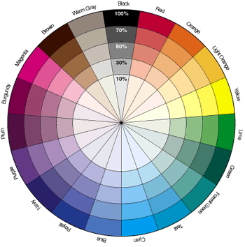
and than work out some focus by saturating for example 2 colors-types, or colorranges. take a look at some maps like greenland, the third crusade or Ireland. sometimes you need some 'logic' adjacent colorregions. I guess your contrast between some regions is just to hard. for a logic contrast , working with a colorwheel like this might be usefull:
good luck!
Re: Central America V11.2 (p.18) Let's Finish It! [D,GP]
Posted: Tue Jan 19, 2010 3:23 pm
by lgoasklucyl
Okay, so this is the direction we're moving in now. I've desaturated the territory colors a bit to better match the ocean and I think it solved a giant issue I had with the overall look of the map. As it looks now, I think I'm content with the ocean/land colors and textures.
I also:
-Moved some names around
-Adjusted strokes for the legend text
-Dropped the gradient on the credits (and like how it looks)
-Make a few adjustments to the compass
-Other things I cannot remember, as I neglected to take notes

Issues:
-The exterior land just looks more and more terrible as time goes on. The brown looks better than the gray, but it just looks flat, pixelated, and atrocious. Something needs to be done there, but I cannot figure it out.
-The font for the sea territs. I worked on the stroke a little, but didn't come up with a decision. This I don't really need input on, I just need to toy around for a bit and find something that works.
-With regards to outlining the land: I tried it and really don't like how it looks. I can adjust the bevel on the land a little to make it flow more naturally, but having a border around the continent just changes the whole look and feel of the map in a direction that looks awful.
-Cleaning up some pixelated areas (notably in the north, the exterior land, some areas have a strange white glow of pixels I'll need to clean up, etc...).
-The attack routes changed to be more... not circle. Once I've returned home for the evening (8:30ish) I'll have access to a tablet and be capable of drawing smooth lines (though, I suppose I could just use the pen) that will fix those.
-I happened to notice the opacity for the stroke is different on some territories (it's sort of a north/south thing). The ones in the north are ~60% with the ones in the south ~30%. Any opinions on which looks better would help a lot, then I'll change them all to look the same.
Other things, I'm sure.
Let's get this thing done!
Version 11.2:
[bigimg]http://img695.imageshack.us/img695/5792/camapsmallerv112grunge.jpg[/bigimg]
Re: Central America V11.2 (p.18) Let's Finish It! [D,GP]
Posted: Tue Jan 19, 2010 5:36 pm
by Incandenza
A small thing: the terit name Canal lacks the accent of the legend instructions Canal (plus the latter actually looks like it says Canat). They should both be one way or the other.
Re: Central America V11.2 (p.18) Let's Finish It! [D,GP]
Posted: Tue Jan 19, 2010 5:46 pm
by AndyDufresne
I'm really digging the whole look of the map, from the title, to the compass, to the colors and fonts. You may want to experiment with a slightly darker/bluer outline for the sea territories.
You're right about the unplayable area feeling out-sync with the map...or at least, the top portion. The bottom portion is small enough that it doesn't bother me. What could do with the area? I'm not sure. You could try experimenting with other grunge-ier textures---perhaps deliberately inconsistent colors/hardness/softness might make that area more appealing.
In the legend, Panama's bonus doesn't stand out like the others---probably because the black outline emphasizes the structure better on the lighter colors than on the dark green.
You also use the word "attack" while currently official CC Lingo is "Assault," should you want/need to change it.
--Andy
Re: Central America V11.2 (p.18) Let's Finish It! [D,GP]
Posted: Wed Jan 20, 2010 5:13 am
by DubWarrior
Hi, some great improvements...my suggestion with the non-playable area? look for a tone that blends with the sea...maybe some soft grey-green? or, you can put some blur on the sides of the region? I like the solid look of the map, so don't use too much different structures... My other little concern is the costa-rica color...I think it looks too heavy, probably beacuse it is placed between 2 green regions. I think if you replace the red-orange by a lighter yellow (so less red) it will make the bottom of the map a bit 'lighter'...or perhaps a blue-green turquoise color? just a thought
cheers
Re: Central America V11.2 (p.18) Let's Finish It! [D,GP]
Posted: Wed Jan 20, 2010 5:13 pm
by MrBenn
AndyDufresne wrote:You're right about the unplayable area feeling out-sync with the map...or at least, the top portion. The bottom portion is small enough that it doesn't bother me. What could do with the area? I'm not sure. You could try experimenting with other grunge-ier textures---perhaps deliberately inconsistent colors/hardness/softness might make that area more appealing.
--Andy
Adding a black "territory" border to the edge of the unplayable area would probably make it look less out of place. The patch of ocean right in the top corner could probably be fudged a bit, and just blended into brown land - I've always thought it looks a little odd (despite being accurate!)
That aside, you've come on leaps and bounds recently - the only thing I would like to see some more work on is the title - you could use that top corner to add a lot of life and character to the map...
Re: Central America V11.2 (p.18) Let's Finish It! [D,GP]
Posted: Wed Jan 20, 2010 7:50 pm
by AndyDufresne
MrBenn wrote:That aside, you've come on leaps and bounds recently - the only thing I would like to see some more work on is the title - you could use that top corner to add a lot of life and character to the map...
I like the title the way it is---fits the general theme of the map. Though I'm not opposed to any sprucing up.
--Andy
Re: Central America V11.2 (p.18) Let's Finish It! [D,GP]
Posted: Wed Jan 20, 2010 11:25 pm
by RedBaron0
What program are you using lucy? I can see the pixelation along the edge of the land surface too... it is dreadful. Have you tried playing with blending modes? Have you also tried to see the map without any bevel or drop shadow? You may just need to change the angle the light is creating these effects, it might change some of the pixelation too.
Have you tried just a neutral color for those connector dots? Go a little bit smaller for those dots. They should feel more like a path rather then a part of the actual territory if you get my meaning.
Re: Central America V11.2 (p.18) Let's Finish It! [D,GP]
Posted: Fri Jan 22, 2010 4:49 pm
by iancanton
RedBaron0 wrote:Have you tried just a neutral color for those connector dots? Go a little bit smaller for those dots. They should feel more like a path rather then a part of the actual territory if you get my meaning.
agreed. these assault routes each look like a chain of islands.
ian.
Re: Central America V11.2 (p.18) Let's Finish It! [D,GP]
Posted: Fri Jan 22, 2010 6:22 pm
by Industrial Helix
iancanton wrote:RedBaron0 wrote:Have you tried just a neutral color for those connector dots? Go a little bit smaller for those dots. They should feel more like a path rather then a part of the actual territory if you get my meaning.
agreed. these assault routes each look like a chain of islands.
ian.
Or just change them to white or black or something.
Re: Central America V11.2 (p.18) Let's Finish It! [D,GP]
Posted: Sun Jan 24, 2010 4:37 pm
by Elegarth
For the record, and since someone mentioned it above, the word Canal in spanish has no accent. Is just Canal.
Re: Central America V11.2 (p.18) Let's Finish It! [D,GP]
Posted: Mon Jan 25, 2010 12:26 pm
by lgoasklucyl
Elegarth wrote:For the record, and since someone mentioned it above, the word Canal in spanish has no accent. Is just Canal.
I keep forgetting to update this when I make changes

I'm going to make the attack routes a little more spaces out, less cylindrical, and more neutral colored to avoid confusion as islands.
With regards to the white pixelation around the continent border in locations, I've been having difficulty fixing it. Lessening the bevel layer doesn't seem to help and adding additional color to the continent layer just results in a need for more bevel. Perhaps lessening the pixel size of the bevel will help... We'll see.
Re: Central America V11.2 (p.18) Let's Finish It! [D,GP]
Posted: Mon Jan 25, 2010 1:09 pm
by DubWarrior
Or you could do a blur on the edges? I see you saved the map as an JPG...maybe saving it as a PNG can do the job?
good luck, I like this one!
Re: Central America V11.2 (p.18) Let's Finish It! [D,GP]
Posted: Mon Jan 25, 2010 5:27 pm
by lgoasklucyl
DubWarrior wrote:Or you could do a blur on the edges? I see you saved the map as an JPG...maybe saving it as a PNG can do the job?
good luck, I like this one!
I only save it as a jpeg for the hosting on imageshack, otherwise it stays a .psd.
I MAY have a solution to this issue, involving some interesting methods of touch up on the territory colors along the side and potentially drawing a border around the exterior land (also covering up some of the pixelation in those areas).
We'll see. Big changes next update people, be prepared
Re: Central America V11.2 (p.18) Let's Finish It! [D,GP]
Posted: Mon Jan 25, 2010 5:37 pm
by natty dread
What he means is that if you save it as PNG and host the PNG file, the image may look better. JPEG:s often look fuzzy. PNG is a lossless format so it will look exactly as it should.