Page 11 of 22
Posted: Mon Nov 19, 2007 2:18 am
by edbeard
well the back and forth isn't solving anything honestly.
I'm not sure how far gimil is willing to go, but I think he might be willing to help out on the border issue.
Perhaps Tisha/RS can ask for his help, and maybe send gimil the psd file so he can do the borders. (maybe I'm being optimistic about what gimil is willing to do!)
Posted: Mon Nov 19, 2007 2:19 am
by gimil
Risky_Stud wrote:as long as gameplay works and map looks good(without a microscope) then yeah they should'nt concern themselves. just approve and if a problem come's up while playing then pull it and fix it. do you really look at line thickness when playing, now tell the truth!
of course i dont. But i look at a map as a piece of art. Its something that should be enjoyable to look at. So if i see somethnig out of place i will bring it up like most people around here.
Posted: Mon Nov 19, 2007 2:20 am
by gimil
edbeard wrote:well the back and forth isn't solving anything honestly.
I'm not sure how far gimil is willing to go, but I think he might be willing to help out on the border issue.
Perhaps Tisha/RS can ask for his help, and maybe send gimil the psd file so he can do the borders. (maybe I'm being optimistic about what gimil is willing to do!)
I alreadt told tisha because i left such a comment to so late i was willing to make hte changes for her, but shes would rather do it herself which is fair enought.
Posted: Mon Nov 19, 2007 2:21 am
by Risky_Stud
the problem is that it's just a game and not a peice of art! sry!
Posted: Mon Nov 19, 2007 2:24 am
by gimil
Risky_Stud wrote:the problem is that it's just a game and not a peice of art! sry!
wait a minute, how is that a problem, a cartographer spends hours of time on photoshop to make something creative... how is that not art?
Posted: Mon Nov 19, 2007 2:28 am
by Risky_Stud
what i'm saying is that it's just a game board and should not be judged as art. i don't go buy a board game because it looks pretty. should look ok, but the game play is what really matter's. do you think people join this sight to look at art. no, did'nt think so.
Posted: Mon Nov 19, 2007 2:31 am
by gimil
Risky_Stud wrote:what i'm saying is that it's just a game board and should not be judged as art. i don't go buy a board game because it looks pretty. should look ok, but the game play is what really matter's. do you think people join this sight to look at art. no, did'nt think so.
I wont even have this argument here, its off topic. But i can assure you that you are wrong here.
Posted: Mon Nov 19, 2007 2:34 am
by Risky_Stud
it's not off topic, your judging this map on artistic integrity. and i'm saying that should'nt matter as much as your saying it should. i was using board games as an example
Posted: Mon Nov 19, 2007 2:40 am
by gimil
Risky_Stud wrote:it's not off topic, your judging this map on artistic integrity. and i'm saying that should'nt matter as much as your saying it should. i was using board games as an example
well if your going to put it like that, would a company put out a graphically incompetant looking board?
Posted: Mon Nov 19, 2007 2:44 am
by Risky_Stud
so your calling this incompatant, now that's not nice. i live here and geographicly it looks just fine. by the way after all the people that have seen this you are the only one that has a problem and andy did'nt see anything until you gave him a microscope. thats how insignificant your complaint is.
Posted: Mon Nov 19, 2007 2:56 am
by gimil
Risky_Stud wrote:so your calling this incompatant, now that's not nice. i live here and geographicly it looks just fine. by the way after all the people that have seen this you are the only one that has a problem and andy did'nt see anything until you gave him a microscope. thats how insignificant your complaint is.
No i didnt call it incompotant, probably not hte best word to use, but you understand what i mean. And hte fact that andy didnt notice this, or any other cartographer for that matter is rather disapointing, inconsistancy tend to be one of the 1st things the foundry notices.
Posted: Mon Nov 19, 2007 2:59 am
by Risky_Stud
i understand your complaint gimil and i appriciate your offer to help out, but i know my wife and she likes to do things herself(very stubborn). i'm not trying to piss you off and my opinion won't change. i think were here to have fun and arguing over lines is not fun. just take it easy on her, please!
Posted: Mon Nov 19, 2007 3:05 am
by gimil
Argument and debate are what the foundrys about, unfortunatly were not going to sort this out until the foundry are acctually awake (This hours is generally when no foundry regulars are about)
So we will have to wait and see how it turns out.
Posted: Mon Nov 19, 2007 3:09 am
by Risky_Stud
agreed

Posted: Mon Nov 19, 2007 3:38 am
by gimil
Risky_Stud wrote:agreed
lol

Posted: Mon Nov 19, 2007 3:39 am
by reverend_kyle
The legend has major issues also that I have said since day 1. I check back when it's in final forge and they still haven't been fixed. I believe it has to do with the lighting effects on the drop shadow. Either way all of the legend continents have inconsistent drop shadows that need fixing.
Posted: Mon Nov 19, 2007 10:47 am
by Risky_Stud
shut up kyle, there's nothing wrong with the legend. idiot!
Posted: Mon Nov 19, 2007 11:02 am
by Tisha
you have only made about three comments on this map...the font..which i have changed, and these two...
reverend_kyle wrote:The army shadows seem really inconsistant.
reverend_kyle wrote:When I looked at the start of the last page I was like "why is this final forged it looks so bland". Then I got to the last one and I was like.. "quench"
Posted: Mon Nov 19, 2007 1:08 pm
by RjBeals
Tisha wrote: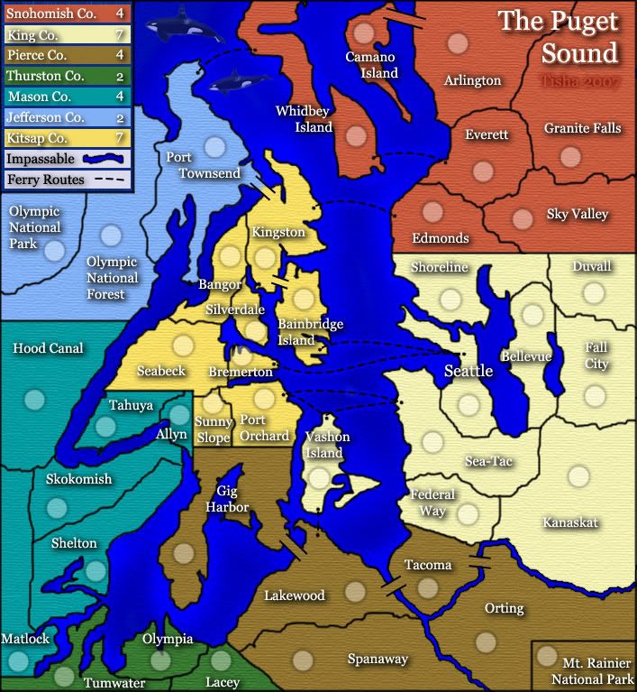
Final Forge...??
First of all, maps are definitely artwork. Like gimil said, I spend hours working on my maps, and I try very hard to be picky on all the details. Once it's quenched, you can't go back and tweak because you don't like something. These people who post frequently in the foundry are very particular and want maps to be the best possible before quenching. We don't just ignore small details that could be easily (or sometimes not easily) fixed. I guess it depends on how well you maintain your layers when creating the map.
Anyway - I personally don't see a big deal with the borders, but the legend looks awful. King Co. looks like its floating way above the other titles. There is no way the drop shadow is consistent across all titles. I also don't prefer the drop shadow in general - across the whole map. The style you used really takes away from the names. In fact I think the names are too big. It makes the map look cluttered.
Your Ferry Route dotted line in the legend is sloping down? The giant leaping whales look out of place. The water is too bright of blue. It's too bad the map is so long vertically. There will be lots of scrolling. But I do like the canvas pattern you used for the land. And the color choice is okay - at least you can easily tell the different bonus territories apart.
I'm sure the response will be that I am too late and I should' have posted earlier in the maps development. O well - thats what I get. And I'm not commenting on game play - just graphics, which are obviously my personal opinion - but I hope at the very least, you can fix the drop shadows on the legend.
Your friend -
RjBeals.
Posted: Mon Nov 19, 2007 1:10 pm
by Tisha
so everything looks like shit...nice to know..thanks
Posted: Mon Nov 19, 2007 1:15 pm
by RjBeals
Tisha wrote:so everything looks like shit...nice to know..thanks
I didn't say that. You're in final forge so you obviously pleased the majority of the forum. It should only take you 1/2 hour to fix the drop shadows. I think it will make a big difference. Have you tried bringing the saturation down on the water? That may also give a better feel of the map as a whole. If you have reasons why you don't want to - then that's fine. I'm just posting my opinions. I did have some positives hidden in that post
Posted: Mon Nov 19, 2007 1:15 pm
by Gnome
Tisha wrote:you have only made about three comments on this map...the font..which i have changed, and these two...
reverend_kyle wrote:The army shadows seem really inconsistant.
reverend_kyle wrote:When I looked at the start of the last page I was like "why is this final forged it looks so bland". Then I got to the last one and I was like.. "quench"
Risky_Stud wrote:shut up kyle, there's nothing wrong with the legend. idiot!
Ok it seems like there is a war over here...
Risky, A few post higher you said Gimil he wasn't acting nice...what is your definition of "nice" than?
To be honest, I'm more on Gimil's side...
All the talk about a map has to be playable and the look doesn't count...What is your point...would you play a map that is drawed by hand but has a great gameplay...
The only thing I can understand is that you defend your wife's map...
Here are my comments on the map
1) The legend on the small map doesn't look well...the shadow is to big or something, it's just that the legend on the big map looks better...
(this goes for all shadows on the small map...all names look so dark...maybe lower them?)
2) Some army circles are maybe better when they are moved around...
Sunny slope: army circles touches 2 borders...why? can you move it some pixels? same goes for "Olympia", "silverdale" and "Allyn" also "Bremerton" has that problem but I don't think there is enough space to make it fit...
Same goes on the small map...there is not a lot of space but some of those circles can be moved so they fit better...
The army circle of Gig Harbor is all the way down...there is no game there...no route or anything...why not just add it on the right side of the territory?
Sorry to mention this in FF while I think the Xml has been made already...
Don't know if some other people think this is important...but I think it looks a lot better when they fit...
3)I don't really like the texture of the land

(actually I didn't comment on this map a lot because I didn't like it...now it's in FF so I just tell you everything that I would like to see change...do with it what you want...)
4) I can give a lot of other stuff where you can work on but it seems that posting your ideas in this thread will get a "SHUT UP IDIOT" so if this how you want your map quenched...well ok but than this will be a new map that I will never play (And I won't be the only one)...
Posted: Mon Nov 19, 2007 1:32 pm
by Tisha
all these thing that everyone decided to post all at once are not going to take just a half an hour to fix...
gimil whats all the borders for the small map and the large map redone..
as far as inconsistent drop shadows..they are NOT . they are the same drop shadows throughout.. but u say that the small looks different then the large?
and change the army circles around..that i already have..and thought everyone was happy with... which will screw with the actual placing of the armies..that i can't get right anyways..no matter how centered i get them
and the whales that i have been over again and again...that no one is ever happy with...
the shade of the water sucks of course....even though i have brought it down a couple times
and of course the map is too long vertically..
the texture of the land suck
the fonts to large..
anything else i forgot?
Posted: Mon Nov 19, 2007 1:42 pm
by rebelman
/me offers Tisha a hug
Posted: Mon Nov 19, 2007 1:44 pm
by Risky_Stud
give me a break, not everyone is going to be pleased, so why all the bashing now. if you were not going to play gnome then don't play. but please don't comment on something you were never gonna give a chance! final forge is for touching up, not major changes, especially this late.