Re: RAIL ASIA [1.11.12] QUENCHED
Moderator: Cartographers
Forum rules
Please read the Community Guidelines before posting.
Please read the Community Guidelines before posting.
- natty dread
- Posts: 12877
- Joined: Fri Feb 08, 2008 8:58 pm
- Location: just plain fucked
Re: RAIL ASIA [19.1.12] V23-P15 Signatures
Well, you don't have to use that exact font. But maybe something in that style. Would at least be more theme-appropriate than the current title.

- natty dread
- Posts: 12877
- Joined: Fri Feb 08, 2008 8:58 pm
- Location: just plain fucked
Re: RAIL ASIA [19.1.12] V23-P15 Signatures
No.
Natty. the reason i like the original font is that it is the same style of "square" font that is in the rest of the legend.
The fonts you have shown are way out of style with want i want for the map.
The map is filled with loads of "fancy shapes" and that huge station.
I want the legend and the title to reflect the same simple easy-to-read style and not be inconsistent with each other, in contrast to everything else that is going on in the map.
I still prefer the original font.

* Pearl Harbour * Waterloo * Forbidden City * Jamaica * Pot Mosbi
- natty dread
- Posts: 12877
- Joined: Fri Feb 08, 2008 8:58 pm
- Location: just plain fucked
Re: RAIL ASIA [19.1.12] V23-P15 Signatures
Natty, have you not got the message yet. NO. NO. NO.

* Pearl Harbour * Waterloo * Forbidden City * Jamaica * Pot Mosbi
- natty dread
- Posts: 12877
- Joined: Fri Feb 08, 2008 8:58 pm
- Location: just plain fucked
Re: RAIL ASIA [19.1.12] V23-P15 Signatures
But why not? I think the last one looks pretty good and it's consistent with the style of the map.

Re: RAIL ASIA [19.1.12] V23-P15 Signatures
I'm sorry. I don't share your belief. It is what i'd call a "scewed font" and looks nowhere near as good as the Jazz LET font. It is just as inconsistent as the previous two fonts shown.natty_dread wrote:But why not? I think the last one looks pretty good and it's consistent with the style of the map.
Original title font is still in place.

* Pearl Harbour * Waterloo * Forbidden City * Jamaica * Pot Mosbi
- natty dread
- Posts: 12877
- Joined: Fri Feb 08, 2008 8:58 pm
- Location: just plain fucked
Re: RAIL ASIA [19.1.12] V23-P15 Signatures
What do you mean by skewed?cairnswk wrote: It is what i'd call a "scewed font"

Re: RAIL ASIA [19.1.12] V23-P15 Signatures
Version 23


* Pearl Harbour * Waterloo * Forbidden City * Jamaica * Pot Mosbi
- natty dread
- Posts: 12877
- Joined: Fri Feb 08, 2008 8:58 pm
- Location: just plain fucked
Re: RAIL ASIA [19.1.12] V23-P15 Signatures
Ok, anyway... let's not concentrate so much on the fonts, what I'm trying to communicate with these visual suggestions is not the exact font you should use, rather I'm suggesting styles of titles that you could go for.
So here's what I think is wrong with the current title.
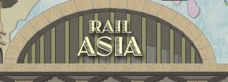
Firstly, here's a 400% zoom of the title: There you can see that there's this sort of uneven, pixelly thing on the surface of the letters. I don't know if it's the font or some effect on the text, but it seems to me like it's some small detail in the letters which simply just mashes up into unrecognizable pixel porridge when the text is in that small size. Very detailed, ornamental fonts like that are not suitable for small sized text. Then again if it's not the font but rather some effect you've placed on it, it's an easier fix, just remove that.
Secondly: the placement and size of the title - it feels lackluster. It's small and simple, it kind of feels like an afterthought - like, oh right, here's the name of the map. It doesn't feel like a consistent part of the overall image.
I think, the title is what identifies your map - your title is representative of your map, it's not just a label on a can of beans... it should part of the theme and setting of the map, it should indeed do more than just identify the name of the map... the title is an important part of the overall visual appearance.
So: keep the font if you want, but make it larger. And arrange the text better so it doesn't look like it was slapped on as an afterthought... maybe look at how I arranged the text in my latest example: "Rail" is smaller and on top, and "Asia" larger underneath it, which gives a slight implication of "Rail" being the subtitle with "Asia" being the main subject of the map - or, that the map is part of a series of rail maps.

Re: RAIL ASIA [19.1.12] V23-P15 Signatures
I think the ornamentation of the font is fine. I have only sympathy for anyone forced to study a map at 400% zoom, and pity for those who merely choose to do so.
I think the title should be considered in the light of it being a sign on the end of a train station. From that viewpoint, I think cairnswk's font is fine, and the placement is quite acceptable, too. Natty's last paragraph may raise a valid point. I am not agreeing that the title looks slapped on, but a smaller "Rail" above a larger "Asia" might be an improvement. Then again, it might not. It's probably worth a look.
I think the title should be considered in the light of it being a sign on the end of a train station. From that viewpoint, I think cairnswk's font is fine, and the placement is quite acceptable, too. Natty's last paragraph may raise a valid point. I am not agreeing that the title looks slapped on, but a smaller "Rail" above a larger "Asia" might be an improvement. Then again, it might not. It's probably worth a look.
Re: RAIL ASIA [19.1.12] V23-P15 Signatures
Small and simple - that's exactly what i want.natty_dread wrote:...
Secondly: the placement and size of the title - it feels lackluster. It's small and simple, it kind of feels like an afterthought - like, oh right, here's the name of the map. It doesn't feel like a consistent part of the overall image...
Natty. you're driving me batty. Keep badgering about this and I will end up foeing you.
I feel i have given you enough explanantion about why i want the font.
I have to agree, If it were borders, i'd understand.ender516 wrote:I think the ornamentation of the font is fine. I have only sympathy for anyone forced to study a map at 400% zoom, and pity for those who merely choose to do so.
At last, someone with some brains who is willing to accept my font decision but simply offering a suggestion as to alternative placement.I think the title should be considered in the light of it being a sign on the end of a train station. From that viewpoint, I think cairnswk's font is fine, and the placement is quite acceptable, too. Natty's last paragraph may raise a valid point. I am not agreeing that the title looks slapped on, but a smaller "Rail" above a larger "Asia" might be an improvement. Then again, it might not. It's probably worth a look.
Thank-you ender516.

* Pearl Harbour * Waterloo * Forbidden City * Jamaica * Pot Mosbi
- Nola_Lifer
- Posts: 819
- Joined: Mon Oct 13, 2008 4:46 pm
- Location: 雪山
- Contact:
- natty dread
- Posts: 12877
- Joined: Fri Feb 08, 2008 8:58 pm
- Location: just plain fucked
Re: RAIL ASIA [19.1.12] V23-P15 Signatures
What an inspiration you are to all of us. We should all look up to you, cairnswk, on how to handle feedback to our maps.cairnswk wrote:Natty. you're driving me batty. Keep badgering about this and I will end up foeing you.
cairnswk wrote:At last, someone with some brains who is willing to accept my font decision but simply offering a suggestion as to alternative placement.
Thank-you ender516.
Where's my thank you?natty_dread wrote:So: keep the font if you want, but make it larger. And arrange the text better so it doesn't look like it was slapped on as an afterthought... maybe look at how I arranged the text in my latest example: "Rail" is smaller and on top, and "Asia" larger underneath it, which gives a slight implication of "Rail" being the subtitle with "Asia" being the main subject of the map - or, that the map is part of a series of rail maps.

- natty dread
- Posts: 12877
- Joined: Fri Feb 08, 2008 8:58 pm
- Location: just plain fucked
Re: RAIL ASIA [19.1.12] V23-P15 Signatures
ender516 wrote:I think the ornamentation of the font is fine. I have only sympathy for anyone forced to study a map at 400% zoom, and pity for those who merely choose to do so.
I have only pity for those who try to bully and belittle people who are only trying to help them.

Re: RAIL ASIA [19.1.12] V23-P15 Signatures
I will try to fix that for you, thanks Nola_LiferNola_Lifer wrote:Your 2012 looks goofy at that angle.

* Pearl Harbour * Waterloo * Forbidden City * Jamaica * Pot Mosbi
Re: RAIL ASIA [19.1.12] V23-P15 Signatures
I think i handle feedback very well on 99% of issues raised. As for being looked up to, that is entriely a personal decision i leave to others, since no-one is forcing anyone to do that.natty_dread wrote:What an inspiration you are to all of us. We should all look up to you, cairnswk, on how to handle feedback to our maps.cairnswk wrote:Natty. you're driving me batty. Keep badgering about this and I will end up foeing you.
cairnswk wrote:At last, someone with some brains who is willing to accept my font decision but simply offering a suggestion as to alternative placement.
Thank-you ender516.
Where's my thank you?[/quote]natty_dread wrote:So: keep the font if you want, but make it larger. And arrange the text better so it doesn't look like it was slapped on as an afterthought... maybe look at how I arranged the text in my latest example: "Rail" is smaller and on top, and "Asia" larger underneath it, which gives a slight implication of "Rail" being the subtitle with "Asia" being the main subject of the map - or, that the map is part of a series of rail maps.
I think you've had enough thank-yous and i certainly won't thank-you for being a potential pain in the butt.
I back ender516 up on this issue. I think studying the font at 400% was going overboard and was a silly and almost last-resort attempt get me to do "what you wanted". even though i had repeatedly told you i was not changing the font.natty_dread wrote:ender516 wrote:I think the ornamentation of the font is fine. I have only sympathy for anyone forced to study a map at 400% zoom, and pity for those who merely choose to do so.You don't have to study the map at 400% to see what I'm talking about, I just thought it best to use it as an example. To better show what I'm talking about.
I have only pity for those who try to bully and belittle people who are only trying to help them.
In this case, i beleive it is me who is being bullied by you in an attempt to do what you want.

* Pearl Harbour * Waterloo * Forbidden City * Jamaica * Pot Mosbi
- natty dread
- Posts: 12877
- Joined: Fri Feb 08, 2008 8:58 pm
- Location: just plain fucked
Re: RAIL ASIA [19.1.12] V23-P15 Signatures
Please try to understand, it's not about "what I want" you to do. I'm just trying to help you create the best possible map you can.cairnswk wrote: I think studying the font at 400% was going overboard and was a silly and almost last-resort attempt get me to do "what you wanted". even though i had repeatedly told you i was not changing the font.

Re: RAIL ASIA [19.1.12] V23-P15 Signatures
ender516...here is a look at your suggestion...it does bring up pixelation issues, so i don't think it is suitable.ender516 wrote:... but a smaller "Rail" above a larger "Asia" might be an improvement. Then again, it might not. It's probably worth a look.

As a look at the other maps in this series, some consistency would be nice, so i think i should keep the title in a straight line as it is now.


* Pearl Harbour * Waterloo * Forbidden City * Jamaica * Pot Mosbi
Re: RAIL ASIA [19.1.12] V23-P15 Signatures
Sometimes...it doesn't feel like that.natty_dread wrote:...Please try to understand, it's not about "what I want" you to do.
I appreciate your concern and you have already done this on other issues on the map, but i have explained several times now that i am happy with font as it is, it is clear, is consistent with the legend font being "squarish", it constrasts simply with the rest of the complicated gfx on the map...and now it is consistent in a straight line with other rail maps.I'm just trying to help you create the best possible map you can.
So let's move on from this issue, natty please.
The title will remain as it is.

* Pearl Harbour * Waterloo * Forbidden City * Jamaica * Pot Mosbi
Re: RAIL ASIA [19.1.12] V23-P15 Sml/Lge
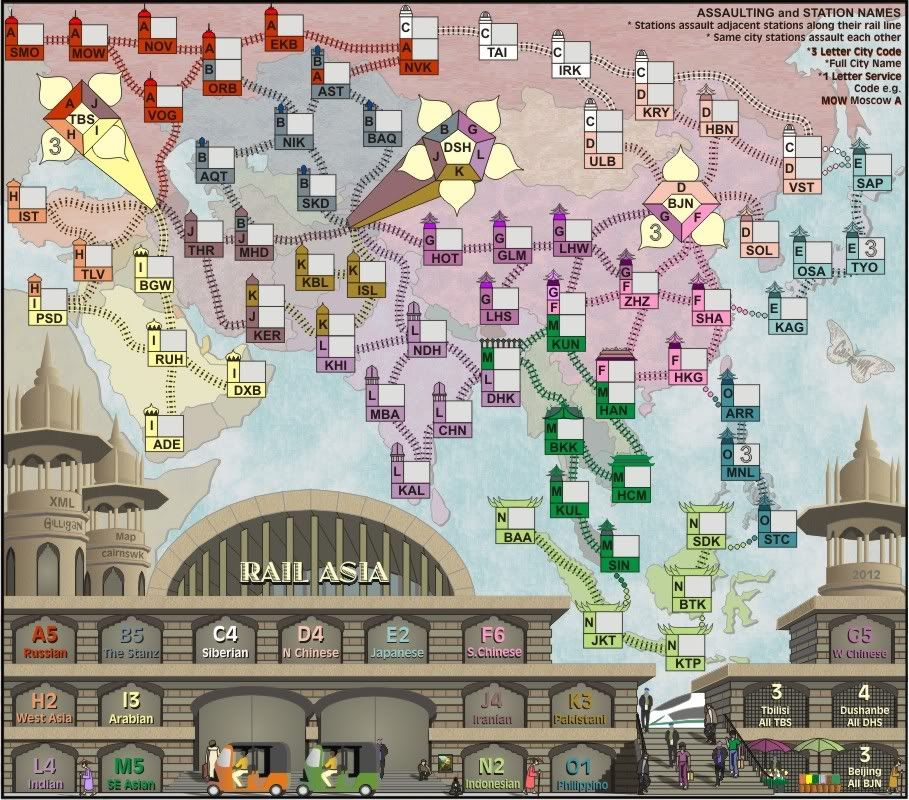
Version 23 - this has been updated to strighten the 2012 as suggested by Nola_lifer...and replace the drop shadow on the title with a solid extrusion perspective towards to vanishing point.


Last edited by cairnswk on Sat Jan 21, 2012 1:32 pm, edited 1 time in total.

* Pearl Harbour * Waterloo * Forbidden City * Jamaica * Pot Mosbi
Re: RAIL ASIA [19.1.12] V23-P15 Signatures
Last Call
If anyone has any other comments on gameplay, now is the time to speak up! If there are no other concerns within the next couple of days, this map will be moved to the Final Forge!
isaiah40
If anyone has any other comments on gameplay, now is the time to speak up! If there are no other concerns within the next couple of days, this map will be moved to the Final Forge!
isaiah40
Re: RAIL ASIA [19.1.12] V23-P15 Signatures
Interesting. At the larger size, the ornamentation looks quite different. I thought from looking at the small version that it consisted of small rivets. Anyway, it doesn't work in two sizes, so that's that.cairnswk wrote:ender516...here is a look at your suggestion...it does bring up pixelation issues, so i don't think it is suitable.ender516 wrote:... but a smaller "Rail" above a larger "Asia" might be an improvement. Then again, it might not. It's probably worth a look.

As far as natty's suggestion before me of keeping the font and repositioning it, I suspect that you might have just skimmed that last paragraph, having seen the first paragraphs so many times before.
Natty, I think I may have been a little snarky about the 400% zoom, and I apologize. But really, some things are not meant to be examined that closely.
Re: RAIL ASIA [22.1.12] V23-P19 Sml/Lge
cairns, can you adjust the kerning on the title a tad?
Re: RAIL ASIA [22.1.12] V23-P19 Sml/Lge
isaiah40, i can't in coreldraw with that particular font (no paragraph formatting). I'll have to import from another program.isaiah40 wrote:cairns, can you adjust the kerning on the title a tad?
what is your objective...do you want the letters spaced a bit more for better eye space?

* Pearl Harbour * Waterloo * Forbidden City * Jamaica * Pot Mosbi


