Page 10 of 15
Re: MEXICO [D] p1/14 --Aug 6th--
Posted: Wed Aug 25, 2010 3:25 pm
by MrBenn
None of those fonts would work with territory text; they're all too bold/chunky. Having browsed a little more, it would seem that Lithos is a stereotypical South American font (whatever that means), so its use is probably justified

RedBaron0 wrote:Like the flag look of the map itself and wouldn't mind see the Golden Eagle coat of arms make its way onto the map in some capacity.
I've had a play with it once before, and will wait for your opinion on what it looks like...
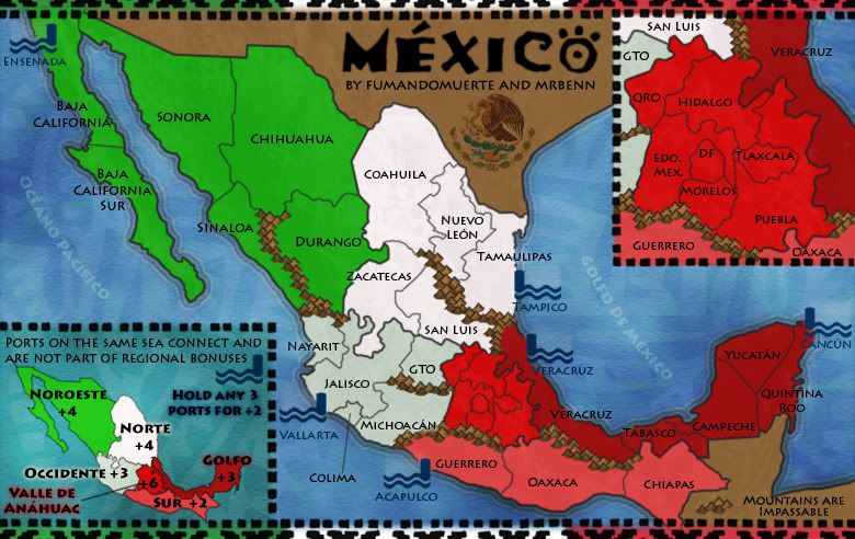
Re: MEXICO [D] p1/14 --Aug 6th--
Posted: Wed Aug 25, 2010 3:25 pm
by MrBenn
Oh, I forgot to mention... UPDATE TIME!!
[bigimg]http://i275.photobucket.com/albums/jj320/bpawley/mexico/Mexico12.jpg[/bigimg]
Re: MEXICO [D] p1/14 --Aug 6th--
Posted: Wed Aug 25, 2010 3:36 pm
by The Bison King
Looks sharp. I like the seal. Might I suggest that Veracruz the sea port and Veracruz the territory have different names. It might get confusing. That's the only thing on my mind... Except the mountains...
*wink* *wink* *nudge* *nudge*
viewtopic.php?f=127&t=124754
Re: MEXICO [D] p1/16 --Aug 25th--
Posted: Wed Aug 25, 2010 10:12 pm
by Industrial Helix
Valle de Anáhuac is a bit too bright of a red I think and Occidente would look better as a light gray rather than a greenish white.
I'd still rather see the ocean names in spanish.
The bit saying mountains are impassable seems like it would be more in place above the legend.
Re: MEXICO [D] p1/16 --Aug 25th--
Posted: Thu Aug 26, 2010 9:49 am
by The Bison King
I agree with this:
Occidente would look better as a light gray rather than a greenish white.
But not with this:
Valle de Anáhuac is a bit too bright of a red I think
Re: MEXICO [D] p1/14 --Aug 6th--
Posted: Thu Aug 26, 2010 4:29 pm
by MrBenn
The Bison King wrote:Looks sharp. I like the seal. Might I suggest that Veracruz the sea port and Veracruz the territory have different names. It might get confusing.
You're not the first person to mention it - I had already conceded the point that they'll need to be named differently in the XML, so they'd be differentiated that way (similar to how the ports are labelled on Age of Merchants). I'd rather not add more text to the territory names unless absolutely necessary, as it could look pretty crammed in.
Industrial Helix wrote:Valle de Anáhuac is a bit too bright of a red I think and Occidente would look better as a light gray rather than a greenish white.
Personally I think the red works well, as it echoes the colours of the flag - which is the look I was going for. If anybody else agrees with you I'll look at tweaking it a fraction - although it will only be slight as it has to contrast with the other two reds. As for the green/grey, I keep flitting between the two, and prefer the slight bit of colour - although will look at making it slightly more grey and less green.
Industrial Helix wrote:I'd still rather see the ocean names in spanish.
It's a simple change to make, if others are of the same opinion. I seem to recall having them in Spanish at some point (although that may just be a figment of my imagination).
Industrial Helix wrote:The bit saying mountains are impassable seems like it would be more in place above the legend.
I'm going to disagree on this point, as the mountains would look slightly out of place hovering over the sea - I like them down in that otherwise-dead space, and plan on keeping them there

Re: MEXICO [D] p1/16 --Aug 25th--
Posted: Thu Aug 26, 2010 4:50 pm
by natty dread
I ran your map through a general purpose colourblind simulation. Looks ok to me:
[bigimg]http://a.imageshack.us/img163/3820/mexicocb.png[/bigimg]
Re: MEXICO [D] p1/16 --Aug 25th--
Posted: Thu Aug 26, 2010 5:57 pm
by MrBenn
Random question... should I add a couple of mountains to block off the GTO/Zacatecas border? I don;t know whether or not it's necessary, but was thinking that there could potentially be some confusion about the closeness of the borders there (it almost looks like a 4-way border)
Re: MEXICO [D] p1/16 --Aug 25th--
Posted: Thu Aug 26, 2010 6:05 pm
by natty dread
Is it supposed to be impassable? If so, then add mountains. If not, just make the border between them wider.
Re: MEXICO [D] p1/16 --Aug 25th--
Posted: Fri Aug 27, 2010 11:19 pm
by RedBaron0
Loving the eagle, fits perfectly.
Re: MEXICO [D] p1/16 --Aug 31st--
Posted: Tue Aug 31, 2010 4:51 pm
by MrBenn
Here's another quick update. I've made some minor tweaks to colours and some name placements. The sea names are now in Spanish too.
[bigimg]http://i275.photobucket.com/albums/jj320/bpawley/mexico/Mexico12b.jpg[/bigimg]
Anything else I need to do?
Re: MEXICO [D, GP] p1/16 --Aug 31st--
Posted: Tue Aug 31, 2010 5:10 pm
by natty dread
This is just me, but I wouldn't mind seeing a little bit of texture on the land.
Re: MEXICO [D, GP] p1/16 --Aug 31st--
Posted: Tue Aug 31, 2010 5:12 pm
by The Bison King
natty_dread wrote:This is just me, but I wouldn't mind seeing a little bit of texture on the land.
He had texture on there earlier but had decided to remove it.
Re: MEXICO [D, GP] p1/16 --Aug 31st--
Posted: Tue Aug 31, 2010 5:27 pm
by thenobodies80
The only two things that i see are:
- finish the veracruz coast line in the top right inset
- Make better T letters in the phrase " ports on the same sea connect......" in the other inset
Re: MEXICO [D, GP] p1/16 --Aug 31st--
Posted: Tue Aug 31, 2010 8:11 pm
by RedBaron0
and the small map.
Re: MEXICO [D, GP] p1/16 --Aug 31st--
Posted: Thu Sep 02, 2010 3:52 pm
by MrBenn
The Bison King wrote:natty_dread wrote:This is just me, but I wouldn't mind seeing a little bit of texture on the land.
He had texture on there earlier but had decided to remove it.
Yep - nothing quite looked right, and I like the contrast between the land and the water.
thenobodies80 wrote:The only two things that i see are:
- finish the veracruz coast line in the top right inset
- Make better T letters in the phrase " ports on the same sea connect......" in the other inset
Fixed them both; also joined up a line in the Central region on the main map, where I had removed a mountain at some point
RedBaron0 wrote:and the small map.
Voila....
[bigimg]http://i275.photobucket.com/albums/jj320/bpawley/mexico/Mexico12S.jpg[/bigimg]
[bigimg]http://i275.photobucket.com/albums/jj320/bpawley/mexico/Mexico12L.jpg[/bigimg]
Are we all done?
Re: MEXICO [D, GP] p1/17 --Sep 2nd--
Posted: Thu Sep 02, 2010 5:20 pm
by Victor Sullivan
I'd say so, but I'm prolly not the one to say.
Re: MEXICO [D, GP] p1/17 --Sep 2nd--
Posted: Thu Sep 02, 2010 6:45 pm
by RjBeals
curious how it would look with black borders instead of those soft muted ones. ? Have you tried that?
Re: MEXICO [D, GP] p1/17 --Sep 2nd--
Posted: Fri Sep 03, 2010 12:28 am
by The Bison King
Victor Sullivan wrote:I'd say so, but I'm prolly not the one to say.
ditto
Re: MEXICO [D, GP] p1/17 --Sep 2nd--
Posted: Fri Sep 03, 2010 12:35 pm
by RedBaron0
Guess that's my cue... any more concerns? Let's hear'um.
Re: MEXICO [D, GP] p1/17 --Sep 2nd--
Posted: Fri Sep 03, 2010 3:04 pm
by Rih0
well, I do not like the grafics of this map, and more, I believe that the mapmakers working on it can do a lot better.
Add some shadow, use black borders, a sea texture would be nice.
Re: MEXICO [D, GP] p1/17 --Sep 2nd--
Posted: Fri Sep 03, 2010 4:12 pm
by The Bison King
Rih0 wrote:well, I do not like the grafics of this map, and more, I believe that the mapmakers working on it can do a lot better.
Add some shadow, use black borders, a sea texture would be nice.
The sea does have texture.
Re: MEXICO [D, GP] p1/17 --Sep 2nd--
Posted: Fri Sep 03, 2010 4:50 pm
by MrBenn
I've had a bit of a play around with some aspects of the map, and wondered whether people prefer this version or the one above?
I've added some (more) texture to the coastline, darkened the border lines, and added a new texture to the land (which I still feel ambiguous about, but could live with this one).
Re: MEXICO [D, GP] p1/17 --Sep 3rd--
Posted: Fri Sep 03, 2010 4:58 pm
by natty dread
Love the subtle texture. Perhaps you could make it just a bit more visible on the playable area though.
The sea glow I'm not sold on, it looks kinda dirty. Reminds me of the oil spill for some reason...
Re: MEXICO [D, GP] p1/17 --Sep 3rd--
Posted: Fri Sep 03, 2010 5:02 pm
by The Bison King
natty_dread wrote:Love the subtle texture. Perhaps you could make it just a bit more visible on the playable area though.
The sea glow I'm not sold on, it looks kinda dirty. Reminds me of the oil spill for some reason...

Fixed
However I agree with Natty I'm not particularly a fan of the sea glow. I don't hate it, but I don't really like it either.