Page 10 of 24
Re: S Africa 1885 - wildly open to gfx suggestions
Posted: Tue Aug 24, 2010 3:19 pm
by Industrial Helix
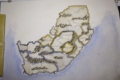
Alright... here's what I've got so far. I'm running into major problems on the transvaal/orange free state border, which has prevented me from posting a full update.
Also, bear in mind this is a photograph and not an actual scan.
So here's what I'm looking for. Basically, should I continue with this version idea or should I just stick to computer graphics and grunge up the original map? Or perhaps, should I start over on watercolors?
[bigimg]http://img.photobucket.com/albums/v302/Shone/preview.jpg[/bigimg]
My concerns:
The mountains are not so nice but somewhat satisfactory.
Natal's color (pink to the right of the map)
The colors aren't different enough. Basically, I'm going to photoshop clone stamp a section from the map and use that for the legend... alternatively, I may use a minimap.
The numbers are going to look strange on this map.
And lastly, the avatar image is Tsarina Alexandra who is both a fascinating woman and somewhat related to the Russian Revolution map.
Re: S Africa 1885 - watercolors and avatars on p. 16
Posted: Tue Aug 24, 2010 5:32 pm
by porkenbeans
I really like the watercolor look and feel, although I do not really think that it is the right choice for this map. This place and time just does not remind me of pretty, pastelic watercolors.
Dark, earth tones, or light faded mono-chromatic colors, would fit better for this subject. Or even a full on rainbow splash, but in bold, not pastel.
Re: S Africa 1885 - watercolors and avatars on p. 16
Posted: Tue Aug 24, 2010 8:12 pm
by The Bison King
Looking good, I'll give it a more thorough look over later when I have time.
Re: S Africa 1885 - watercolors and avatars on p. 16
Posted: Wed Aug 25, 2010 3:51 am
by natty dread
Wow Bison, you're starting a foundry fad!

Re: S Africa 1885 - watercolors and avatars on p. 16
Posted: Wed Aug 25, 2010 8:31 am
by The Bison King
Wow Bison, you're starting a foundry fad!
Any way I've given it a more thorough glance over now. Over all it looks pretty nice. I think the pink you used for east coast bonus (2nd from the top on the shore) looks a little weird compared to the other colors. I kind of like how the colors bleed more in the top right bonus compared to the rest. I think the mountains look ok, just a little messy, but the style looks good to me.
I think you could probably get away using this, and correcting the mistakes on photoshop. However, if you took the time to start over, and do the image a second time in watercolor, I'm sure that you would nail it!
Re: S Africa 1885 - watercolors and avatars on p. 16
Posted: Sun Aug 29, 2010 6:56 pm
by Industrial Helix
Hmm... so I count a 1 for needs some cleaning up and 1 for no. Not the mas off feedback I was hoping for, but ok.
Pork, here's what I was basing my map on:
http://www.qub.ac.uk/schools/SchoolofEn ... 85_000.jpg
Re: S Africa 1885 - watercolors and avatars on p. 16
Posted: Sun Aug 29, 2010 8:14 pm
by porkenbeans
OK, that is a very nice looking map. If you can do something like that, I am on board.

Re: S Africa 1885 - watercolors and avatars on p. 16
Posted: Mon Aug 30, 2010 7:13 am
by jasnostj
maybe mentioned before, but Grigua and Orange Free State were swapped in the latest version (14.6) of the map
Re: S Africa 1885 - watercolors and avatars on p. 16
Posted: Mon Aug 30, 2010 3:49 pm
by Victor Sullivan
Do the three blue regions at the bottom pass the colorblind test? The shades are awful similar.
Re: S Africa 1885 - watercolors and avatars on p. 16
Posted: Mon Aug 30, 2010 9:29 pm
by Industrial Helix
porkenbeans wrote:OK, that is a very nice looking map. If you can do something like that, I am on board.
Well, that's what I was trying to emulate in the painted version. Or at least I was regarding the styling on the 'continents.' You mention pretty pastel colors but I really don't see it. Can you elaborate further? Is it the pinks? Maybe I'll swap Natal out for a darker red or something...
So any input on that would be appreciated.
As for colorblind tests, Natal seems to be a problem. As does swaziland.
Re: S Africa 1885 - watercolors and avatars on p. 16
Posted: Tue Aug 31, 2010 9:27 pm
by porkenbeans
IH,
Here are some of my thoughts on this.
That old map that you posted is so nice. It is so nice, that I thought, it would sure be cool, if it could actually be used for this project. It would need some changes in graphics here and there, But I think with some work, you could make a CC map from it.
To start from scratch like you are, to try and simulate an old antique map, is going to be a whole lot of work.
So why not, if you can, just use this image. It is certainly FREE DOMAIN. It would not only save you many hours, but whats better than "The real thing" when it comes to antique maps. ?
I worked up something for ya that I hope will show, just how this might be pulled off.
First, I am thinking a small map with only 20 something territs.
The gameplay can be worked out in a number of different ways, but the color coding for the bonus regions can be done something like this.-[bigimg]http://i665.photobucket.com/albums/vv12/porkenbeans/Safricaworkcopy.png[/bigimg]
Re: S Africa 1885 - watercolors and avatars on p. 16
Posted: Tue Aug 31, 2010 10:44 pm
by Industrial Helix
That's awesome what you did with the base map. But I'm not sure I want to trek back to the gameplay workshop. I'm quite happy with the gameplay I have.
But i think you might have pointed out to me what this map is in need of and I'll see what I can do.
Re: S Africa 1885 - watercolors and avatars on p. 16
Posted: Tue Aug 31, 2010 11:09 pm
by porkenbeans
Industrial Helix wrote:That's awesome what you did with the base map. But I'm not sure I want to trek back to the gameplay workshop. I'm quite happy with the gameplay I have.
But i think you might have pointed out to me what this map is in need of and I'll see what I can do.
Thank you IH.
I am happy to contribute any way I can.
If you wanted to keep the current gameplay and border layout, you could still use the Antique as the base, like I did.
What I think is so cool about using it is, You are in essence using the old labeling, mountains, etc..., as a background "pattern," or "texture".
In the end you get a map that is brightly colored enough for a CC map, and at the same time, you can clearly see, that it is made from an original antique map. The blend IMHO, is stunning. I can see why you chose it for your inspiration.

with all of that said, I gotta say that, I do like your painting talent. I have no doubt that the finished product will be fabulous.
Re: S Africa 1885 - watercolors and avatars on p. 16
Posted: Tue Sep 07, 2010 4:45 pm
by Industrial Helix
Alrighty... update time. I've pretty much ended the phase of painting and have turned to photoshop to fix a lot of problems I've created for myself. If only there were ctrl+z for life! Anyway... here's the latest version with some inked ships I did. I'm pretty indifferent on them, I can be convinced to do something else. As for the forts... all my ideas suck. I inked some stuff and it looked way awkward when applied to the map.
[bigimg]http://img.photobucket.com/albums/v302/Shone/SouthAfrica021.png[/bigimg]
Re: S Africa 1885 - update 9/7 p. 16
Posted: Tue Sep 07, 2010 5:00 pm
by natty dread
Hmm. You probably won't appreciate this coming at this point, but it seems to me that an optimal way to do this would be to do all the colours & mountains by hand, and all the black lines & borders ("inking") by computer...

Re: S Africa 1885 - update 9/7 p. 16
Posted: Tue Sep 07, 2010 5:04 pm
by Industrial Helix
You know... I thought the same thing. Cause I touched up a bunch of lines in photoshop and I saw how much better they looked. In the mean time, I've got a clean version of the map without the lines I inked on there so essentially, i could draw the lines via photoshop on that.
Speaking of the mountains... stay or go?
Re: S Africa 1885 - update 9/7 p. 16
Posted: Tue Sep 07, 2010 5:06 pm
by The Bison King
natty_dread wrote:Hmm. You probably won't appreciate this coming at this point, but it seems to me that an optimal way to do this would be to do all the colours & mountains by hand, and all the black lines & borders ("inking") by computer...
That's what I've been doing, as of late.
Speaking of the mountains... stay or go?
stay. I love the mountains, and the new boats.
Re: S Africa 1885 - update 9/7 p. 16
Posted: Tue Sep 07, 2010 5:24 pm
by natty dread
I also like the new mountains. Boats look good too.
Re: S Africa 1885 - update 9/7 p. 16
Posted: Sat Sep 11, 2010 10:46 pm
by Industrial Helix
Ok, mountains and boats it is... now what to do about those forts? I've got little place holders at the moment... but I'm real uncertain as to whether or not to stick with them.
[bigimg]http://img196.imageshack.us/img196/8282/southafrica17large.png[/bigimg]
Re: S Africa 1885 - update 9/12 p. 17
Posted: Sat Sep 11, 2010 11:24 pm
by ender516
Well, if you don't find something you like better, I think your "place holders" work just fine. They remind me of a Vauban fortification.
Re: S Africa 1885 - update 9/12 p. 17
Posted: Sun Sep 12, 2010 2:41 am
by Victor Sullivan
ender516 wrote:Well, if you don't find something you like better, I think your "place holders" work just fine. They remind me of a Vauban fortification.
Idk, the six-pointed stars are fine, except they don't have the water-color effect like the rest of the map, including the text. They look very cut-and-pasted. Another small thing: you think you could squeeze the "Transvaal" and "East Cape" labels so that the "l" in "Transvaal" and the "e" in "East Cape" don't go into the colored border? I think it'd be easier to read that way. Also, I'm afraid I don't fully understand the words after the bonuses in the bottom-left hand corner. Y'know like "Redcoats" and stuff.
Re: S Africa 1885 - update 9/12 p. 17
Posted: Sun Sep 12, 2010 9:20 am
by Industrial Helix
Vauban forts might work, but I think they need to be in an ink style like the ships. I'll give it a shot.
As for the letters crossing over the color... I'm going to take the policy that if you can read it then it doesn't need to be changed. I don't want to set a precedent that it going to create difficulties for me with places like Basutoland or Swaziland.
As for Redcoats or Huurlingen or whatever, those are the types of military soldiers that each state had. Redcoat is slang for the British Soldier. Baster Commando are, well, Bastard Comandoes (mix between Boer and African races). Boers were what the Dutch settles called themselves and Ibutho is the Zulu soldier.
Re: S Africa 1885 - update 9/12 p. 17
Posted: Sun Sep 12, 2010 1:22 pm
by Victor Sullivan
Industrial Helix wrote:As for the letters crossing over the color... I'm going to take the policy that if you can read it then it doesn't need to be changed. I don't want to set a precedent that it going to create difficulties for me with places like Basutoland or Swaziland.
I was referring to the mini map in the top-left hand corner. I know that can't be avoided for the territory names.
Industrial Helix wrote:As for Redcoats or Huurlingen or whatever, those are the types of military soldiers that each state had. Redcoat is slang for the British Soldier. Baster Commando are, well, Bastard Comandoes (mix between Boer and African races). Boers were what the Dutch settles called themselves and Ibutho is the Zulu soldier.
I understand. Is there a particular reason for this? Like, an extra bonus for holding all the "Redcoat" bonus areas, or something?
Re: S Africa 1885 - update 9/12 p. 17
Posted: Sun Sep 12, 2010 1:41 pm
by The Bison King
I really dig the direction you are going with this.
Re: S Africa 1885 - update 9/12 p. 17
Posted: Sun Sep 12, 2010 1:43 pm
by The Bison King
I think the 6 pointed start looks fine as well, but I am interested to see what the ink drawing of a fort would look like. If it doesn't work the stars are a fine fall back.