Page 9 of 22
Posted: Fri Feb 02, 2007 3:39 pm
by oaktown
sully800 wrote:But there is something about the rounded edges that looks 'off'. I think it might be the fact that they are rounded too much, and I would also like to see a version were you match the radius of the circle with the rounded points...I think it will look a lot better like that.
if others want me to I'll do it, but it sounds like most are leaning toward the pointed triangles, both in the poll and in the feedback. I'm inclinded to agree, even though the rounded edges are softer.
edit: OK, just played around with the file. Seems that for the radius of the curve of the underlying shape I used the same center point as that of the army circles, but by doing so the triangles look kinda stubby. The outside edges are embossed and shadowed creating an entirely new outer edge, and it's this embossing that makes the edges look too flat. I could re-do it and make it look less stubby, but it means a longer tip and less actual area saved. If most favor the pointed triangles it'd be a lot of work for nothing. I'll wait for additional feedback.
Posted: Fri Feb 02, 2007 10:11 pm
by oaktown
Just in case things weren't confusing enough, here's a MUCH better version of the board with rounded corners.
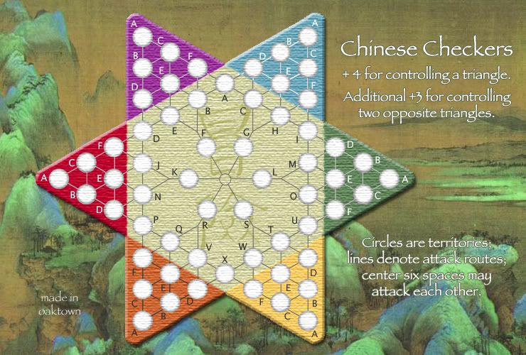
I know this throws the whole poll off - if you voted for corners but like this version better let me know and I'll run with it. It doesn't save as much space on the small map, but it's better than nothing.
Note that I just caught the nick in the red tip - that's easy to fix.
Posted: Fri Feb 02, 2007 10:30 pm
by Selin
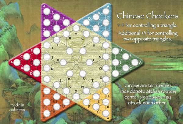
i voted for corners, but this version is ok
Posted: Sat Feb 03, 2007 1:48 am
by sully800
I definitely like the new version the best- It's a compromise between the points and the old rounded corners. But I like all 3 decently, just not as much as the chopped corners.
Posted: Sat Feb 03, 2007 9:36 am
by Guiscard
Agreed.
Posted: Sat Feb 03, 2007 9:41 am
by bonobo`s son
oaktown wrote:Just in case things weren't confusing enough, here's a MUCH better version of the board with rounded corners.
I know this throws the whole poll off - if you voted for corners but like this version better let me know and I'll run with it. It doesn't save as much space on the small map, but it's better than nothing.
Note that I just caught the nick in the red tip - that's easy to fix.
this onw is the best with rounded corners bt still like the points more
Posted: Sat Feb 03, 2007 10:45 am
by Enigma
new corners are perfect
Posted: Sat Feb 03, 2007 12:12 pm
by Lone.prophet
checkers is supushed to have pointed corners
Posted: Sat Feb 03, 2007 1:37 pm
by oaktown
Lone.prophet wrote:checkers is supushed to have pointed corners
Sure, but which would you rather play on?
Thanks to all for the quick feedback - I agree that the rounded corners flow with the background art better. Here's a small version...
In other news, the XML is done and checked. I still have to fine tune the coordinates to make them all as close to center as possible.
I still have lingering doubts about the bonuses. When we play-tested it, four seemed pretty big for a triangle. The equivalent territory on the standard map is Africa: six territories, three borders to hold, four countries it can attack to. Certainly, this map will not play like the standard map, and the case can be made that Africa should be worth four, but it gives a basis for comparison.
I'm thinking it may make for more interesting play if we gave 3 for each triangle, and an additional 4 for holding opposite triangles - 10 total, not 11, but it makes working for an opposite even more attractive.
Posted: Sat Feb 03, 2007 3:07 pm
by reverend_kyle
I dont like the background too lord of the ringsy.
Posted: Sat Feb 03, 2007 3:56 pm
by Sargentgeneral
i agree with kyle, i think there could be something better, something that more represents the style of the map you have.
Posted: Sat Feb 03, 2007 5:06 pm
by Enigma
oaktown wrote:I still have lingering doubts about the bonuses. When we play-tested it, four seemed pretty big for a triangle. The equivalent territory on the standard map is Africa: six territories, three borders to hold, four countries it can attack to. Certainly, this map will not play like the standard map, and the case can be made that Africa should be worth four, but it gives a basis for comparison.
I'm thinking it may make for more interesting play if we gave 3 for each triangle, and an additional 4 for holding opposite triangles - 10 total, not 11, but it makes working for an opposite even more attractive.
that sounds like a good idea. i agree that 4 is a little high, when it wouldnt take much to get a lucky placement and take over a triangle in the 1st round.
Posted: Sat Feb 03, 2007 6:30 pm
by Gamera
I really like the look of this. The last one posted was fantastic, and I personally think it looks excellent with that background. My only real issue is that of cards.
As such, everything is labeled with letters (A-F) that repeat seven times so you'd have to name the territories A (purple) or F (green) to avoid that. And while it's kind of ugly, it's not too cumbersome.
Posted: Sat Feb 03, 2007 7:59 pm
by oaktown
Gamera wrote:As such, everything is labeled with letters (A-F) that repeat seven times so you'd have to name the territories A (purple) or F (green) to avoid that. And while it's kind of ugly, it's not too cumbersome.
The way I've set it up in the XML is "Green-A" or "Yellow-C" with the non-triangle spaces being "Center-X" etc. I'd started with "White" for the center labels, but we've since ditched the white. If somebody has a better idea I'm listening, but I think it's important to start with the colors rather than the letters.
As for the background, I liked the earlier comment about this being the game the Chinese generals play far from the actual conflict, and so I think it works with whatever 'theme' I have going. I also played around with some black and white bamboo paintings, but the more the board colors took shape to fit this background the more I liked it. And is this 12th Century Song Dynasty painting too Lord of the Rings, or was the Lord of the Rings look inspired by actual art of the middle ages?
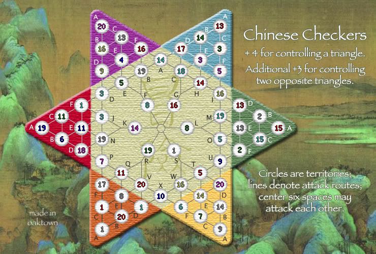
Here it is with numbers... I have a couple of coordinates to fix, but not many.
Posted: Sun Feb 04, 2007 12:12 am
by Enigma
oaktown wrote:And is this 12th Century Song Dynasty painting too Lord of the Rings, or was the Lord of the Rings look inspired on actual art of the middle ages?
Here it is with numbers... I have a couple of coordinates to fix, but not many.
wow. blue-c, purple-f, orange-b, maybe center-l, but it looks almost perfect.
lol if people r thinking this looks too elvish, the art for the elven cities were based on paintings like these, for the precise reason that the elves were portrayed as... strategizers... try reading the silmarillion by tolkein. if there was anyone who knew how to play risk it was the elves

this map looks beautiful.
the only last concerns i can think of are
a) the bonuses, to switch or not to switch
and b) the explanitory text in the bottom right is still hard to read. not really sure how to fix that
youve put a ton of work into this map and the result is, as gamera said, fantastic.
Posted: Sun Feb 04, 2007 1:10 am
by Gamera
Forgot to mention - I support the +3 for a triangle, +4 for opposite triangles movement.
As for the explanatory text, I can read it fine but I think making the outline darker by a percent or three should make it just dandy for all involved.
Posted: Sun Feb 04, 2007 3:13 am
by reverend_kyle
the second you make the background more chinese checkerish.. it is ready for quench.
I dont see any uncentralised numbers either.
Posted: Sun Feb 04, 2007 6:17 am
by gavin_sidhu
i think the background is fine as it is.
Posted: Sun Feb 04, 2007 8:58 am
by Wisse
seems great to me

Posted: Sun Feb 04, 2007 12:06 pm
by oaktown
reverend_kyle wrote:the second you make the background more chinese checkerish.. it is ready for quench.
I dont see any uncentralised numbers either.
The numbers are pretty damn close, as I used the same x coordinates for each column, y for each row, etc. A couple are off, but some appear off-centered because every army circle is a bit different - this is the nature of the random texture, as some lighter on the top, darker on the left side, etc. And some I've noticed others look off because the connecting line isn't in the correct spot, like the line between green-b and green-c.
I have more voices saying the background is good to go, but if there are any specific suggestions as to how to make it more "chinese checkerish" I'll entertain them. Some marbles laying to the side of the board maybe?
Posted: Mon Feb 05, 2007 1:42 am
by oaktown
somebody say marbles? Oh, I did.
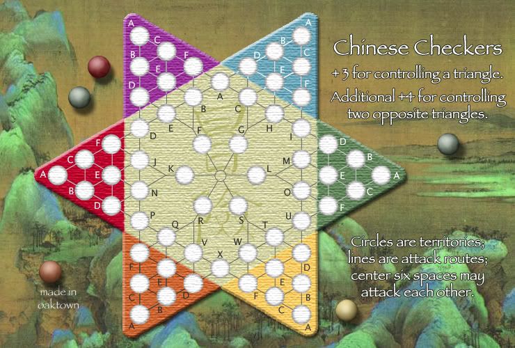
Hmm... I might hate them. Tell me what you think.
Also made the text a wee bit bigger, and with a darker border.
Posted: Mon Feb 05, 2007 2:15 am
by KEYOGI
Lose the marbles.

Posted: Mon Feb 05, 2007 3:14 am
by reverend_kyle
every other background you had was better.
Posted: Mon Feb 05, 2007 4:58 am
by gavin_sidhu
KEYOGI wrote:Lose the marbles.
Oh they look bad. I think your done as soon as you get rid of them (your background doesn't look like a table so it doesnt suit.)
Posted: Mon Feb 05, 2007 5:15 am
by Wisse
reverend_kyle wrote:every other background you had was better.
the background is fine...