Page 8 of 17
Re: The Citadel V11 (Pg1+12) [I]
Posted: Sat May 03, 2008 7:47 am
by bryguy
Kaplowitz wrote:TaCktiX wrote:Kaplowitz wrote:What if you made all of the buildings the same, buildingish color, but make the color of the text different to differentiate between continents? I think it would still be easy to tell what goes where, but it would look much more realistic, and therefore better.
Version 5. Been done before, people didn't like it that way.
I think thats just because so much was going on. Maybe now with the simpler map it would look nice.
that old look got me all confused about who could attack where and what could attack who and...
i think im even more confused now

Re: The Citadel V11 (Pg1+12) [I]
Posted: Sun May 04, 2008 1:26 pm
by TaCktiX
Version 12 will be significantly delayed, as my computer decided to reformat the drives that have the map's source PSD on it. Sorry about the delay.
Re: The Citadel V11 (Pg1+12) [I]
Posted: Mon May 12, 2008 5:05 pm
by laci_mae
Not a big deal Tack. Sorry about your computer troubles.
I think that Legend option 2 is the way to go. (From RJ's post)
LMR
Re: The Citadel V11 (Pg1+12) [I]
Posted: Tue May 13, 2008 1:44 pm
by yeti_c
This one...
RjBeals wrote: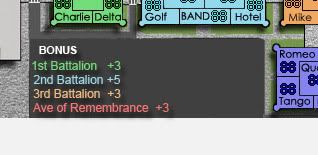
C.
Re: The Citadel V11 (Pg1+12) [I]
Posted: Wed May 14, 2008 12:30 am
by oaktown
alright, you just convinced me to back up my maps!
When you get back at it, keep in mind that sometimes less is more. The last update had a whole lot going on visually.
Re: The Citadel V11 (Pg1+12) [I]
Posted: Wed May 14, 2008 12:23 pm
by TaCktiX
oaktown, I reposted the old Version 5 to disprove someone's idea to put the buildings all one color and change the text to have a color glow. Version 11's a bit further up the page.
As for map status itself, I've got the entire background re-layered and all of 1st Battalion reconstructed (sans army numbers, haven't redownloaded the army circles PNG). That leaves 16 buildings to parse back out of the source layer, which I will work on today. Then I'll add those trees I was talking about.
Re: The Citadel V12 (Pg1+13) [I]
Posted: Thu May 15, 2008 3:48 am
by TaCktiX
Yes, this is no joke. From a JPG to a full PSD, with trees too!
Version 12
Updates:
- Added Trees
- Reverted the Sidewalk change so that shadows cover them again
- Cleaned up the crosswalks so they have universal 2 pixel width
- Rebuilt the PSD from the ground up
Small Version (600x461)
I'm going to throw in a large version later today, but comment to your heart's content in the meantime.

Re: The Citadel V12 (Pg1+13) [I]
Posted: Thu May 15, 2008 4:23 am
by yeti_c
"the tower" seems to be a bit disconnected from - the tower...
Consider - widening the tower slightly and then changing the wording to "Tower" and putting it into the territory.
C.
Re: The Citadel V12 (Pg1+13) [I]
Posted: Thu May 15, 2008 4:38 pm
by RjBeals
Wow... 100% better. Great update Tack. - Are you going to add army shadows (circles) to the map? Some of the armies may be hard to see (red on red, or blue on blue, or gray on gray). To prove me wrong, try posting some sample armies on the territs.
- Your grass & shrubs look great. My only suggestion would be to not blur them as much. The map's grass and buildings look sharp, so the bushes should be a little sharper as well.
- Your pathways are great. No change needed there.
- The comment "Parade deck resets to 3 when conquered" - does that mean if I attack it, and place 10 men there, those 10 men will disappear and 3 neutrals will replace them at the beginning of my next turn? eh.. I'm not sure about that. Maybe just have the parade deck start with like 10 neutrals. or even 6 neutrals will persuade most people not to attack until a few rounds into the game.
- I would suggest adding your real screen name "tacktix" instead of "TCX" to the map. That way, people can identify you. TCX means nothing to the 1000's of other cc members.
Overall - nice update tac. Sometimes, it's not a bad thing when our files are deleted.

Re: The Citadel V12 (Pg1+13) [I]
Posted: Thu May 15, 2008 5:09 pm
by TaCktiX
RjBeals wrote:Wow... 100% better. Great update Tack.
Thanks, it took a while to recreate it from flat JPEG.
Are you going to add army shadows (circles) to the map? Some of the armies may be hard to see (red on red, or blue on blue, or gray on gray). To prove me wrong, try posting some sample armies on the territs.
No I am not, and I posted in Versions 8-11 the army numbers to match, and they still showed up fine. I think I'm going to drop Support Battalion's color saturation a bit, but that's all it needs.
Your grass & shrubs look great. My only suggestion would be to not blur them as much. The map's grass and buildings look sharp, so the bushes should be a little sharper as well.
I disagree here. If you look on Google Maps (where I got inspiration for the trees, and their relative positioning), they look almost identical to what I've got, but they've got more black splotchiness from shadows. Now if you can help me come up with a way of manufacturing trees without excessive use of the Blur tool, I'll consider it.
The comment "Parade deck resets to 3 when conquered" - does that mean if I attack it, and place 10 men there, those 10 men will disappear and 3 neutrals will replace them at the beginning of my next turn? eh.. I'm not sure about that. Maybe just have the parade deck start with like 10 neutrals. or even 6 neutrals will persuade most people not to attack until a few rounds into the game.
The accessibility of the Parade Deck could become a serious gameplay concern. I'll put up a poll and see if people want it to start neutral, be killer neutral, or never neutral.
I would suggest adding your real screen name "tacktix" instead of "TCX" to the map. That way, people can identify you. TCX means nothing to the 1000's of other cc members.
Will do.
Overall - nice update tac. Sometimes, it's not a bad thing when our files are deleted.
Actually, it's virtually identical, but the small changes I made for the sidewalks and the trees made a massive difference.
yeti_c wrote:"the tower" seems to be a bit disconnected from - the tower...
Consider - widening the tower slightly and then changing the wording to "Tower" and putting it into the territory.
C.
This I can do.
Re: The Citadel V12 (Pg1+13) [I]
Posted: Thu May 15, 2008 5:21 pm
by gimil
I like the feel the trees add but there to blurred for my liking. Clashes with the sharpness of the rest of the map.
Re: The Citadel V12 (Pg1+13) [I]
Posted: Thu May 15, 2008 10:19 pm
by WidowMakers
gimil wrote:I like the feel the trees add but there to blurred for my liking. Clashes with the sharpness of the rest of the map.
I agree. They seem a bit out of place with this style. I do think they are an improvement however.
-I think the army circles are not needed. The map looks better without them but RJ is right we need to see how the numbers look on the roofs.
-I would like to see a little more texture or depth on the roofs. Lek the chapel. it just give the feel that these are actual buildings.
-Plus to give more depth have some of the buildings cast shadows onto the other sections of each building. The way you have it now, the sun is int eh north side of the map so , for example, make Thompson hall cast a little shadow onto Grimsley Hall. I think it might make the map feel more real.
WM
Re: The Citadel V12 (Pg1+13) [I] Parade Deck Poll 5/22/08 End
Posted: Thu May 15, 2008 10:28 pm
by TaCktiX
WidowMakers wrote:gimil wrote:I like the feel the trees add but there to blurred for my liking. Clashes with the sharpness of the rest of the map.
I agree. They seem a bit out of place with this style. I do think they are an improvement however.
Already have an edit on the books that addresses this. I'll see if you like the sharpened trees more, or if I'll have to start from scratch with a different tree process.
-I think the army circles are not needed. The map looks better without them but RJ is right we need to see how the numbers look on the roofs.
I'll stick a sample in next version, but Versions 8-11 showcase them, even on the hot pink Support Battalion (which is a Citadel injoke).
-I would like to see a little more texture or depth on the roofs. Lek the chapel. it just give the feel that these are actual buildings.
-Plus to give more depth have some of the buildings cast shadows onto the other sections of each building. The way you have it now, the sun is int eh north side of the map so , for example, make Thompson hall cast a little shadow onto Grimsley Hall. I think it might make the map feel more real.
I'm a little hampered by the fact that all of those buildings are the same height, with nothing on the roof save cornicework and air conditioning units (if applicable). Mark Clark Hall and Bond Hall have a little height differential, and each battalion's quad is on ground level of a 4-story building, and McAlister Field House has a dome shape to it surrounded by flatness, but the rest are virtually identical in height and lack of interesting things going on the roof. I'll do what I can with buildings that actually have the architectural capability for me to mess with them, but I'd like to take a limited amount of artistic license.
EDIT: Can oaktown please show up in this thread again and give it a gameplay lookover? Aside from the Parade Deck issue, I have heard ZERO gameplay discussion since I removed the Tower's ridiculous ability to bombard. I think my map is overdue for another hefty gameplay feedback session.
Re: The Citadel V12 (Pg1+13) [I] Parade Deck Poll 5/22/08 End
Posted: Fri May 16, 2008 12:32 am
by oaktown
I'm back... sorry about my confusion over the last version posted.
The Parade deck seems problematic to me, and I may now know why: it doesn't look like a territory in the traditional CC sence, because it's just a nebulous area in the middle of the map that some things can attack. Perhaps the green area needs to become the territory itself, with a black border befitting it's status. Bring the trees (which look nice, by the way) in off the street so we have a contiguous border around the entire rectangle of the Parade Deck. The pathways should cross the street but stop when they hit the border, just as they do when pathways hit other territories: e.g. the pathway doesn't enter the canteen, it stops at the door. And I think I might even consider taking the map title off of the of the Parade deck, since maps usually don't have legend or title info on a territory. You have space in the top left corner, which might be less distracting anyway.
As for how the Parade Deck plays, I like the killer neutral idea, and I agree that it should be set higher... it should be high enough that I'll think twice before using it to cross the board, but not so high that it is suicide to attack. Without the Parade Deck this map is just one, big, round bottleneck. If you get the Parade Deck right, this is a map with a (rare) unique gameplay feature.
Hmm, it really is a big round, 15 territory bottleneck from McAlister to Duckett, with a bunch of dead-ends tacked on around the outside. ROTC, President, Buyer, and School of English add nothing to the gamepay other than adding value to the region. Could President hit Byrd Hal? Buyer hit the Canteen? ROTC slide up to touch Commandant?
A line in the legend about pathways being attack routes wouldn't hurt... a representation of a pathways and the line "attack along paths" will do.
Re: The Citadel V12 (Pg1+13) [I] Parade Deck Poll 5/22/08 End
Posted: Fri May 16, 2008 2:18 am
by whitestazn88
i'm all for a never neutral with the parade deck. it would make the game so hard to play
like if the quad were always reverting to neutral in ccu, people would just horde and build and be gay
Re: The Citadel V12 (Pg1+13) [I] Parade Deck Poll 5/22/08 End
Posted: Fri May 16, 2008 11:36 pm
by laci_mae
Are we talking about starting neutral or reverting to neutral? I'm for starting neutral, but against reverting.
LMR
Re: The Citadel V12 (Pg1+13) [I] Parade Deck Poll 5/22/08 End
Posted: Sat May 17, 2008 12:28 am
by ZeakCytho
laci_mae wrote:Are we talking about starting neutral or reverting to neutral? I'm for starting neutral, but against reverting.
LMR
I agree with that. If you start with, say, ten neutrals, it will prevent someone from having the center in the first few rounds but allow for open gameplay from there on out. If you have killer neutrals, it really hinders the flow of the map. Having no neutrals at all makes it too open.
Re: The Citadel V12 (Pg1+13) [I]
Posted: Sat May 17, 2008 7:36 pm
by AndyDufresne
RjBeals wrote:Your grass & shrubs look great. My only suggestion would be to not blur them as much. The map's grass and buildings look sharp, so the bushes should be a little sharper as well.
I just came across this latest update, and this was the first thing that struck me.
--Andy
Re: The Citadel V12 (Pg1+13) [I] Parade Deck Poll 5/22/08 End
Posted: Sun May 18, 2008 11:32 am
by cairnswk
Apart from agreeing with Rj above, this is really looking great, TaCktiX.
Jut a small thing on your legend....while you have most text center justified on the map, see what the legend looks like if you have the right side (Support...Lee...Jenkins) right justified in line with the text of the Parade Deck. It might just tidy that area.

Re: The Citadel V12 (Pg1+13) [I] Parade Deck Poll 5/22/08 End
Posted: Mon May 19, 2008 10:22 am
by bryguy
Love how it looks now, good job tac!
1) Maybe lower the opacity a little on the brown trees
2) Yay! i can now read the legend! but its slightly blurry for some reason, could u clear it up?
3) I think that it should be killer neutral (the parade deck), cause since it connects with almost everything, it has a big advantage
4) If u decide not to have it killer neutral, then u should have it neutral 10 or 15, so that it cant easily be conquered.
5) Looking along the path, the curves at:
Mcalister field house
Canteen area
are really pixely (btw just look in the general area of the path in those areas)
6)
yeti_c wrote:"the tower" seems to be a bit disconnected from - the tower...
all i can see for now, and the map looks better than ever!!!
Re: The Citadel V12 (Pg1+13) [I] Parade Deck Poll 5/22/08 End
Posted: Tue May 20, 2008 7:42 pm
by TaCktiX
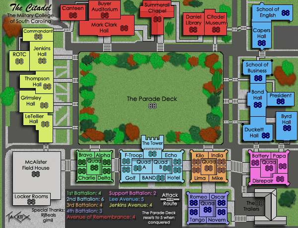
Version 13
Updates:
- Moved the trees onto the Deck and bordered it
- Added more trees to fill out the Deck
- Moved the paths back to the edge of the Deck
- Moved the title to the top left
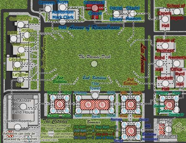
- Changed the Parade Deck killer neutral to 5 (poll is 3 for start neutral, 10 for killer, with comments saying "make it stronger")
- Changed my signature
- Made The Tower bigger and moved its title inside of it
- Added shadows to the Quads
- Added attack routes from Business to President, Canteen to Buyer, and ROTC to Commandant (forgot to add Byrd to President, on the To Do)
- Sharpened up the trees
- Added note of attack routes in the legend
- Moved bonus text around to make room for the attack route text
Small (600x461)
 To Do:
- Add Byrd to President Attack Route
- Depixelate the curved roads
Discussion Points:- I tried re-adding inner shadows to others buildings, and it just didn't look right, especially considering the actuality of campus. How about the Quads?
- Are the trees acceptable now?
- Any other gameplay/graphics notes?
- Could I have the poll taken down?
Re: The Citadel V13 (Pg1+14) [I]
Posted: Tue May 20, 2008 7:52 pm
by Kaplowitz
I still dont like the trees. They really dont fit the theme.
Re: The Citadel V13 (Pg1+14) [I]
Posted: Tue May 20, 2008 9:05 pm
by TaCktiX
The trees fill up a lot of empty space. Now that I look at them post-update, they look awful. I'll go back to the drawing board on creating them, but they're staying. And they DO fit the theme, as there are trees in virtually the same locations in reality (I took artistic liberty with how many trees, and what color, but they really do encircle the Deck).
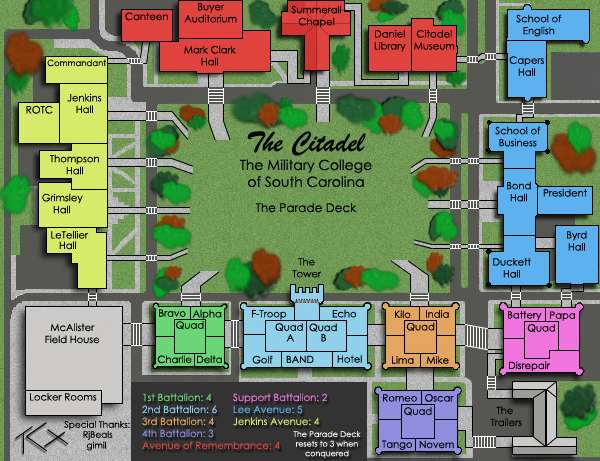
EDIT: Forgot the army placement notes. Here's the image:
I'll be editing 2nd battalion to have better-spaced borders, but I'm pretty sure if I notched an 888 test on everything, they'd be fine.
Re: The Citadel V13 (Pg1+14) [I]
Posted: Wed May 21, 2008 8:30 am
by gimil
Trees need a drop shadow.
Re: The Citadel V13 (Pg1+14) [I]
Posted: Wed May 21, 2008 8:32 am
by bryguy
hmm... i just noticed that 1 tree is different from the rest, the tree in the lower right corner. It looks like it has a drop shadow