[phpBB Debug] PHP Warning: in file [ROOT]/includes/bbcode.php on line 240: Undefined array key 1 [phpBB Debug] PHP Warning: in file [ROOT]/includes/bbcode.php on line 240: Undefined array key 1 [phpBB Debug] PHP Warning: in file [ROOT]/includes/bbcode.php on line 240: Undefined array key 1 Conquer Club • Re: Rail S America [21.11.13] BETA READY - Page 8
Re: Rail S America [13.8.13] V23S (p12) - Gameplay Done?
Posted: Tue Aug 20, 2013 5:26 pm
by cairnswk
iancanton wrote:
cairnswk wrote:So if you want to keep the fourth H line, i am thinking that maybe B FOR can be alleviated. Do you agree to return to 89 GN ?
i seem to remember that koontz suggested removing a whole load of neutrals to move up to the next golden number. do we have enough non-essential neutrals to do this? if not, then keep B FOR if possible because fortaleza is a well-known city, one of the largest in brazil. ESG in paraguay or VVI in bolivia are better candidates for removal, since they are obscure places whose elimination hardly changes any of the gameplay on the map.
OK, i'll take VVI out.
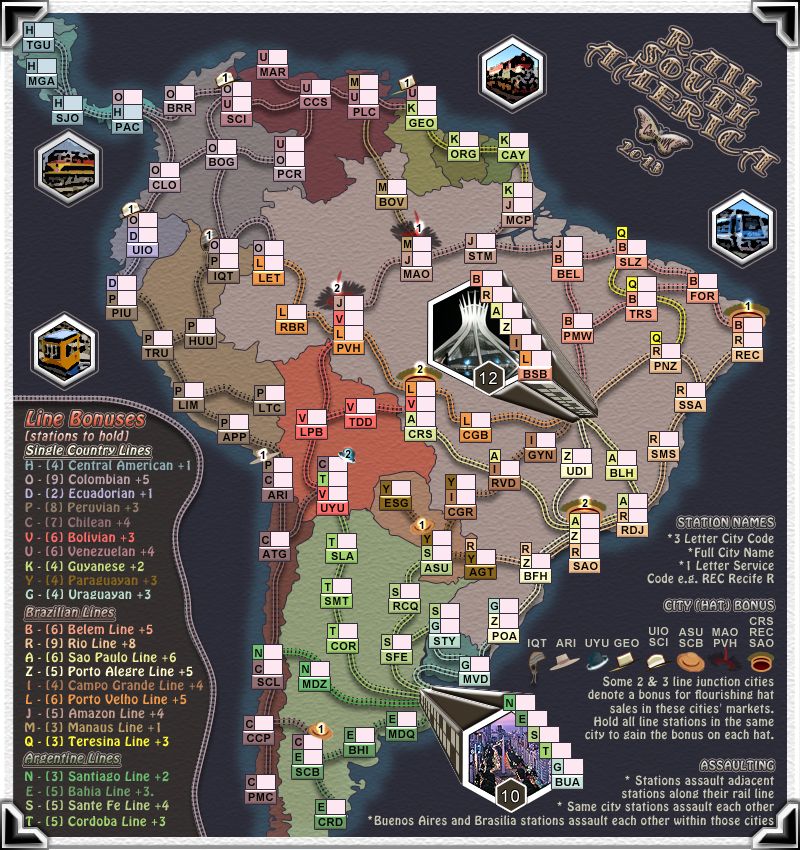
cairnswk wrote:these are the new bonuses i propose... These are worked with adjustments made for 1. minus hat bonuses
the hat bonuses haven't been deducted correctly: they have to be done at the end of the calculation, not in the middle, since each hat reduces the bonus by only 0.17 at the moment (the correct deduction is 0.5 for a 2-station hat and 0.67 for a 3-station hat).
ian.
this is the new bonus list with the hats removed at the end.
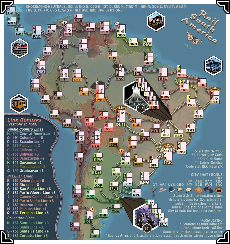
Line Bonus CONTINENT Plus Hat Bonus 1 H - Central America 0 3 O - Columbian 3 0 D - Ecuadorian 1 2 P - Peruvian 2 2 C - Chilean 3 1 V - Bolivean 3 2 U - Venezuelan 2 1 K - Guyanese 1 2 Y - Paraguayan 1 3 G - Uraguayan 0 4 B - Belem Line 1 6 R - Rio Line 2 4 A - Soa Paulo Line 2 4 Z - Porto Alegre Line 1 4 I - Campo Grande Line 0 3 L - Porto Velho Line 2 2 J - Amazon Line 2 1 M - Manaus Line 1 3 Q - Teresina Line 0 2 N - Santiago Line 0 2 E - Bahia Line 1 3 S - Santa Fe Line 1 2 T - Cordoba Line 1
But i am sorry, i have to say, i don't agree with many of those bonuses, particularly when some continents have 4 stations to defend but only get 3 to defend it with.
Re: Rail S America [13.8.13] V23S (p12) - Gameplay Done?
Posted: Wed Aug 21, 2013 12:45 pm
by koontz1973
Here you go cairns. Slightly over due and I apologise for that.
I know you and ian are still discussing the bonuses but I see no reason to hold you up any longer. Things can still be discussed and agreed on while you work on the graphics.
Re: Rail S America [13.8.13] V23S (p12) - Gameplay Done?
Posted: Wed Aug 21, 2013 3:05 pm
by cairnswk
Thanks koontz, most unexpected
Re: Rail S America [22.8.13] V23aS (p12) - GFX?
Posted: Wed Aug 21, 2013 7:11 pm
by cairnswk
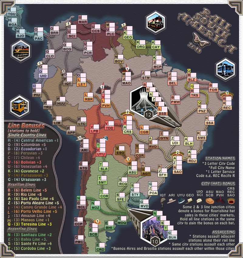
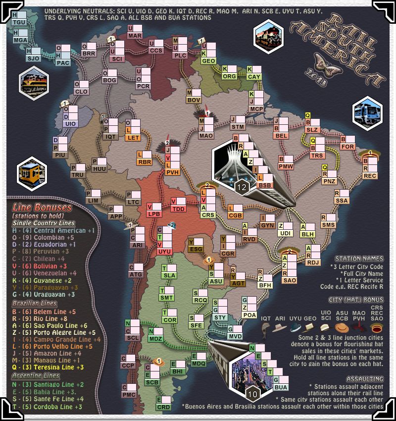
While waiting for ian to answer re gameplay.. i thought i'd try something a little different to see if anyone liked the direction. There was a request for some mountains a while back, so while i don't want to do the whole NZ thing that i did, i thought this might be a good compromise to compare against.
Re: Rail S America [13.8.13] V23S (p12) - Gameplay Done?
Posted: Wed Aug 21, 2013 7:25 pm
by isaiah40
Please keep what you have, IMHO, it looks 100x's better!!!
Re: Rail S America [22.8.13] V24S (p12) - GFX Suggestions?
Posted: Thu Aug 22, 2013 2:33 am
by cairnswk
Thanks for responding isaiah40.
Towards moving on with other stuff, i've found a new font for the title - Samba - very appropriate i think, so i've used that on major headings also. I've also enhanced (i think) the paper of the whole image with a sligthly course surface to give texture, and enhanced the buildings with the same outer glow & bevel/emboss.
Re: Re: Rail S America [22.8.13] V24S (p12) - GFX Suggestion
Posted: Thu Aug 22, 2013 2:35 am
by koontz1973
Really nice looking and I like all of the improvements.
Re: Rail S America [22.8.13] V24S (p13) - GFX Suggestions?
Posted: Thu Aug 22, 2013 9:14 am
by Gilligan
I REALLY like that texture.
Re: Re: Rail S America [22.8.13] V24S (p12) - GFX Suggestion
Posted: Thu Aug 22, 2013 4:43 pm
by cairnswk
koontz1973 wrote:Really nice looking and I like all of the improvements.
Gilligan wrote:I REALLY like that texture.
Thanks guys.
cairnswk wrote:
iancanton wrote:
cairnswk wrote:So if you want to keep the fourth H line, i am thinking that maybe B FOR can be alleviated. Do you agree to return to 89 GN ?
i seem to remember that koontz suggested removing a whole load of neutrals to move up to the next golden number. do we have enough non-essential neutrals to do this? if not, then keep B FOR if possible because fortaleza is a well-known city, one of the largest in brazil. ESG in paraguay or VVI in bolivia are better candidates for removal, since they are obscure places whose elimination hardly changes any of the gameplay on the map.
OK, i'll take VVI out.
cairnswk wrote:these are the new bonuses i propose... These are worked with adjustments made for 1. minus hat bonuses
the hat bonuses haven't been deducted correctly: they have to be done at the end of the calculation, not in the middle, since each hat reduces the bonus by only 0.17 at the moment (the correct deduction is 0.5 for a 2-station hat and 0.67 for a 3-station hat).
ian.
this is the new bonus list with the hats removed at the end.
Line Bonus CONTINENT Plus Hat Bonus 1 H - Central America 0 3 O - Columbian 3 0 D - Ecuadorian 1 2 P - Peruvian 2 2 C - Chilean 3 1 V - Bolivean 3 2 U - Venezuelan 2 1 K - Guyanese 1 2 Y - Paraguayan 1 3 G - Uraguayan 0 4 B - Belem Line 1 6 R - Rio Line 2 4 A - Soa Paulo Line 2 4 Z - Porto Alegre Line 1 4 I - Campo Grande Line 0 3 L - Porto Velho Line 2 2 J - Amazon Line 2 1 M - Manaus Line 1 3 Q - Teresina Line 0 2 N - Santiago Line 0 2 E - Bahia Line 1 3 S - Santa Fe Line 1 2 T - Cordoba Line 1
But i am sorry, i have to say, i don't agree with many of those bonuses, particularly when some continents have 4 stations to defend but only get 3 to defend it with.
Further for ian... UYU hat bonus was only 1. I have increased it to 2 inline with other 3 station hat bonuses.
Re: Rail S America [22.8.13] V24S (p13) - GFX Suggestions?
Posted: Thu Aug 22, 2013 6:16 pm
by cairnswk
I've added some building lights to side of BSB and BUA buildings.
Re: Rail S America [22.8.13] V24S (p13) - GFX Suggestions?
Posted: Thu Aug 22, 2013 11:30 pm
by RedBaron0
Gilligan wrote:I REALLY like that texture.
I REALLY like her mane! : sorry, bad pony joke XD :
But... I figure my job is gonna be pretty easy here. I will through something out for debate though, the hat bonus, would it be better to put the bonus value in the legend instead of directly on the map? On the map the number may cause confusion as a player may see it as part of the territory name instead of the bonus's value. Or, you could put the numbers on both legend and the map hats. It could cause clutter, but also make it easier to identify, will depend on what looks best, and whatever makes the map most readable.
Re: Rail S America [22.8.13] V24S (p13) - GFX Suggestions?
Posted: Fri Aug 23, 2013 12:43 am
by isaiah40
I must say cairns, IMO, this is the best map you have made thus far graphically speaking!
RedBaron0 wrote:But... I figure my job is gonna be pretty easy here. I will through something out for debate though, the hat bonus, would it be better to put the bonus value in the legend instead of directly on the map? On the map the number may cause confusion as a player may see it as part of the territory name instead of the bonus's value. Or, you could put the numbers on both legend and the map hats. It could cause clutter, but also make it easier to identify, will depend on what looks best, and whatever makes the map most readable.
The problem with putting the bonus value in the legend is that you have a few which have different values, unless you place them beside the hats, which would make it cramped. I say keep them were they are, except the CRS/REC/SAO values. They are a tad hard to read with that red band on the hat. My suggestion would be to place the bonus value just above the red band and see if it is easier to read. That is all I can see.
Re: Rail S America [22.8.13] V24S (p13) - GFX Suggestions?
Posted: Fri Aug 23, 2013 3:50 am
by cairnswk
isaiah40 wrote:I must say cairns, IMO, this is the best map you have made thus far graphically speaking!
I think i'm learning eh!?
RedBaron0 wrote:But... I figure my job is gonna be pretty easy here. I will through something out for debate though, the hat bonus, would it be better to put the bonus value in the legend instead of directly on the map? On the map the number may cause confusion as a player may see it as part of the territory name instead of the bonus's value. Or, you could put the numbers on both legend and the map hats. It could cause clutter, but also make it easier to identify, will depend on what looks best, and whatever makes the map most readable.
The problem with putting the bonus value in the legend is that you have a few which have different values, unless you place them beside the hats, which would make it cramped. I say keep them were they are, except the CRS/REC/SAO values. They are a tad hard to read with that red band on the hat. My suggestion would be to place the bonus value just above the red band and see if it is easier to read. That is all I can see.
I have to agree with isaiah40... but first RB0..sorry, but "through" <- throw i don't like clutter, and i think the legend is already packed. I will move the bonuses around so they are more clearly visible. perhaps even a small increase in size.
Re: Rail S America [22.8.13] V24S (p13) - GFX Suggestions?
Posted: Tue Aug 27, 2013 7:32 am
by koontz1973
Suggestion for you. Now that you have the paper effect running over the map, the four corners are like frame clips, how about making them gold using the effect you perfected in Moscow?
Re: Re: Rail S America [22.8.13] V24S (p13) - GFX Suggestion
Posted: Tue Aug 27, 2013 10:22 am
by Aleena
good suggestion - either gold, or chrome... think it would make it pop...
Re: Rail S America [22.8.13] V24S (p13) - GFX Suggestions?
Posted: Tue Aug 27, 2013 12:23 pm
by isaiah40
koontz1973 wrote:Suggestion for you. Now that you have the paper effect running over the map, the four corners are like frame clips, how about making them gold using the effect you perfected in Moscow?
+1000 if you want to do it!
Re: Rail S America [22.8.13] V24S (p13) - GFX Suggestions?
Posted: Tue Aug 27, 2013 1:58 pm
by cairnswk
koontz1973 wrote:Suggestion for you. Now that you have the paper effect running over the map, the four corners are like frame clips, how about making them gold using the effect you perfected in Moscow?
Aleena wrote:good suggestion - either gold, or chrome... think it would make it pop...
isaiah40 wrote:
koontz1973 wrote:Suggestion for you. Now that you have the paper effect running over the map, the four corners are like frame clips, how about making them gold using the effect you perfected in Moscow?
+1000 if you want to do it!
so i don't think i'd like to go down that road of turning them gold or silver or whatever other colour. I think the map actually "pops" as it is...it also lifts its leg
thanks for the suggestions though
Re: Rail S America [22.8.13] V24S (p13) - GFX Suggestions?
Posted: Wed Aug 28, 2013 12:45 am
by koontz1973
cairnswk wrote:
koontz1973 wrote:Suggestion for you. Now that you have the paper effect running over the map, the four corners are like frame clips, how about making them gold using the effect you perfected in Moscow?
so i don't think i'd like to go down that road of turning them gold or silver or whatever other colour. I think the map actually "pops" as it is...it also lifts its leg
thanks for the suggestions though
Fair enough, but can I ask you to make the ones you have look like the adhesive pads (I have used them in my wedding album) and not some god awful clip art then?
cairns, please do not get me wrong on this, the map looks bloody fantastic, as for ideas and suggestions go to make it better, I cannot think of another one or see anything wrong with the map. You have surpassed your best by a mile. So without blowing too much smoke up your arse, the map looks fantastic, the corners now look like shit. So I think I will have one more go at asking you to change them for something different.
This is the one you linked to and it looks worse than the ones you have so not really a good argument for keeping your ones.
But if you really did not like the look of those ones, here are some more ideas allowing you to change the look easily and giving it a bit more. [spoiler=glass photo frames]Your corners made into two simple silver bars. [bigimg]http://kenro.co.uk/wp-content/uploads/BlackGlassSingle_Frames-BG1015-1-Black-Glass.jpg[/bigimg] A straight forward plastic frame. I know it is pink but I found it on a girly site. It can be any colour, black, pink or even gold. [bigimg]http://blog.divabelle.com//HLIC/d353c8bd226ea278ce352d37b3b5f7b6.png[/bigimg] Here are the clips I asked for at first, back only here [bigimg]http://blog.ukpictureframingsupplies.co.uk/wp-content/uploads/2013/01/sswiss_clip_frame1.jpg[/bigimg] But placing them in the normal style of north, east, south, west In the corners two in each corner [/spoiler] Sorry to bug you cairns over this, I promise to not turn this into gold frame like Moscow.
Re: Rail S America [22.8.13] V24S (p13) - GFX Suggestions?
Posted: Wed Aug 28, 2013 4:52 am
by cairnswk
koontz, you initially asked me to turn them to Moscow gold and i said i wouldn't go down down that road.
While i am happy with them, you then asked me to do something with them, which i will endeavour to do for you, but don't expect too much as i don't want to take it too far away from the idea of being a photo? in an album which is a design CC doesn't have.
unlike your ideas that you've conveyed to me with Moscow gold that seems to suit your vision for the map, my idea for this map is that it is not to be sparkling gold or silver or any other colour.
I am quite displeased with your insult about the corners describing the corners as you did...clipart. and shit. Those parts are indeed hand drawn vectors in PS5 and not clipart borrowed from somewhere. There is no need to use that sort of insult. As for blwoing smoke up my arse, well what can i say execpt you sir are totally uncooth., and if you're going to use that sort of labguage in my thread, then please don't bother coming back...boy in blue or not.
Re: Rail S America [22.8.13] V24S (p13) - GFX Suggestions?
Posted: Wed Aug 28, 2013 7:05 am
by koontz1973
cairnswk wrote:While i am happy with them, you then asked me to do something with them, which i will endeavour to do for you, but don't expect too much as i don't want to take it too far away from the idea of being a photo? in an album which is a design CC doesn't have.
This is all I ask. I know from what I have seen of your work, you can take the most mundane of ideas and turn it into gold dust. I promise to not get my hopes up.
cairnswk wrote:I am quite displeased with your insult about the corners describing the corners as you did...clipart. and shit.
I really did not mean to insult you over them and I know the ones you have are drawn by you and not a short cut via clip art and I never said anything or even implied it. But to say they are as good as the rest of the map, I would have to stand by my original statement but remove the offending words which are probably a bit harsh. But come on cairns, my words are not that bad so please do not get overly offended by them. I did not mean them in any way as an insult to you but to try and convey my feelings of admiration for your skill without giving you a big head, or have I just insulted you again?
Re: Rail S America [29.8.13] V25S (p13) - GFX Suggestions?
Posted: Wed Aug 28, 2013 6:41 pm
by cairnswk
koontz1973 wrote:....But to say they are as good as the rest of the map, I would have to stand by my original statement...
and that was all that was needed koontz, the other rhoetirc was not required.
Still waiting to hear from ian re the bonuses discussion from previous page.
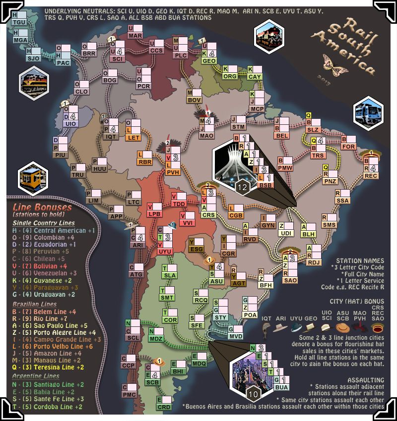
Version 25. 1. bevelled the corners 2. same styles applied to the train photos as the title 3. underlying neutrals text removed - always intended never to be there permanently
Re: Rail S America [29.8.13] V25S (p14) - GFX Suggestions?
Posted: Wed Aug 28, 2013 10:33 pm
by cairnswk
pls note the xml file is only there for centering purposes
Re: Rail S America [30.8.13] V26S (p14) - GFX Suggestions?
Posted: Fri Aug 30, 2013 3:26 am
by cairnswk
Version 26. Some changes to the corners as requested....not sure they are perfect yet, but getting there towards what i envisage.
Re: Rail S America [31.8.13] V27S (p14) - GFX?
Posted: Fri Aug 30, 2013 5:32 pm
by cairnswk
Version 27.
1. the photos, legends and title have had their opacity lowered so that the map stands out more as the central image 2. the legend bonuses are changed to the new bonuses that were calculated as normal minus any hat bonus that is available when the hat is gained 3. the rail line has been removed from the legend...i think it simplifies the map and gives the bonus legend the same treatment as the other texts therefore not setting it apart.
Re: Re: Rail S America [31.8.13] V27S (p14) - GFX?
Posted: Sat Aug 31, 2013 1:01 am
by koontz1973
cairns, nice idea to remove the line around the legend, but with the lower opacity, I am finding it hard to read. Can you bring it up some. Maybe half way between what you have now and what was before. As for the corners (much better by the way already), should they not go to the top and cover some of TGU station (as long as you can read the line and station name).


 [/spoiler]