Page 7 of 19
Posted: Mon Sep 17, 2007 12:02 am
by reverend_kyle
oaktown wrote:unriggable wrote:Army circles and angle of F is screwy.
I think they're army footballs, not army circles.
And yeah, F will take some getting used to, but i appreciate that it's different from everything else we have. The other options just look like the current Canada map with softer colors.
I think F is wonderful, it's alot better than san francisco but the same style. which I much appreciate.
I'd guess that D is pepperonibread and F is johloh
Posted: Mon Sep 17, 2007 12:14 am
by Unit_2
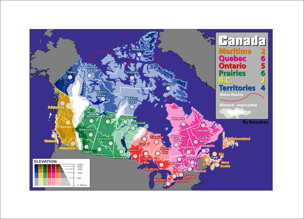
Keredrex wrote:jako wrote:Unit_2 wrote:did you guys see that the names of Quebec and Ontario are back-words in F?
backwords?
seriously, im looking over it 5 times now, and i cant see which are backwards. i even went back to check the original, but i still cant see what backwards names u are refering to in quebec and bc.
he is referring to the bonus legend..... he swapped the colors of quebec and ontario
thats not what i was saying. i was talking about the names of Quebec and Ontario, it says that Quebec is Ontario and Onterio as Quebec .
Posted: Mon Sep 17, 2007 12:47 am
by edbeard
Unit_2 wrote:thats not what i was saying. i was talking about the names of Quebec and Ontario, it says that Quebec is Ontario and Onterio as Quebec .
actually it is what you're saying. if you switched the colours then it would be correct.
edit: Also I think the same thing is true for B.C and Maritimes
Posted: Mon Sep 17, 2007 2:28 am
by reverend_kyle
edbeard wrote:Unit_2 wrote:thats not what i was saying. i was talking about the names of Quebec and Ontario, it says that Quebec is Ontario and Onterio as Quebec .
actually it is what you're saying. if you switched the colours then it would be correct.
edit: Also I think the same thing is true for B.C and Maritimes
Whoever made F is geographically challenged..
Actually this stresses the importance of a revamp, currently it is very hard to understand wtf is going on.. In B they have wrong territory borders up north near taloyoak because its so hard to figure out.
Posted: Mon Sep 17, 2007 4:56 pm
by d.gishman
Unit_2 wrote:thats not what i was saying. i was talking about the names of Quebec and Ontario, it says that Quebec is Ontario and Onterio as Quebec .
you are right -- also, BC and the Maritimes are messed up as well
Posted: Mon Sep 17, 2007 5:54 pm
by Keredrex
edbeard wrote:actually it is what you're saying. if you switched the colours then it would be correct.
edit: Also I think the same thing is true for B.C and Maritimes
Edbeard is right About F… It needs the colors in the legend Swapped between Quebec & Ontario... And B.C. With Maritimes...
Otherwise the Names on the Map Appear to be Correct
Personally I am a little surprised with the Poll Counts.. I think Many of the votes for D are from people who didnt want the Canada map changed... So allowing the the original cartographers name up there gave them an easy voting choice...not that it is a bad map... I just wonder how different the poll woulf be if it was all completely anonomous
Posted: Mon Sep 17, 2007 7:39 pm
by WidowMakers
Keredrex wrote:edbeard wrote:actually it is what you're saying. if you switched the colours then it would be correct.
edit: Also I think the same thing is true for B.C and Maritimes
Edbeard is right About F… It needs the colors in the legend Swapped between Quebec & Ontario... And B.C. With Maritimes...
Otherwise the Names on the Map Appear to be Correct
Personally I am a little surprised with the Poll Counts.. I think Many of the votes for D are from people who didnt want the Canada map changed... So allowing the the original cartographers name up there gave them an easy voting choice...not that it is a bad map... I just wonder how different the poll woulf be if it was all completely anonomous
Yes the colors need to be swapped and the football shaped army circles on F need to be changed too.
They look very rushed. That might be why the colors are wrong too.
As far as why people voted for D, I do not see a problem with having the original cartographers name on there. The last competition had the original name on there too.
Maybe people voted for D because they liked it.
Posted: Mon Sep 17, 2007 8:09 pm
by unriggable
WidowMakers wrote:Maybe people voted for D because they liked it.
Actually, you'd be surprised.
Why do you think Bush won the '04 election?
Posted: Mon Sep 17, 2007 8:20 pm
by Keredrex
WidowMakers wrote:
Maybe people voted for D because they liked it.
I didn't say they didn't... Remember many club members liked the alien version even though it was all just a joke.....
all I mean is how many votes are there because of random votes, or "It looks Cool in the 10 seconds I looked at it Votes", or "Dude I made a map vote for mine" and that person has 20 friends online who barely looked at the maps.....
I could be wrong of course and I hope I am... But maybe the maps should of been up for awhile before the Poll was added....
I Still think it would only be fair for all makers to get a last run based on feedback before the final.... Or at least B & F... Which I think are the top 2...
in my opinion....the rest are fighting for 3rd no matter what the polls say
Posted: Mon Sep 17, 2007 8:32 pm
by WidowMakers
Keredrex wrote:I Still think it would only be fair for all makers to get a last run based on feedback before the final.... Or at least B & F... Which I think are the top 2...
in my opinion....the rest are fighting for 3rd no matter what the polls say
Based on the rules, the top vote getter is the winner and moves on to FF.
But even if it is decided to take the top 2, D and F are currently the leaders.
EDIT: I guess the rule do not actually say the top vote getter makes FF. My Bad.
Posted: Mon Sep 17, 2007 10:39 pm
by Coleman
D is really really really nice. It's too bad.

Posted: Mon Sep 17, 2007 11:14 pm
by MR. Nate
F is really really really nice too, and I think it's great.

Posted: Mon Sep 17, 2007 11:20 pm
by Coleman
Well, I think cairnswk may actually want to run this a lot more then me, so we'll wait for his word on it. Hope you guys don't mind us having powers now. I'll try not to be scary.

err wrong face.

<- Much better.
Promise this will get moving again soon, you've all been waiting long enough.
Posted: Tue Sep 18, 2007 5:35 am
by WidowMakers
Coleman wrote:Well, I think cairnswk may actually want to run this a lot more then me, so we'll wait for his word on it. Hope you guys don't mind us having powers now. I'll try not to be scary.
What if we do mind? WIll you give them up?.
I AM KIDDING!!!!
You two guys will do a great job. You both see things from a little different perspective and post your feelings when people ask. You will be an asset to the site I am sure. Good Luck.
Posted: Tue Sep 18, 2007 6:34 am
by cairnswk
Coleman wrote:Well, I think cairnswk may actually want to run this a lot more then me, so we'll wait for his word on it.
Hey Coleman...we run across each other in another country! Amazing!

Actually no, i don't want to run this alot more than you...we gotta work this all out together and repsect each others opinions. [How nice!
]
Hope you guys don't mind us having powers now. I'll try not to be scary.
Yeh me 2!!
err wrong face.
<- Much better.
Promise this will get moving again soon, you've all been waiting long enough.
I'm only about 8 hours behind this annoucement, but that's kewl.

Posted: Tue Sep 18, 2007 6:45 am
by cairnswk
For the record...i voted E.
my reasons....
* although totally away from the original style, i liked the crisp freshness of it.
* I dont' beleive it was finished ( and i could be wrong - forgive me if i am), and had great potential to go somewhere.
* I like the simplicity of the title word over the maple leafs.
* the text was large and unassuming and very legible
* the colours are easy on MY eyes
* most tert names sit well within the confines of their actual tert and wouldn't have needed too much adjusting
* and plenty of room for armies
That's my personal preference.
Now onto the actual contest, i'm just checking rules etc and will post something again soon.
Posted: Tue Sep 18, 2007 7:06 am
by cairnswk
WidowMakers wrote:Coleman wrote:Well, I think cairnswk may actually want to run this a lot more then me, so we'll wait for his word on it. Hope you guys don't mind us having powers now. I'll try not to be scary.
What if we do mind? WIll you give them up?.
I AM KIDDING!!!!
You two guys will do a great job. You both see things from a little different perspective and post your feelings when people ask. You will be an asset to the site I am sure. Good Luck.
Thanks WM....i'm sure we can work on a proliferation of US-OZ treaties or similar. Thank you for your wishes
I don't see this as a power position, but one of co-operation and proactive productivity **Cairns likes these buzz words **... co-operation with the forum to ensure the guideline are meet, and proactive productivity to ensure that maps don't sit for too long without being "gently nudged".
Posted: Wed Sep 19, 2007 6:31 pm
by Coleman
Gently nudged. We've put the Keyogi cricket bat away. As effective as he was with it, it just feels awkward in my hands. Also, since I have the go ahead...
*************************************************************
The competition is closed with the following results:
-----------------------------------------------------------
Vote for your favourite Canada REVAMP
A
6% [ 6 ]
B
13% [ 12 ]
C
10% [ 9 ]
D
18% [ 17 ]
E
2% [ 2 ]
F
48% [ 44 ]
Total Votes : 90
-----------------------------------------------------------
Congratulations to our winner WidowMakers
The map will now go through the usual foundry process. Map image is below, so let the feedback begin.

*************************************************************
Posted: Wed Sep 19, 2007 6:40 pm
by Kaplowitz
Coleman wrote:Congratulations to our winner WidowMakers
Youre kidding me....
Posted: Wed Sep 19, 2007 6:45 pm
by Keredrex
Good job Widow Had a feeling that was yours.... I Still think All submissions should of gotten a second go Based on feedback it might of made the COMPETITION a bit more interesting
Here was My 2nd go after what was said in the posts....
http://i239.photobucket.com/albums/ff11 ... KREXv2.jpg
And I would like to know who made all the maps since the decision has been made Why Not it might help for future collaborations
Posted: Wed Sep 19, 2007 6:51 pm
by Gilligan
I was really hoping for D.
Posted: Wed Sep 19, 2007 6:52 pm
by Coleman
Gilligan wrote:I was really hoping for D.
I was as well, but our final decision was not to do a revote or anything of that nature. I am confident WidowMakers can transform his version into something we all would like.
Posted: Wed Sep 19, 2007 6:55 pm
by Gilligan
Coleman wrote:Gilligan wrote:I was really hoping for D.
I was as well, but our final decision was not to do a revote or anything of that nature. I am confident WidowMakers can transform his version into something we all would like.
Of course he can. He's WidowMakers!
Oh, and Coleman, might want to fix the first page
Posted: Wed Sep 19, 2007 8:36 pm
by MR. Nate
It's already been mentioned that the Maritimes and B.C. have their colors switched on the list of bonuses, as to Ontario and Ottowa, so I'm assumint those will be changed. I'd like to see some changes to the yellow lines connecting the territories through water, they seem too cartoony for the rest of the map.
Posted: Wed Sep 19, 2007 9:31 pm
by WidowMakers
OK I want to address some of the issues brought up during the voting:
Q#1-Where did I get the images and can I use them.
A#1-I used a program called World Wind. It is made by NASA. It is basically a 3D earth and planet renderer. Here is the use statement:
Most data in World Wind is public domain and can be freely redistributed, although crediting World Wind and the data provider is encouraged.
So it is encouraged to credit World Wind but not required.
Q#2-Colors for the Legend names
A#2-While making the legend I initially had one layer of text and just changed the color of the font. I later changed the style to have the glow be the color. I accidentally switched the colors, They will be fixed.
Q#3-Army Circles Look pretty bad. Why?
A#3-Those were an after thought and they look a little better with numbers. I am open for any suggestion.
Q#4-The arrow across the mountains looks rushed
A#$-I made the arrow through the mountains because just cutting a great bit slit between them looked bad. I have no issue eliminating the arrow but I really don't want a big gap in the mountains.
Q#5-Are those mountains really in the correct spot. They look like they are not geographically correct.
A#5-I got them off of the globe. I think they are correct.


More to come.