Page 7 of 14
Posted: Sat Oct 13, 2007 6:54 am
by Gnome
DiM wrote:edit// why does crydee have 2 different glows? the first half is pink and the second is red

same problem for Riibinon. first half is red and second is magenta.
I changed the glows again, they should be consistent now
DiM wrote:also I'm having a lot of trouble reading the text on the map. it's very small. either make it a bit bigger or increase the size of the maps. you have plenty of spare pixels till you reach the limit.
Well I don't know when the rules got changed but I've never seen a rule telling that I could go over 800px for large and over 600px for small?
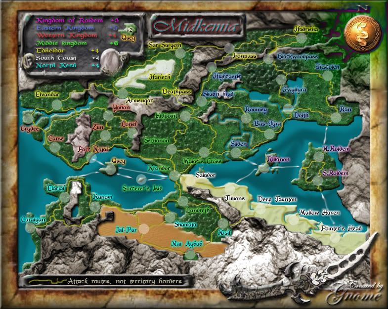
Big map

Small map

Posted: Sat Oct 13, 2007 12:20 pm
by DiM
Gnome wrote:DiM wrote:edit// why does crydee have 2 different glows? the first half is pink and the second is red
same problem for Riibinon. first half is red and second is magenta.
I changed the glows again, they should be consistent now
DiM wrote:also I'm having a lot of trouble reading the text on the map. it's very small. either make it a bit bigger or increase the size of the maps. you have plenty of spare pixels till you reach the limit.
Well I don't know when the rules got changed but I've never seen a rule telling that I could go over 800px for large and over 600px for small?
the glow is good now.
on the size issue maps can be up to 840*800 for large and 630*600 for small.
your map is 785*625 for large and 600*469 for small so you still have extra px till you reach the limit.
Posted: Sat Oct 13, 2007 12:31 pm
by Coleman
I like the text as it is now and would find it refreshing if every member didn't needlessly push their maps to the max size limit.
Posted: Sat Oct 13, 2007 12:34 pm
by DiM
Coleman wrote:I like the text as it is now and would find it refreshing if every member didn't needlessly push their maps to the max size limit.
i suggested to increase the map size because if he increases just the text then the landscape will be more covered. at least make the large version up to 800 px. i'm really finding things difficult to read because of the glow and the smallness of the font.
Posted: Sat Oct 13, 2007 12:36 pm
by The1exile
I can't see the new maps?
edit: nvm, now I can. gj!
Posted: Sat Oct 13, 2007 2:27 pm
by AndyDufresne
---
The Midkemia Map has reached the
‘Final Forge’ Stage. I've revived this thread from the pits of the Foundry furnace and have exmined the contents. Nearly every major concern has been addressed. If there are any other current concerns, please make your voice heard. If after a reasonable amount of time there has not been any objection or protest, the map will be deemed finished with the 'Foundry Brand' of approval and will be submitted for live play. As long as there is still discussion or posts that have yet to be commented on, the map will remain in
Final Forge until said discussion has reached the conclusion that the map has reached its final and polished version.
Post questions and concerns if any.
--Andy
Posted: Sat Oct 13, 2007 2:32 pm
by gimil
congratz

Posted: Sat Oct 13, 2007 2:36 pm
by DiM
gimil wrote:congratz
same
Posted: Sat Oct 13, 2007 4:41 pm
by Wisse
gratz gnome, you deserved it

Posted: Sat Oct 13, 2007 5:12 pm
by Mr_Niels
come on! i want to play this map dude!

i cant wait
Posted: Sun Oct 14, 2007 4:53 am
by Gnome
Thx guys
I added some new links to the files because Ripway wants me to upgrade to premium...
Large
 Small
Small

Posted: Sun Oct 14, 2007 12:22 pm
by Rebirth
Very nice, love the paths idea.
Posted: Sun Oct 14, 2007 1:32 pm
by Coleman
Well the readability of the text has been a constant issue. DiM has trouble reading it, which means a group of people are going to, he's just a representative.
I'd rather not see it change myself. I am not having any problems. I am wondering if it is possible to increase the text size slightly across the whole map and if it would help. I don't think you'd need to increase dimensions to pull that off.
Posted: Sun Oct 14, 2007 1:34 pm
by gimil
i think the text size can be increased by 1-2 pt there is plenty of space for it. I also think i can see a touch of white in the text (bevel?) If this was reduced of removed it may clear the text up a little.
Posted: Sun Oct 14, 2007 1:48 pm
by Coleman
Is bevel what happened to the Thai Burma map? I don't like that effect much if it was. I think a straight size increase with the glow should be enough.
Posted: Sun Oct 14, 2007 2:09 pm
by AndyDufresne
If possible, as is being discussed above, increase the text size slighty. I sometimes have trouble reading it (but only in some areas where 'normal words' aren't found...I.E. Blackwoodpass is easy...familiar words, but Hadrielia? Skabri hrad?)
--Andy
Posted: Sun Oct 14, 2007 2:51 pm
by Mr_Niels
this doesn't really is a priority but i should paint the title 'midkemia' white. its just a bit nicer i personally think
Posted: Sun Oct 14, 2007 4:20 pm
by Gnome
Ok I enlarged the font on the big and the small map with 1 pt
And I fixed the outerglow of Skabri hrad to make it easier to read
Better like this?
If possible, as is being discussed above, increase the text size slighty. I sometimes have trouble reading it (but only in some areas where 'normal words' aren't found...I.E. Blackwoodpass is easy...familiar words, but Hadrielia? Skabri hrad?)
I know it maybe somethimes hard to read but the names are so difficult I'm sure you will never 'miss deploy' armies because of the names...
this doesn't really is a priority but i should paint the title 'midkemia' white. its just a bit nicer i personally think
sure it looks nice...but when it's white it will be an "eye catcher" and that's not what it's meant to be...I made everything dark so you can concentrate on the game and doesn't get distracted by flashy colours...
Large map
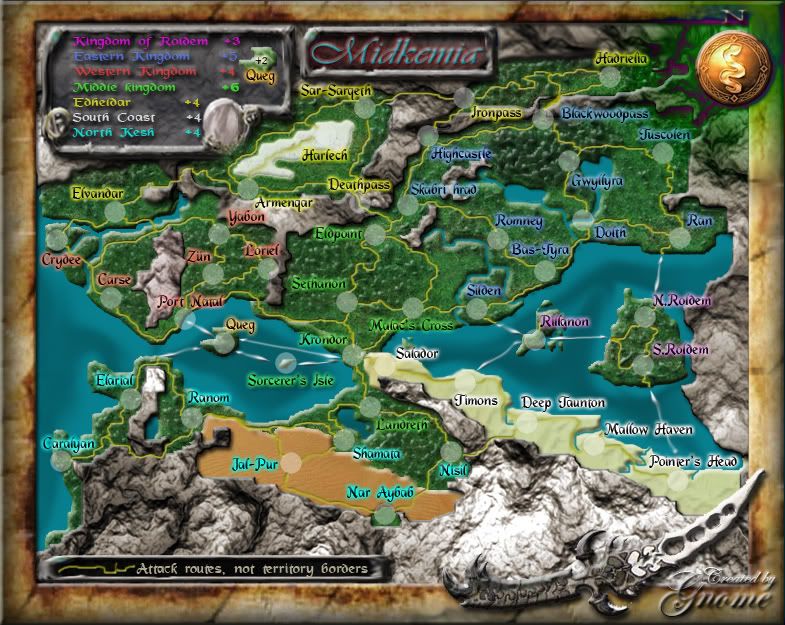 Small map
Posted: Sun Oct 14, 2007 8:27 pm
by unriggable
I like it...alot actually. Well fixed.
Posted: Mon Oct 15, 2007 4:43 am
by DiM
i like the new font size. the large map is perfect. the small map is also good. everything is readable. i have a bit of trouble at the legend but it's just a matter of getting 2 inches closer to the display which isn't hard to do. so in my opinion the font is ok. nice fix.
Posted: Mon Oct 15, 2007 5:33 am
by unriggable
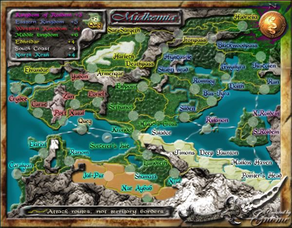
South Coast should be 3.
Posted: Mon Oct 15, 2007 6:56 am
by DiM
unriggable wrote:South Coast should be 3.
reasons?

Posted: Mon Oct 15, 2007 8:19 am
by oaktown
any chance the you can make each "+" a bit less crunched vertically? I know that players will automatically assume that they are plus signs, but they look like bullets especially in the small map.
Posted: Mon Oct 15, 2007 11:04 am
by Gnome
DiM wrote:unriggable wrote:South Coast should be 3.
reasons?
ya lol why? I see there are 4 diffrent ways to invade South Coast...from 4 diffrent continents...so I think +4 is good...
any chance the you can make each "+" a bit less crunched vertically? I know that players will automatically assume that they are plus signs, but they look like bullets especially in the small map.
Ok, I'll just make the + an other font...or just a bit bigger...on my screen it looks like a + but I noticed on school that there is a lot of diffrence between monitors...
Posted: Mon Oct 15, 2007 12:00 pm
by Coleman
DiM wrote:unriggable wrote:South Coast should be 3.
reasons?
He probably didn't see the Deep Jaunton - Nisil connection.