Page 7 of 22
Posted: Sun Jan 21, 2007 11:09 pm
by oaktown
all those lines in the middle hurt my head!

not very zen.
But yeah, the hexagon is too simple, and I'll play around with the lines. I'd like to represent the fact that those circles attack each other without actually having 13 lines criss-cross the center of the board.
I sense by the nature of the recent feedback that I'm pretty close - the latest suggestions are based on individual artistic taste, rather than issues of game play. I do not doubt that many of you will not like all of the artistic decisions that go into the final map, but I want everyone to know that I'm not dismissing any suggestions - they've made the map what it is. But at some point I have to be done with it, if only for my own sanity.
Posted: Mon Jan 22, 2007 1:20 am
by sully800
haha, I also thought putting all the lines in would be a bit confusing. I really just wanted to see what it would look like since I knew it would make an interesting pattern. I don't think it looks good enough to warrant keeping that design, I just wanted to post it so others could at least see the design.
Posted: Mon Jan 22, 2007 1:21 am
by Molacole
Do you think you could change the texture in the white part inside the circles where the armies go? The texture now seems like it blurs the border (circle outline in grey) of the circles, but not sure how much that would matter with numbers on it.
Posted: Mon Jan 22, 2007 2:26 am
by Wisse
make the lines darken because in some triangles i can't see them and make some of the letters darker (only the ones in the orange country, because its difficul to see if it is a f or a e
Posted: Mon Jan 22, 2007 11:15 am
by Marvaddin
oaktown wrote:Marvaddin wrote:Wont you even try a battle image for background??

send me one a good one and I'll drop it in there.
Check the images of this site:
http://www.ageofbattles.ru/
Also, if you dont like any, I got some interesting images to send you too, in this case, pm your e-mail.

Posted: Mon Jan 22, 2007 3:29 pm
by KEYOGI
I understand the reasons for getting rid of the centre circle, but is it really that bad of an idea to keep it? Would adding more circles to the middle help, making it more like a proper Chinese Checkers board?
Posted: Mon Jan 22, 2007 7:04 pm
by oaktown
KEYOGI wrote:I understand the reasons for getting rid of the centre circle, but is it really that bad of an idea to keep it? Would adding more circles to the middle help, making it more like a proper Chinese Checkers board?
Filling the center with circles would be ideal visually, but bad for game play. With the center circle we have 61 territories, and you have to hold five territorities to connect two opposing triangles. Without the center we're at 60, requiring four to connect. If the center was filled to complete the pattern, we'd have 78 territories, and it would take seven territories to connect two sides.
78 is a lot of territories on a small space, and more than half of those territories (42) would not be part of a bonus region, so the center of the board would go largely untouched until somebody was already in control of the game. Plus there aren't 42 letters in the alphabet, so I'd have to come up with an entirely new labelling system.
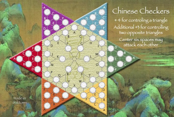
Posted: Wed Jan 24, 2007 12:42 am
by oaktown

OK, I'm quite satisfied with this latest image. Here's what's new:
• center six territories have been brought in toward each other to better emphasize that they can all attack each other... I think that between the legend and the new placement this should be quite clear. I played with other configurations, but i think this is the cleanest.
• lightened the attack lines between spaces in the red and purple triangles... I can do the same in blue and/or red if those of you with better color vision than I feel it's needed.
edit - lightened blue and red lines, darkened orange lines since enigma's post, below.
• very subtle shadow behind the board, as suggested.
• darkened the letters in orange, as suggested.
Marv, I checked out the site you suggested, and decided that I really like the juxtaposition of the peaceful Chinese landscape over a game of war strategy. In addition, I suspect the images at that site are not public domain.
I'll continue to take suggestions, but I'd like to think that major concerns have been addressed. If that is the case, I will redo the small version incorporating the latest changes, update the XML to reflect changes in territory names, and plot the territory coordinates.[/b]
Posted: Wed Jan 24, 2007 12:50 am
by Enigma
the lighter lines in purple and green are much better- def in red and maybe blue and orange as well
Posted: Fri Jan 26, 2007 12:36 am
by Coleman
Why do I feel the desire to set my coffee mug on it.

Posted: Fri Jan 26, 2007 7:51 am
by Selin
If you have a laptop you can do it. With a desktop it will be difficult to place your cup on the screen.

In any case be careful, if you want to use your computer also in the future.

Posted: Fri Jan 26, 2007 10:36 am
by boberz
i know iv said it a couple of times but i thought i would keep the comment in mind for others but i still prefer it in black, perhaps with a gold dragon i thought it would be authentic and it would look good. I know i keep mentioning it but i think it is so much better
Posted: Fri Jan 26, 2007 10:46 am
by Guiscard
Looking very nice Oaktown. The centre looks much better than the previous version but to my eyes it could look like the centre circles can only attack the circle accross from them rather than all the others. Maybe try a small circle of border in the middle to which all the others connect?
Posted: Fri Jan 26, 2007 6:48 pm
by AndyDufresne
Regarding Guiscard, I agree that it may seem like they only connect across from one another. Perhaps...

Something like that would get the point across easily I think.
Regarding a few other things, perhaps look into darker lines in the blue triangle, as they are almost too light. Maybe keep looking for a good tone that works in all, or two moderately different tones to use in the continents.
Also, the triangles touch corner, but aren't borders. I think people will understand they aren't borders, but might just extend the central zone slightly in between all triangles to give them a buffer zone.
--Andy
Posted: Fri Jan 26, 2007 8:07 pm
by Marvaddin
Does someone else think the red and the purple triangles are too bright?
Posted: Fri Jan 26, 2007 8:10 pm
by Bad Speler
come to think of it does seem a bit bright to me...
Posted: Fri Jan 26, 2007 9:30 pm
by Gilligan
oaktown wrote:OK, I'm quite satisfied with this latest image. Here's what's new:
• center six territories have been brought in toward each other to better emphasize that they can all attack each other... I think that between the legend and the new placement this should be quite clear. I played with other configurations, but i think this is the cleanest.
• lightened the attack lines between spaces in the red and purple triangles... I can do the same in blue and/or red if those of you with better color vision than I feel it's needed.
edit - lightened blue and red lines, darkened orange lines since enigma's post, below.
• very subtle shadow behind the board, as suggested.
• darkened the letters in orange, as suggested.
Marv, I checked out the site you suggested, and decided that I really like the juxtaposition of the peaceful Chinese landscape over a game of war strategy. In addition, I suspect the images at that site are not public domain.
I'll continue to take suggestions, but I'd like to think that major concerns have been addressed. If that is the case, I will redo the small version incorporating the latest changes, update the XML to reflect changes in territory names, and plot the territory coordinates.[/b]
When you say center 6 can attack, does that mean any one can attack any one?
Posted: Fri Jan 26, 2007 9:50 pm
by oaktown
Gilligan wrote:When you say center 6 can attack, does that mean any one can attack any one?
yes. if there is a more clear way to stating this in the map's legend please suggest it. I'll play with something in the center to break up the lines... maybe a hollow circle rather than a solid circle, as it looks a bit heavy.
as for wanting to put your cup on the map, I guess that suggests that it looks a bit less flat than it did originally.
Posted: Sat Jan 27, 2007 2:25 am
by Molacole
red and purple at the bottom with green and yellow at the top might help the blending of colours a bit?
Posted: Tue Jan 30, 2007 5:30 pm
by Wisse
you stopped? i like this map, so don't stop

Posted: Tue Jan 30, 2007 5:33 pm
by Guiscard
AndyDufresne wrote:Regarding Guiscard, I agree that it may seem like they only connect across from one another. Perhaps...
Something like that would get the point across easily I think.
Regarding a few other things, perhaps look into darker lines in the blue triangle, as they are almost too light. Maybe keep looking for a good tone that works in all, or two moderately different tones to use in the continents.
Also, the triangles touch corner, but aren't borders. I think people will understand they aren't borders, but might just extend the central zone slightly in between all triangles to give them a buffer zone.
--Andy
This but a hollow circle would be the best idea in my opinion.
Posted: Tue Jan 30, 2007 6:02 pm
by sully800
This idea certainly doesn't work but it looks cool:
I was thinking that you could just move all the circles even closer together to make it clearer. Then I thought, what if you just overlapped all 6? The problem with circles is that overlapping all 6 would leave no room for the numbers, to the image is interesting.

However, that did give me a thought- why does each army have to have its own circle? You could perhaps put one large circle in the center and have all 6 numbers inside of it. No connecting lines because they'd all be connected. However I don't think that would fit with the chinese checkers look, so like I said- it won't work.
Posted: Wed Jan 31, 2007 2:40 am
by oaktown
What's new:
- Hollow center circle. I think it works.
- Letters in center, yellow, and orange are dark grey, not black.
- Lighter attack lines in orange.
- Minor adjustments to some letter locations.
AndyDufresne wrote:perhaps look into darker lines in the blue triangle, as they are almost too light. Maybe keep looking for a good tone that works in all, or two moderately different tones to use in the continents.
When you say too light, you mean they're hard to read, or wrong artistically? I started with the same grey as the center, but they were unrecognizable against the blue. Any darker they're too heavy. I'd have to go lighter to make them more visible.
AndyDufresne wrote:Also, the triangles touch corner, but aren't borders. I think people will understand they aren't borders, but might just extend the central zone slightly in between all triangles to give them a buffer zone.
It would throw off the symetry - right now it's two overlapping triangles, like a star of david; in order for the triangles to not touch at all I'd have to make the triangles smaller or the hexagon bigger, which throws off the overall shape. I'm going to trust people to figure out that they're working on a hex grid style map, and that the lines are attack lines.
Alternatively, I could simply state in the legend that the lines represent attack lines between spaces.
I don't want to rework the small map until major issues are settled on this one.
Posted: Wed Jan 31, 2007 6:44 am
by Wisse
oaktown wrote:What's new:
- Hollow center circle. I think it works.
- Letters in center, yellow, and orange are dark grey, not black.
- Lighter attack lines in orange.
- Minor adjustments to some letter locations.
AndyDufresne wrote:perhaps look into darker lines in the blue triangle, as they are almost too light. Maybe keep looking for a good tone that works in all, or two moderately different tones to use in the continents.
When you say too light, you mean they're hard to read, or wrong artistically? I started with the same grey as the center, but they were unrecognizable against the blue. Any darker they're too heavy. I'd have to go lighter to make them more visible.
he didn't mean the font, he meant the lines, i can't see them good
Posted: Wed Jan 31, 2007 8:00 am
by insertnamehere
i would like to play this map , it is unique , theres nothing like it . however the lines on blue do need sorting out .