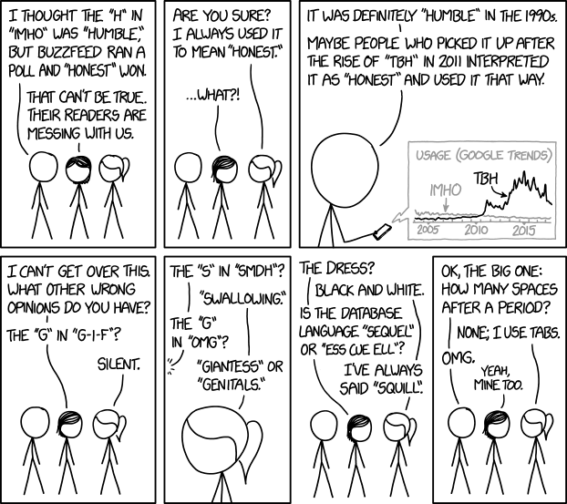
In the beginning, the rules of the space bar were simple. Two spaces after each period. Every time. Easy.
That made sense in the age of the typewriter. Letters of uniform width looked cramped without extra space after the period. Typists learned not to do it.
But then, at the end of the 20th century, the typewriter gave way to the word processor, and the computer, and modern variable-width fonts. And the world divided.
Some insisted on keeping the two-space rule. They couldn't get used to seeing just one space after a period. It simply looked wrong.
Some said this was blasphemy. The designers of modern fonts had built the perfect amount of spacing, they said. Anything more than a single space between sentences was too much.
And so the rules of typography fell into chaos. “Typing two spaces after a period is totally, completely, utterly, and inarguably wrong,” Farhad Manjoo wrote in Slate in 2011. “You can have my double space when you pry it from my cold, dead hands,” Megan McArdle wrote in the Atlantic the same year. (And yes, she double-spaced it.)
(...)
So the researchers, Rebecca L. Johnson, Becky Bui and Lindsay L. Schmitt, rounded up 60 students and some eye-tracking equipment, and set out to heal the divide.
First, they put the students in front of computers and dictated a short paragraph, to see how many spaces they naturally used. Turns out, 21 of the 60 were “two-spacers,” and the rest typed with close-spaced sentences that would have horrified the Founding Fathers.
The researchers then clamped each student's head into place, and used an Eyelink 1000 to record where they looked as they silently read 20 paragraphs. The paragraphs were written in various styles: one-spaced, two-spaced, and strange combinations like two spaces after commas, but only one after periods. And vice versa, too.
And the verdict was: two spaces after the period is better. It makes reading slightly easier. Congratulations, Yale University professor Nicholas A. Christakis. Sorry, Lifehacker.


