Actually..... no.... a lot of maps even within Europe were oriented differently.... but this is not worth arguing about. If this field really interests you I'm sure you can check it out before you conplain of "political correctness running rampant".
As you can see below, the Ptolemaic orientation (ie Greek-European) was only one of many, and not even the most prevalent, until at least the early 16th century. It is only with the rise and dominance of Europe, and particularly north-western Europe, from then onwards, that the orientation you mention becomes truly dominant and universally-accepted. To argue that this has nothing to do with emerging global power structures is, at the very least, naive....
Also note that Africa's position in the Mibi Flipside version is actually quite close to this continent's orientation on quite a few of the maps below.... Sometimes satire can actually prove the opposite point....
 http://en.wikipedia.org/wiki/File:Diagr ... 12th_c.jpg
The medieval T and O maps originate with the description of the world in the Etymologiae of Isidore of Sevilla (died 636). This qualitative and conceptual type of medieval cartography represents only the top-half of a spherical Earth.[4] It was presumably tacitly considered a convenient projection of the inhabited portion of the world known in Roman and Medieval times (that is, the northern temperate half of the globe). The T is the Mediterranean, dividing the three continents, Asia, Europe and Africa, and the O is the surrounding Ocean. Jerusalem was generally represented in the center of the map. Asia was typically the size of the other two continents combined. Because the sun rose in the east, Paradise (the Garden of Eden) was generally depicted as being in Asia, and Asia was situated at the top portion of the map.
http://upload.wikimedia.org/wikipedia/c ... script.pngThis map appears in a copy of a classical work on geography, the Latin version by Priscian of the Periegesis, that was among the manuscripts in the Cotton library (MS. Tiberius B.V., fol. 56v), now in the British Library. It is not intended purely as an illustration to that work, for it contains much material gathered from other sources, including some which would have been the most up-to-date available, although it is based on a distant Roman original (similar to the source of another 11th century world map, illustrating an edition of Isidore of Seville)- on which the network of lines appears to indicate the boundaries of imperial provinces. The date of drawing was formerly estimated at about AD 992-994, based on suggested links to the journey of Archbishop Sigeric of Canterbury from Rome[5] but more recent analysis indicates that, although the information was revised about that time, the map was probably drawn between 1025 and 1050.[6] Like the later map by al-Idrisi (see below) this map is clearly outside the largely symbolic early medieval mapping tradition, but equally it is not based on the famous Ptolemaic co-ordinate system. East is at the top, but Jerusalem is not in the centre, and the Garden of Eden is nowhere to be seen. Unusually, all the waterways of Africa, not just the Red Sea, are depicted in red (mountains are green). The depiction of the far East is ambitious, including India and Taprobane (Sri Lanka)- the latter depicted according to the exaggerated classical conception of its size. Unsurprisingly, Britain itself is depicted in some detail. Great Britain, unusually by medieval standards, is shown as one island, albeit with an exaggerated Cornish promontory, and Mona, Ireland and the many Scottish islands are all indicated. The cartographer is slightly confused by Iceland, depicting it both by a version of its classical name 'Thule', north-west of Britain, and as 'Island', logically linked with Scandinavia.
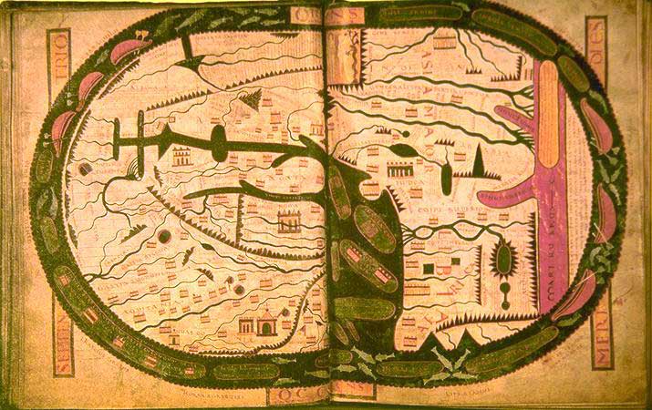
http://upload.wikimedia.org/wikipedia/c ... us_map.jpgBeatus of Liébana (c. 730 - 798) was a Spanish monk and theologian. He corresponded with Alcuin, and took part in the Adoptionist controversy, criticizing the views of Felix of Urgel and Elipandus of Toledo. He is best remembered today as the author of his Commentary on the Apocalypse, published in 776. The Commentary also contained one of the oldest Christian world maps. Although the original manuscript and map has not survived, copies of the map survives in several of the extant manuscripts.
http://upload.wikimedia.org/wikipedia/c ... eriana.jpgThe Arab geographer, Muhammad al-Idrisi, incorporated the knowledge of Africa, the Indian Ocean and the Far East gathered by Arab merchants and explorers with the information inherited from the classical geographers to create the most accurate map of the world at the time. It remained the most accurate world map for the next three centuries.
The Tabula Rogeriana was drawn by Al-Idrisi in 1154 for the Norman King Roger II of Sicily, after a stay of eighteen years at his court, where he worked on the commentaries and illustrations of the map. The map, written in Arabic, shows the Eurasian continent in its entirety, but only shows the northern part of the African continent.
On the work of al-Idrisi, S. P. Scott commented:
"The compilation of Edrisi marks an era in the history of science. Not only is its historical information most interesting and valuable, but its descriptions of many parts of the earth are still authoritative. For three centuries geographers copied his maps without alteration. The relative position of the lakes which form the Nile, as delineated in his work, does not differ greatly from that established by Baker and Stanley more than seven hundred years afterwards, and their number is the same. The mechanical genius of the author was not inferior to his erudition. The celestial and terrestrial planisphere of silver which he constructed for his royal patron was nearly six feet in diameter, and weighed four hundred and fifty pounds; upon the one side the zodiac and the constellations, upon the other-divided for convenience into segments-the bodies of land and water, with the respective situations of the various countries, were engraved."
http://upload.wikimedia.org/wikipedia/c ... i_1300.jpgThe Hereford Mappa Mundi is a detailed mappa mundi based on the T and O map style, dating to ca. 1300. The map is signed by one "Richard of Haldingham or Lafford". Drawn on a single sheet of vellum, it measures 158 cm by 133 cm. The writing is in black ink, with additional red and gold, and blue or green for water (with the Red Sea coloured red). The captions demonstrate clearly the multiple functions of these large medieval maps, conveying a mass of information on Biblical subjects and general history, in addition to geography.
http://en.wikipedia.org/wiki/File:Da-ming-hun-yi-tu.jpgChina developed sophisticated mapping techniques at about the same time as ancient Rome, and never lost them, so by the "medieval" period the country had been mapped with considerable detail and accuracy. When European mapping techniques caught up again at about AD 1300, Islamic contacts were able to supply new maps of the Mediterranean area to China, via the communication routes in the Mongol empire, and these prompted Chinese scholars to create world maps, with China at the centre and Europe, half-way round the globe, depicted very small and horizontally compressed at the edge. Significantly, Africa was also mapped from an Indian Ocean perspective, showing the Cape of Good Hope area, which Europeans would not visit until much later. The first examples, made in the 1320s, are lost, so the earliest survivor is the elaborate, colourful Da Ming Hun Yi Tu, painted on 17 sq. m. of silk in 1389 for the first Ming emperor.
http://en.wikipedia.org/wiki/File:DeVirgaDetail.jpgThe De Virga world map was made by Albertinus de Virga between 1411 and 1415. Albertin de Virga, a Venetian, is also known for a 1409 map of the Mediterranean, also made in Venice. The world map is circular, drawn on a piece of parchment 69.6x44 cm. It consists of the map itself, about 44 cm in diameter, and an extension containing a calendar and two tables.
http://upload.wikimedia.org/wikipedia/e ... ncomap.jpgAndrea Bianco's atlas of 1436 comprises ten leaves of vellum, measuring 29 X 38 cm., in an 18th century binding. The first leaf contains a description of the Rule of Marteloio for resolving the course, with the "circle and square", two tables and two other diagrams. The next eight leaves contain various navigation charts. The ninth leaf contains a circular world map measuring 25 cm in circumference. And the final leaf contains the Ptolemaic world map on Ptolemy's first projection, with graduation. Some believe Bianco's maps were the first to correctly portray the coast of Florida, as a macro-peninsula is attached to a large island labeled Antillia. Bianco also collaborated with Fra Mauro on the Fra Mauro world map of 1459.
http://upload.wikimedia.org/wikipedia/c ... a_Cosa.jpgJuan de la Cosa, a Spanish cartographer, explorer and conquistador, born in Santoña in the northern autonomous region of Cantabria, made several maps of which the only survivor is the Mappa Mundi of 1500. It is the first known European cartographic representation of the Americas. It is now in the Museo Naval in Madrid. Reproductions of it are given by Humboldt in his Atlas géographique et physique.


