Page 1 of 3
North America: to be revisited later

Posted:
Mon Jun 29, 2009 1:04 pmby oaktown
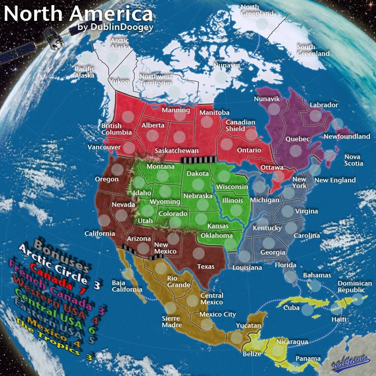
- Click image to enlarge.
Hi all,
I recently exchanged PMs with Dublin Doogey, the creator of the North America map, about reworking the visual side of the map a bit. I'm not proposing any changes to gameplay, connections, bonuses, or the basic layout of the map. But in playing the map recently I've had troubles making out connections, following the impassables, and sorting out the colors of the bonus regions. The basic play mechanics of the map are sound, I would just like to spend some time making it more player-friendly.
Below is the current map for reference. Visually there are some thing that I like about the simplicity of this map, and I'd like to keep things - legends, army circles, etc. - as close to where they currently are as possible to maintain continuity. My hope is to capture what I think Dublin was going for in the first place - the blue green ocean, clouds, mountains and rivers for impassables, etc.
Thanks to Dublin Doogey for his participation in this process, and for making a great map to begin with!

- Click image to enlarge.

Re: North America update?
Posted:
Mon Jun 29, 2009 1:07 pmby ManBungalow
I've never had a problem with the border clarity, but if you want to work the graphics of this map then I would like to see a complete graphics overhaul.
Oh, and maybe the regions could be more spread out somehow (I know that's what America is like, but there are massive regions at the top taking up all of the space needed by the smaller regions in the centre).
Re: North America update?
Posted:
Mon Jun 29, 2009 1:10 pmby Danyael
i think the colours are the biggest problem western and mid usa the same for me
Re: North America update?
Posted:
Mon Jun 29, 2009 1:12 pmby Incandenza
This is one of my all-time favorite maps, so I'm glad to hear that it might be visually refreshed...
There are a couple of small things that could be done to make lack of connections more clear: on the small map, the New York army circle is so close to (and overlaps a teeny bit) Ottawa that at first I thought they connected. Also, the Dakota-Illinois non-border could be clearer.
Re: North America update?
Posted:
Mon Jun 29, 2009 1:44 pmby thenobodies80
You can work on colors.
For example i hate tropic islands colors...everytime i think islands aren' t in the same zone of panama,etc....

Speaking like a "not american" doing army cirles with less opacity could help to see borders. (like idaho-montana on the small map).
Mountains could be done better, but only for the pleasure of my eyes

, impassable are clear, only a bit of confusion on texas-oklahoma-kansas on the small version. And explain on the map that mountains are impassables.
Borders are a bit pixellous , specially on the white part of the map, and too bold
Names typed with different size isn't so nice

, maybe some abbreviations ?
Water/background and finally water connections ?
i think it's all

Re: North America update?
Posted:
Mon Jun 29, 2009 2:26 pmby RjBeals
Ocean Texture
Borders (They are thick and sort of blurry)
Colors could be cleaned up a little.
Connections between the tropic islands
Army circle positions
Mountain Ranges
So pretty much anything..
Re: North America update?
Posted:
Mon Jun 29, 2009 2:31 pmby WidowMakers
RjBeals wrote:Ocean Texture
Borders (They are thick and sort of blurry)
Colors could be cleaned up a little.
Connections between the tropic islands
Army circle positions
Mountain Ranges
So pretty much anything..
100% agreed.
Re: North America update?
Posted:
Mon Jun 29, 2009 3:03 pmby Night Strike
Overall I like more about the way this map is than I dislike, but I do recognize some improvements could be made. Is there room for the small map to grow, both the playable area and the map size itself? I think that could help alleviate the main problems of overlapping army circles and unclear borders. I do like the simplistic layout of the bonus legend, so I hope that doesn't change much.
Re: North America update?
Posted:
Mon Jun 29, 2009 3:05 pmby the.killing.44
I think: The outer borders and rivers are pixelly; it's hard to see the USA connections so adding a glow to the borders, changing the font (
CAPITALS OF A SMALL FONT?), making the size uniform, and changing the army circle locations; like nobodies said the colors look inconsistent; mountain ranges look like little turds; background is

; the inner borders seem fuzzy; not sure how he got that shape for Greenland — you can alter it, bring it closer to the mainland (100% accuracy isn't needed is it?), and shrink the map; map the bonus key bigger (there is SO much dead space atm); the connections could be thinner and dashed/dotted; title could be more elegant.
There's my $0.02
.44
Re: North America update?
Posted:
Mon Jun 29, 2009 3:07 pmby oaktown
Night Strike wrote:Overall I like more about the way this map is than I dislike, but I do recognize some improvements could be made. Is there room for the small map to grow, both the playable area and the map size itself? I think that could help alleviate the main problems of overlapping army circles and unclear borders. I do like the simplistic layout of the bonus legend, so I hope that doesn't change much.
My approach to this is that if something isn't broken I shouldn't mess with it. The more that we can retain from the original to maintain the feel of the map the better.
Re: North America update?
Posted:
Mon Jun 29, 2009 4:46 pmby Industrial Helix
I really do not like the visual look of this map, so much to the point where I don't play it (though I just had a random map game that wound me up on it).
I think the gameplay is fine but my graphics crits are:
The colors need changing, don't strike me as "North American"
The rivers make it look like the continent is breaking up.
the borders aren't clear enough... the impassable mountains are too easily confused with the borders for me.
Everything is way to crowded in the middle, take Oklahoma for example.
Ocean doesn't look good to me.
My initial though would be to take a perspective approach on the continent, similar to Great Lakes. That way the North can be shrunk and the more important center enlarged, thus uncrowding places like Oklahoma.
Re: North America update?
Posted:
Tue Jun 30, 2009 1:07 amby RedBaron0
I agree, a graphical update would be nice. I agree with Helix, something along the lines of The Great Lakes map might be the way to go. A great way to achieve this would be to rotate the map clockwise a little bit. Pull Greenland closer to the main land mass to gain room in the northeastern corner. Abbreviation would help, and a key would help fill in dead space. The rivers need to be fixed that for sure... the fork in the Mississippi I think is hiding the entire state of Arkansas. Some sort of graphical accent might eb nice, something that screams "North America" not that I know what that is of course... it'd probably seem to USA to cover the whole continent.
Re: North America update?
Posted:
Tue Jun 30, 2009 5:57 amby Hatchman
I agree the map should be improved graphically. I'd be very eager to see what Oaktown comes up with given his previous works of art. Gameplay on this map is excellent, but I rarely play it because the graphics look very dated, some of the territory borders are hard to discern, and there is not enough colour distinction between the bonuses in the south.
Re: North America update?
Posted:
Wed Jul 01, 2009 11:47 amby oaktown
I'm not ready to post it as a draft as it is still missing mountains and rivers as impassables, but I thought I'd give a sneak peak to those of you who have been following the thread.
http://i141.photobucket.com/albums/r76/ ... asneak.jpg
Re: North America update?
Posted:
Wed Jul 01, 2009 12:05 pmby the.killing.44
really nice. The borders are still kinda hard to see — I think a white glow would be better than a yellow one?
.44
Re: North America update?
Posted:
Wed Jul 01, 2009 12:06 pmby AndyDufresne
I'm not a big fan of the twisting the legend, though I know it fits with the theme.
--Andy
Re: North America update?
Posted:
Wed Jul 01, 2009 12:08 pmby Night Strike
AndyDufresne wrote:I'm not a big fan of the twisting the legend, though I know it fits with the theme.
--Andy
I was thinking the same thing.
Re: North America update?
Posted:
Wed Jul 01, 2009 1:09 pmby WidowMakers
I also think the legend could use some work. Not sure what yet but it is hard to read. Also could we get the same colors for bonus regions?
WM
Re: North America update?
Posted:
Wed Jul 01, 2009 1:30 pmby DublinDoogey
As the original designer, I'm really excited that my map is getting an upgrade that will hopefully bring more people to it. All the comments so far are things I agree with--army circles, tightness, color, etc.
Oaktown, I really like the draft so far, it's what I was thinking when we were talking the other day.
I'm not sure how I feel about the legend either, though. The map curves but all the other font is flat, I think it would work keeping the font on one plane and the map on another.
I think brighter colors, maybe similar to those found on the Africa map, would be good. Someone mentioned having 'north american' colors but I don't know if there is such a palate; maybe something native american inspired but this isn't a native american inspired map.
I like the image but the clouds look weird, more like giant glaciers or something.
Haiti is missing, should be on the same island as dominican republic.
And, if we want to play with the lines to ease space issues in the middle you could probably move nebraska's northern border up, shrinking the dakotas slightly.
I really like it so far though and i hope the community stays behind an upgrade.
Re: North America update?
Posted:
Wed Jul 01, 2009 1:51 pmby thenobodies80
Wow!
As other people pointed out,the weak point is the legend....but on the whole you did a good work on the map.
Re: North America update?
Posted:
Wed Jul 01, 2009 2:10 pmby Hatchman
It's a 100-fold improvement already.
Re: North America update?
Posted:
Wed Jul 01, 2009 11:18 pmby ender516
hatchman wrote:It's a 100-fold improvement already.
At least!
I actually gasped slightly

when I saw the sneak peek. And as far as the legend goes, I kind of like the curvature, but I think you would need to curve all the text in a similar fashion, and I would want to see if that worked everywhere before I could give my full support.
Re: North America update?
Posted:
Thu Jul 02, 2009 6:42 amby Industrial Helix
Oooo... I'm excited. It's a good improvement so far.
Once you get it into drafts, I'll start commenting more.
But I have one spur of the moment idea, maybe you could put the legend on the satellite or something, I'd say maybe a space shuttle, but that's kind of exclusively US.
Re: North America update?
Posted:
Thu Jul 02, 2009 12:42 pmby ender516
Industrial Helix wrote:But I have one spur of the moment idea, maybe you could put the legend on the satellite or something, I'd say maybe a space shuttle, but that's kind of exclusively US.
Well, if the shuttle was using its remote manipulator, fondly known as the Canadarm, it would be less strictly USA. I'm not sure how you bring in Mexico and the Tropics, though.
Re: North America update?
Posted:
Thu Jul 02, 2009 3:09 pmby whitestazn88
i just wanted to say, haiti is missing. although someone has already pointed that out.
looks good. i still feel like the playable area can be made bigger tho... you've got a good amount of empty space still