Pangea | Pangaea etc.
Moderator: Cartographers
![]() by Marvaddin on Mon Oct 09, 2006 12:16 am
by Marvaddin on Mon Oct 09, 2006 12:16 am
Do your way, then. That was a tip. I like them because they make easier to edit a single part of the map, or correct an error, without need to redo the whole map. I dont have many skills too, and Brazil map was made in Paint, so I cant describe how many times those simple things saved my day. Again, how will you edit the colours / texture of only one region using Paint, or a simple tool? But again, if you have a better idea, feel free to use.

-

 Marvaddin
- Posts: 2545
- Joined: Thu Feb 09, 2006 5:06 pm
- Location: Belo Horizonte, Brazil


![]() by Marvaddin on Mon Oct 09, 2006 1:18 am
by Marvaddin on Mon Oct 09, 2006 1:18 am
I can do things like this in 10 minutes using only Paint. Got it?
See how the new pieces match the old ones... I can change a minor part, without need of redo all the map, and without use high skills, or complicated tools.

See how the new pieces match the old ones... I can change a minor part, without need of redo all the map, and without use high skills, or complicated tools.
-
Marvaddin
- Posts: 2545
- Joined: Thu Feb 09, 2006 5:06 pm
- Location: Belo Horizonte, Brazil
![]() by Kayla on Mon Oct 09, 2006 1:22 am
by Kayla on Mon Oct 09, 2006 1:22 am
okay so what exactly are you wanting me to do, your not being clear enough, are you wanting me to save each country on its own separately then piece them together, i dont get it..... and if i did do that how would i piece them... plus, if i have the same border on two different countries when i connect them wont that make the border darker, how do i start, tell me exactly what your talking about
-

Kayla
- Posts: 409
- Joined: Wed Mar 01, 2006 2:43 am
- Location: Sedalia Missouri


![]() by Kayla on Thu Oct 19, 2006 3:56 pm
by Kayla on Thu Oct 19, 2006 3:56 pm
http://i105.photobucket.com/albums/m206 ... Pangea.jpg
i changed it. i still need help getting a background, or is this one okay, seems too plain, just want to know what you all think.
i changed it. i still need help getting a background, or is this one okay, seems too plain, just want to know what you all think.
-
Kayla
- Posts: 409
- Joined: Wed Mar 01, 2006 2:43 am
- Location: Sedalia Missouri
![]() by happysadfun on Thu Oct 19, 2006 3:58 pm
by happysadfun on Thu Oct 19, 2006 3:58 pm
Don't use [url]. use [img]
 Children, this is what happens to hockey players, druggies, and Hillary Clinton.
Rope. Tree. Hillary. Some assembly required.
-

happysadfun
- Posts: 1251
- Joined: Mon Jul 10, 2006 9:06 pm
- Location: Haundin at DotSco, Being Sad that Mark Green Lost in Suburban Wisconsin

![]() by gavin_sidhu on Fri Oct 20, 2006 3:46 am
by gavin_sidhu on Fri Oct 20, 2006 3:46 am
If the number of countries goes with the size of the continents, the south is too strong.
Highest Score: 1843 Ranking (Australians): 3
-

gavin_sidhu
- Posts: 1428
- Joined: Mon May 22, 2006 6:16 am
- Location: Brisbane, Australia
![]() by RjBeals on Mon Dec 11, 2006 3:43 pm
by RjBeals on Mon Dec 11, 2006 3:43 pm
What ever happened to this map? I thought it sounded like a good idea, although the most recent map posted is kinda dull.
Edit... I am going to start working on this map if I don't hear back from the original poster.. I doubt she is still editing the map though. I'll use Photoshop & start from scratch. I'll also start a new thread as this one is 4 pages of banter.
Edit... I am going to start working on this map if I don't hear back from the original poster.. I doubt she is still editing the map though. I'll use Photoshop & start from scratch. I'll also start a new thread as this one is 4 pages of banter.
-

RjBeals
- Posts: 2506
- Joined: Mon Nov 20, 2006 5:17 pm
- Location: South Carolina, USA


![]() by Marvaddin on Mon Dec 11, 2006 10:52 pm
by Marvaddin on Mon Dec 11, 2006 10:52 pm
Calm down. Me and Kayla are very slowly working on it. Real life and my South America map had priority until now. Anyway, if you want help, and its ok to Kayla, I think your help is welcome.
-
Marvaddin
- Posts: 2545
- Joined: Thu Feb 09, 2006 5:06 pm
- Location: Belo Horizonte, Brazil
![]() by RjBeals on Tue Dec 12, 2006 8:44 am
by RjBeals on Tue Dec 12, 2006 8:44 am
Ok... breathing deeply...
Now I'm calm.
Naa I don't want to help. 3 people on 1 map is too much. I'll think of a different map. If you're still working on it, do you have any updated images? Just curious.
Now I'm calm.
Naa I don't want to help. 3 people on 1 map is too much. I'll think of a different map. If you're still working on it, do you have any updated images? Just curious.
-
RjBeals
- Posts: 2506
- Joined: Mon Nov 20, 2006 5:17 pm
- Location: South Carolina, USA
![]() by Marvaddin on Fri Dec 29, 2006 1:12 pm
by Marvaddin on Fri Dec 29, 2006 1:12 pm

Well, while Im awaiting for some feedback about the South America map, we worked a bit on this one. I think this texture is perfect, but would like to know what you guys think about the contrast level. The blue area (North America) has the higher level of contrast. The red one (Antartic) has a very lower level, and the purple area (Asia) has a medium level. What do you like the most? (To me, its the medium level).
I can already admit we merged some territories, there is now (this is an old version, its to know opinions about contrast level) 1 less country in India, Africa, North America and South America. I would remove another one (since we now have 46), but cant find a good place to do it... suggestions?
About territories names, I was thinking about mods of actual names, like we could use Saim (Siam), Nafrique (North Africa), Bresul (Brazil) and so... Of course Im looking for suggestions about the names...
About playability, Im thinking about a North - South connection, possibly from Asia to India. Im also thinking about supercontinents (Gondwana: SA, Antartic, Australia, Africa and India; Laurasia: NA, Europe, Asia). And... about turn the bonus of +1 for holding India in a negative bonus of -1 or -2 if you hold it and another continent. I also intend to sutdy possibilities of other bonuses and penalties for holding multiple continents, and would like very much of suggestions about it.
Thats it for now. Once I get enough feedback about texture, I will post an improved version.
-
Marvaddin
- Posts: 2545
- Joined: Thu Feb 09, 2006 5:06 pm
- Location: Belo Horizonte, Brazil
![]() by reverend_kyle on Fri Dec 29, 2006 2:33 pm
by reverend_kyle on Fri Dec 29, 2006 2:33 pm
wtf, is up with you and your bad bad bad blue borders.
DANCING MUSTARD FOR POOP IN '08!
-

reverend_kyle
- Posts: 9250
- Joined: Tue Mar 21, 2006 4:08 pm
- Location: 1000 post club


![]() by AndyDufresne on Sat Dec 30, 2006 1:20 pm
by AndyDufresne on Sat Dec 30, 2006 1:20 pm
I'm not really a fan of this map. It looks like we would be trying to take over a crumpled up piece of paper or tissue.
--Andy
--Andy
-

AndyDufresne
- Posts: 24935
- Joined: Fri Mar 03, 2006 8:22 pm
- Location: A Banana Palm in Zihuatanejo


![]() by Marvaddin on Sat Dec 30, 2006 3:20 pm
by Marvaddin on Sat Dec 30, 2006 3:20 pm
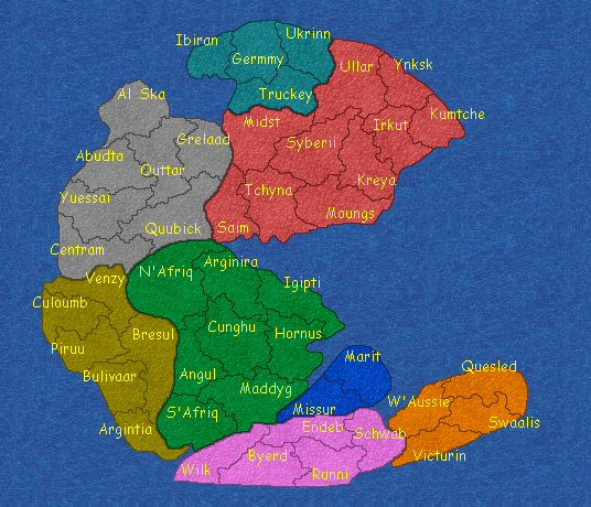
Maybe the interest can be a little higher now
Dont flame me due to the names... this is the 1st approach to the question and Im open to suggestions.
And Im also wanting suggestions about playability... including the best places to connect North and South...
I know, I know, some borders are not that visible, I will improve that later... for now, I was only worried about making them not blue, because Im anxious for more Kyle's comments
-
Marvaddin
- Posts: 2545
- Joined: Thu Feb 09, 2006 5:06 pm
- Location: Belo Horizonte, Brazil
![]() by reverend_kyle on Sat Dec 30, 2006 4:08 pm
by reverend_kyle on Sat Dec 30, 2006 4:08 pm
borders are perfectly visible and look great... ty.
The only place where it seems they may not be visible is, there should be more countries in the blue continent than just 2. .and if you are going to stick with 2 then make sure both can be attacked so they can be sort of like a city feel like ankh and morpok in diskworld.
All in all, this map is really coming along..
DANCING MUSTARD FOR POOP IN '08!
-
reverend_kyle
- Posts: 9250
- Joined: Tue Mar 21, 2006 4:08 pm
- Location: 1000 post club
![]() by AndyDufresne on Sat Dec 30, 2006 4:22 pm
by AndyDufresne on Sat Dec 30, 2006 4:22 pm
A few things that would make this interesting...if you gave it more of a 'beginning' of the world feel...as that what this map is all about. I.E. Volcanoes, rough waters, etc. Right now, there only a little appeal to me.
--Andy
--Andy
-
AndyDufresne
- Posts: 24935
- Joined: Fri Mar 03, 2006 8:22 pm
- Location: A Banana Palm in Zihuatanejo
Return to Melting Pot: Map Ideas
Who is online
Users browsing this forum: No registered users
|
|||||||
| Conquer Club is not associated with RISK online in any way. Copyright © 2006-2025 by Big Wham LLC | |||||||