The ultimate game of online risk
, multiplayer strategy and internet diplomacy!
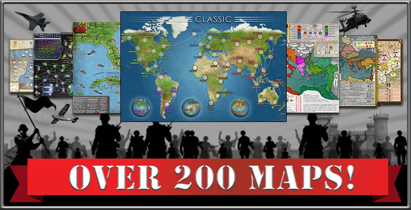
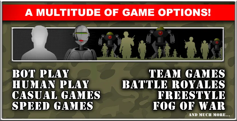
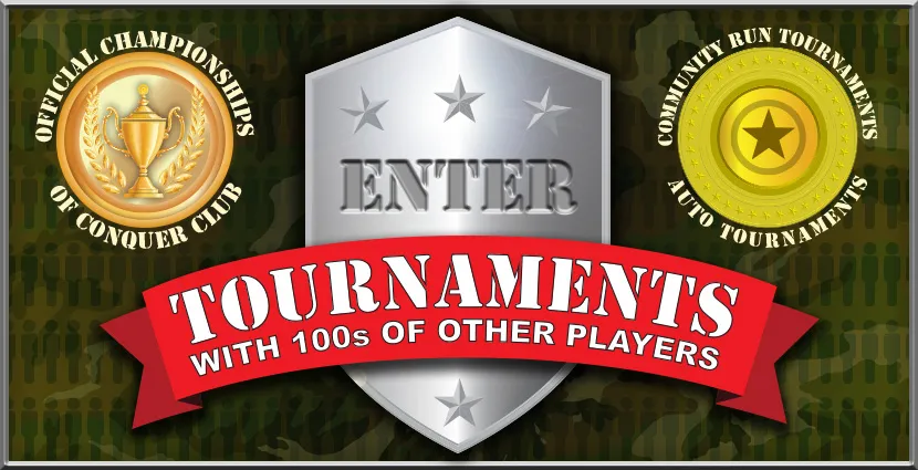
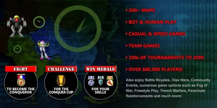
Originally inspired by the board game RISK™, Conquer Club has taken Risk online, expanding the concept to include over 200 maps, playing bots, casual and speed games, numerous gameplay options, tournaments, clans and more! So now you can play a game like Risk online with many thousands of other players and an endless variety of styles.
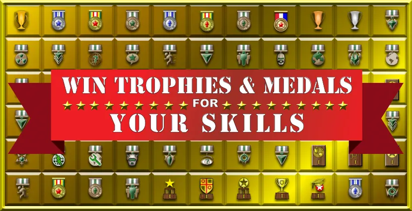
If you wish to play casually, a few minutes per day is all that is required. If you want to delve deeper, Conquer Club offers many options for hardcore strategy game players and online Risk experts.
If you wish to play casually, a few minutes per day is all that is required. If you want to delve deeper, Conquer Club offers many options for hardcore strategy game players and online Risk experts.
Logged in as: .


|
|||||||
| Conquer Club: play Risk online. Copyright © 2006-2025 by Big Wham LLC | |||||||