Well about the texture, I like it, but make it slightly less light (have more of the original colour than the white.
No many white already, guy, but I can do it darker, surely...
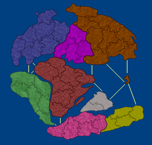
Also, the sea just doesnt fit, either have the sea as a two tone fade without the texture, or make the lander brighter (not more white but brighter colours)
I love the sea. And, I think it fits well... and bright colours sucks... Think about a bright yellow, how bad it would be... But I can adjust ocean colours to be more alike to continent colours, but this could bring problems to the blue continent, and I would like more opinions about this.
the last thing, romove the dinosaus, replace them with better pictures later, they make the whole thing look a bit tacky, also have the edge of the globe either with a glow or blurred, it looks a bit stupid just a straight edge.
What are your sugestions about dinos replacements? I like them, but maybe would be better use coloured ones... Opinions, please?
About the globe edge, its done already. I cant see any problem with it.
More feedback, please???


