lostatlimbo wrote:I do, but they are mostly nitpicky and you don't seem to like those comments.

Smilie noted, but to quote myself from page 12:
Minister X wrote:It's time to get REALLY picky about small adjustments like moving an army number one pixel's-worth one way or another. I am honestly looking forward to seeing how detail-oriented y'all can get.
Regarding the jaggies you see on the reduced fonts: I see some degradation of quality moving from the full to the small map, but nothing I'd call jaggies. But I wear glasses and have to squint - so I'll trust your eyes. I've adjusted the fonts on the small map from 8.68 points to an even 9, as you suggested. You'll have to tell me if you see an improvement. I know a little bit about font technology and I don't believe using even point sizes should make any difference at all, but I could well be wrong. In any case, the increase in size is easily managed.
Regarding the drop shadow on the Gladius and title: I see your point. The problem is that the title, using the incised font, is intended to simulate the letters carved in stone, and such things can't have drop shadows. Nevertheless, I applied a drop shadow just to see what it would look like. It's awful. Solution: remove the drop shadow from behind the gladius. In some ways this looks worse than before, in some ways better. I kind of like it; it's stark but the gladius stands out more. We can easily overdo it with drop shadows.
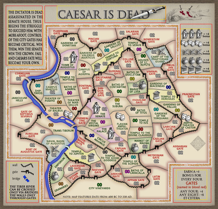
Regarding the color-coded bonuses: you may have forgotten or you may have missed it, but there was a somewhat protracted discussion of how much color should be in the map. Some wanted more; some less. The compromise solution was to have some color in the terts but not under the legend. What you're in essence asking is that we reopen that debate. I'd really rather just live with the result of the previous one, which until your post above seemed to be acceptable as a compromise to everyone.
Regarding using Latin for the title: according to Google Translate, it would be "Caesar Mortuus Est". I'm more concerned by the question of whether the increase in "Roman flavor" would outweigh the fact 1) that only one in forty CC players would know what it means (though more than that could make a good guess), and 2) it would be harder to remember. "Mortuus" is a very awkward word. Because there are more letters than in "Caesar Is Dead" the font must be reduced, which isn't fatal but isn't great. I've placed the gladius where I think it makes the most sense, but it is somewhat distracting there (though still pretty cool). I just don't know. I've made the changes but I consider them temporary and I'd like to hear from as many voices as possible: is this better or worse?
Cairnswk asked, "is it possible to have the title as Rome: Civil War (or 44BC) with your current title as a subtitle, that way you don't lose anything." First for 44BC: the map contains many landmarks built long after 44BC. I couldn't pick one date where Rome actually contained every one of these landmarks. Thus the note at the bottom of the map that says, "Map features date from 400BC to 330AD". Next, as to title plus subtitle: I just think it would be too crowded and confusing; the simpler the better. Let's see what people think of the Latin title.
- Click image to enlarge.

- Click image to enlarge.