hello! i didn't read the discussion, so excuse me if i say something that you have jet decided about.
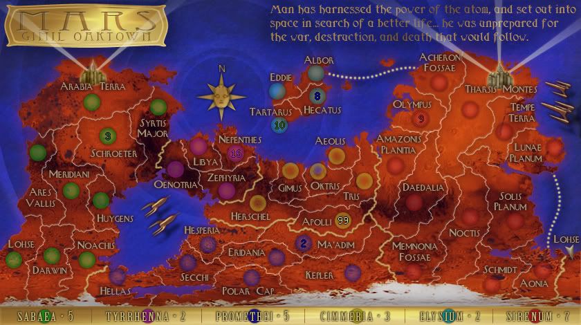
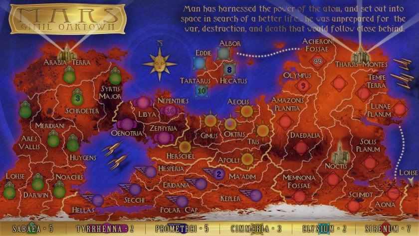
i like the feeling of the map. i like the texture of the territories and the background effect. i really like the outer borders effect (how you made it?) that seems a bit pixellated and give to the map an original futuristic feeling.
the only thing that i don't like is the names of the territories.. i think it's not much readable, and it's very difficult to identify wich territories are in wich country and wich is the right bonus. i don't now if it will be better to change the font, or maybe work on colours and make the glows more fitted and thin. in particular, i think that there are some glow colours that are invisible and don't pop from the background, maybe start changing thoose.

or you can try something like we did in oceania and find a glow colour that pop well for all the territories and then make the names with the same colour for the same country.
then try something to associate the countries with the names on the legend, maybe a colour association, or put an icon in the territories of the same country, or something else like that.
for the gameplay (that's not my speciality..) i think that it will better if there isn't only one access point to the island.

keep on the good work! ^_^


